|
Information from Dr. Jeanette Nicewinter + Additional Resources Notes:
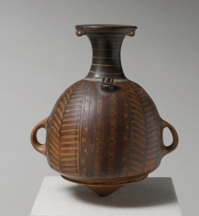 Storage jar or urpu, 15th–early 16th century, Inka, ceramic, 21.9 x 18.8 x 14.6 cm (The Metropolitan Museum of Art) 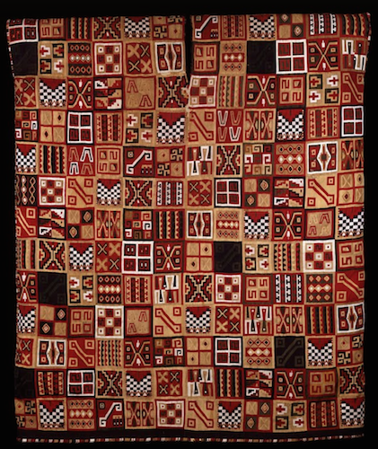 All-T’oqapu Tunic, Inka, 1450–1540, camelid fiber and cotton, 90.2 x 77.15 cm (Dumbarton Oaks, Washington D.C.) 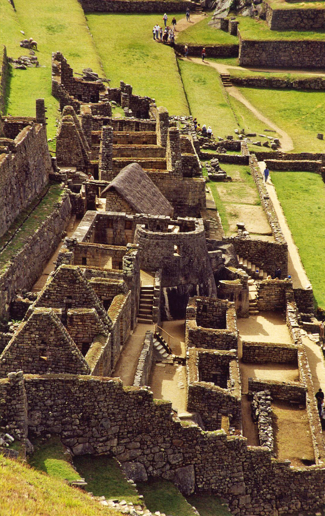 Temple of the Sun at Macchu Picchu 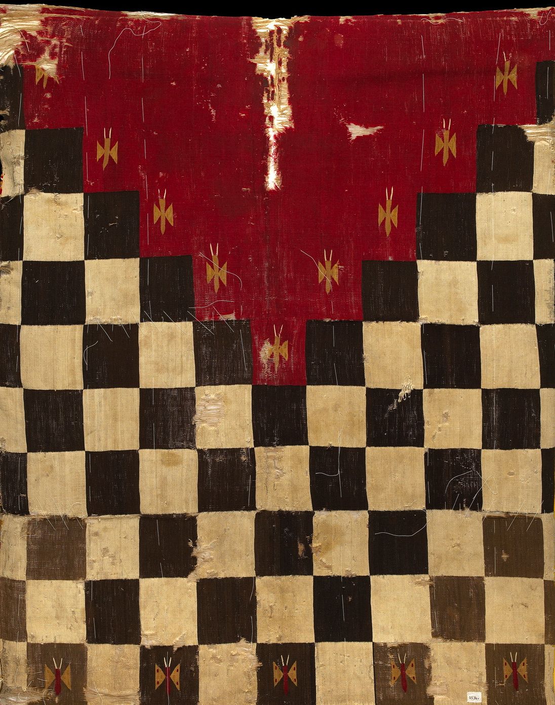 Inca military uniform  Inti Raymi Celebration 2020 Reflection / Connection to my own art:
It was super cool to learn about Incan culture, especially since South America was only a brief part of my 10th grade history class. It's so sad that the majority of Europeans just blatantly disregarded their works and actively tried to suppress their culture. I am so grateful that some artifacts remained because this culture was truly revolutionary in their understanding of artistic principles and appreciation for skilled craftsmanship. I didn't realize how carefully they balances practicality and freedom of expression in their artworks. It was absolutely mind-blowing to learn that some pieces of textile were more valuable to them than gold and silver, especially considering these metals are literally called "precious". The level of detail the weavers were able to attain in their textiles is so impressive. I appreciate the geometric patterns and abstract shapes, too. I wouldn't be opposed to exploring a similar style in my future works, as I tend to gravitate towards realism; I think focusing on the abstract could allow me to express the same theme I am currently working on (where home is, the connection between the mind and body) in a very different way. I also have never worked with textiles before, and I think it could be really interesting to try and actually do a weaving and just get some real hands-on experience to be able to fully appreciate the amount of time and attention textile artworks require. I think I could be good at this because I naturally have an eye for detail, but I could also see myself becoming impatient with the process and frustrated if it didn't turn out exactly like I had imagined. Nevertheless, I am glad to have had the experience of this lecture and looking at some additional resources to gain a greater appreciation for Incan culture. Resource Links: Inca Art - World History Encyclopedia Inca Art Forms | Discover Peru (discover-peru.org) Introduction to the Inka (article) | Inka | Khan Academy
0 Comments
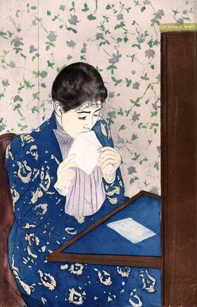
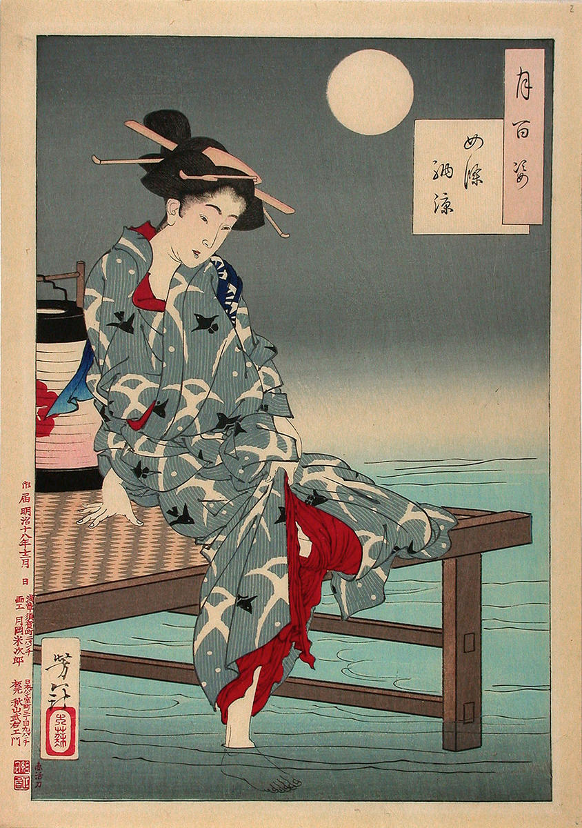
The West has been influenced by Eastern aesthetics since 1853 opening of Japan Right: Mary Cassatt's The Letter (1891) Left: Yoshitoshi's Cooling off at Shijō, from the series One hundred aspects of the moon (1885) 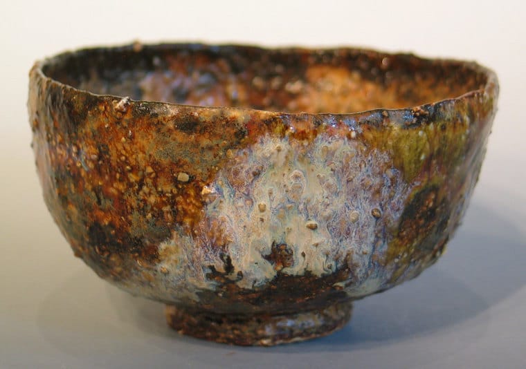 Wabi: connected to Shinto religion, original religion of Japan, 3rd century
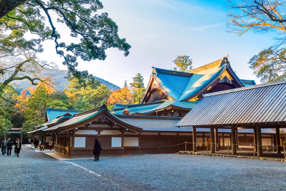 The Grand shrine of Ise is considered the most important Shinto shrine. It is surrounded by 127 smaller shrines and continues to be built every 20 years using same materials and traditional methods as a way to continue that legacy.  Sabi: mono no aware
 Yugen: linked to Buddhist teachings
Junichiro Tanizaki 1933 In Praise of Shadows - wildly read in Japan, a pop culture figure
ReflectionI remembered a lot of the details of this lecture from a similar one from 2018 on Japanese aesthetics. I specifically recalled the information about the principles of wabi and sabi because I think these ideas really resonated with me. As someone who identifies closely with perfectionism and the desire for a polished, finished artwork, I highly respect people who can look at a piece of art that is frustratingly crooked or incomplete and appreciate it as it stands. I found this notion -- that artworks which are not complete could be even more valuable than artwork which has been crafted with painstaking attention to detail -- especially frustrating; it feels like an insult to people who put time and effort into making their craft flawless. I guess that's the whole point, though; as yugen means, life is better spent appreciating the moment as it comes, rather than always thinking about the moment that has yet to come. When you really care about being present for the process of creating an artwork, I guess the finished product doesn't seem like the end-all be-all anymore. I think that's a valuable lesson; but, honestly, I don't know if I'd ever be able to fully ascribe to this way of thinking. I am goal-oriented, motivated by a vision I have of myself -- whether that be in art, school, or any other aspect of my life. While I understand there are drawbacks to this mentality, I also feel it has helped me succeed and maintain a good work ethic because of my internal drive. I would fear that if I were to try to incorporate wabi, sabi, and yugen into my work, I would lose that drive that keeps me on top of things. I guess, though, the whole point is balance: balance in being present in the moment and having a clear vision to work towards; balance in appreciating imperfections but also having a sense of pride in my work; balance in appreciating life as it comes and goes. I understand why individuals within Western art culture were inspired by Japanese aesthetics; their values are simple and humble, but the end result is a sense of contentment and satisfaction you are unlikely to achieve elsewhere. Plus, just the style itself with the flat shapes and the cherry blossoms is peaceful.
Overall, I enjoyed the lecture. I think I will apply it to my current works, using the principles of wabi, sabi, and yugen to center my mind when I feel I am too hyper-focused on perfectionism or not appreciating the process of art-making itself. I watched Ria's interview with sculptor and painter Keith M Ramsey. I found the interview interesting and helpful when thinking about my own relationship with art.
youtu.be/PBSV4BnacwQ I thought this interview was very interesting. Ramsey describes how him being let go from his job as a graphic designer in 2016 really ended up being one of the best things for him. He says how by that time, he was tired of being a graphic designer and having to tailor his projects specifically to his clientele, rather than having some artistic freedom. Personally, I like the idea of being a graphic designer because of the structure that having a client gives you, but I also understand that desire to just explore and be yourself. So, when Ramsey was let go, he took it as a sign from the universe that he would be okay on his own. He decided to make a career out of the art he was already making in his free time. Ramsey works with metalwork, ironwork, railings, tables, and furniture. He loves being able to take something useful, such as a grill or lamp, and making it completely original. His customers give him full control over the direction he takes his projects, which he appreciates. Ramsey is drawn to found objects because he believes they have a sort of personality that a new, freshly bought object simply lacks. He is the type of person to find a weird rusty nail on a sidewalk and put it in his pocket because he might want to use it in a project 2 years from now. Honestly, this type of thinking scares me because I feel like I would never stop just collecting things because I would always have that internal argument of if something is worth picking up; you never know what future-you will need, right? So, I prefer to sort of stay away from collecting found objects to that extreme, but it definitely works for Ramsey. I admire Ramsey's mindset of asking: "why not me?" By this, he means if someone else can make a cool painting or interesting sculpture, then why shouldn't he also be able to do so? I think this way of thinking is really empowering because it sort of carries an underlying message that if you apply yourself, then you can really achieve anything. One artist who really prompted Ramsey to ask the question "why not me?" is Melvin Edwards, a found-object sculptor. Ramsey was inspired by Edwards's work to create the largest metalwork sculpture he had ever done, which is actually located in Richmond. Ramsey's goals for the next year include continuing to make art every single day so that he can practice new skills with stainless steel and aluminum, expand his outreach, establish his own studio, and maybe hire someone to help him with installations. This is the link to my RVART Talk with Dana Roebuck, licensed clinical art psychotherapist, and Dr. Annie Coffey, clinical psychologist and drama therapist.
youtu.be/6GBFEP3QP7I 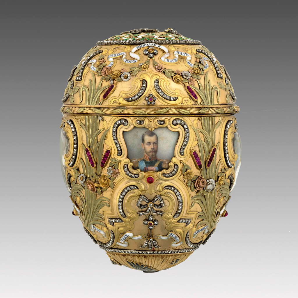 From www.vmfa.museum/piction/6027262-98307438/: The Imperial Peter the Great Easter Egg was presented by Tsar Nicholas II to his wife, Empress Alexandra Feodorovna, in 1903. It commemorates the 200th anniversary of the founding of St. Petersburg by Tsar Peter the Great. The top of the egg bears the Cyrillic initials of Nicholas II and Alexandra Feodorovna. When it is opened, a replica of Étienne-Maurice Falconet’s famous statue of Tsar Peter the Great rises out of the egg. 1903 Egg: gold, silver-gilt, diamonds, rubies, enamel, watercolor on ivory, rock crystal, Statue: gold, sapphire Dimensions: Overall (egg): 4 3/4 × 3 1/8 in. (12.1 × 7.9 cm) Overall (miniature): 1 7/8 × 2 3/4 in. (4.8 × 7 cm) Overall (stand): 3 1/16 × 2 3/4 in. (7.8 × 7 cm) Notes:
The Faberge Obsession -- Russian decorative art Ms. Kitts
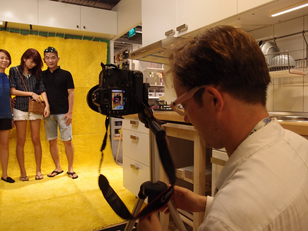
Reflection: I've always thought of the Faberge egg as mystical, an art form hailing from a different time -- a different world. In many aspects, this notion of elusiveness coincides with the long history of lost eggs. In the lecture, Ms. Kitts did an excellent job of highlighting the sense of mystique and grandeur of the Faberge eggs. In tracking the journeys of specific pieces from factory to palace to museum to art collector, she showed us how, after decades, the astonishing detail and precision which which each was crafted can still take your breath away. However, I felt like the lecture was extremely fast-paced and much too focused on the historical narrative of the Russian royalty. Ms. Kitts seemed to speed through the descriptions of the eggs themselves and their unique meanings, instead choosing to linger on details like the monetary value and family relationships. I didn't feel like I was able to truly absorb a lot of information because I was scrambling to just follow along with her words. Still, though, I gleaned some important and interesting information. For example, the initial egg was crafted specifically with instructions by Emperor Alexander III for his wife, the empress. What really stuck with me was that he had the present made because she was extremely sad and wished to cheer her up. That initial Faberge egg sparked an annual commission of Karl Faberge so that the Emperor could give both his mother and wife an egg. These handcrafted gifts not only reflected the wealth and prestige of the royal Russian family, but also paid homage to Russians of the past, like Peter the Great. In this manner, the Faberge eggs were not only honoring the contemporary Russian rulers, but also remembering especially revered historical figures, and sometimes even religion. The ornate nature of the eggs indicate a larger trend in contemporary Russian society during this time period; Russians were looking back fondly upon old Russian style, as well as responding to nationalistic sentiments which were sweeping across Europe. In this manner, Faberge had his workmasters design equally lavish and resplendent household commodities, like a gilded cane cap and decorative tea cups. Even though this lecture was sometimes confusing and hard to follow in terms of a timeline and structure, I found it to be an interesting peek into the history of a culture I have never really paid much attention to. My second visit to the ICA in less than a week! As a class, we viewed the Great Force exhibition. In contrast to my abbreviated observation of the gallery on Friday, I spent a decent amount of time meandering through the first and second floors. I was able to recognize the themes of racism, black identity and culture, heritage, individuality, and defying stereotypes. Most of the works were extremely conceptual in presentation, which I both respect and dislike; I respect the artist's ability to develop an idea and express it in a manner that seems the most appropriate to them, but I dislike a complete disregard for formal techniques. Perhaps this sentiment makes me a bit old - fashioned, but I just prefer works that demonstrate foundational skills of observation and composition. With that said, my favorite piece from the exhibition was the installation piece entitle Colonial White by Charlotte Lagarde. While Lagarde does not have any tangible artwork displayed, the fact that she has actually challenged people to consider and respond to her comments about institutionalized racism inspires me. I value viewer engagement in a piece greatly, and the fact that people took the time and effort to carefully follow Lagarde's instructions and submit their own photographs proves the efficacy of carefully developing your content before thrusting it upon the viewer in a piece of tangible artwork. I can empathize with the difficulty of communicating your idea in a manner which appeals to a widespread audience because I myself had to tackle this obstacle in my sculpture last year. It was hard to figure out how I could persuade and inspire people to participate. Ultimately, such a task is rewarding because you do not truly recognize the value of connecting with another human being and having a sort of multi - dimensional, long - distance conversation with several different people regarding the same theme / topic. I had not initially planned on trying to incorporate viewer participation in one of my upcoming projects, but reflecting on Lagarde's work has exposed me to a whole slew of questions to consider, which could all be answered with interactive artworks: How can I create a dialogue between the text I incorporate in my works and the viewer's response? What can the viewer contribute to my theme? Why is it important to me that I have some sort of impact on the viewer, and how enduring do I want that impact to be? Would I truly be well - equipped to handle both good and bad feedback, should I choose to solicit it? What kind of viewer participation is most meaningful to me -- as in, would I rather someone contribute to the physical display of art or the concept?
I also enjoyed the other works I chose to feature in the above slideshow. Well, I didn't necessarily enjoy the video because i found it disorienting and much too vague for my taste, but I was intrigued by the presentation. However, I found the contrast of materials in Untitled by Radcliffe Bailey very appealing. I like the effect of the expanse of black glitter, as if the tarp is covered in basalt, as if it is situated on the shore of a volcanic island. The hazy photograph of the ocean creates a sense of displacement, as it is asymmetrically situated within a square of solid, sparkly matter. I definitely do not get any sense of the "forced migration" mentioned in the artwork's label, nor do I understand the connection to dehumanization, but I nonetheless am drawn to the artwork. I have no doubt that I would like it more, though, if I more clearly recognized the content so that I could self - ascribe a greater meaning and thus value it more. This experience encourages me to continue developing explicitly conveyed content so that the viewer knows at least a sense of my thoughts and feelings during the creation process. It is important to me to establish that connection between artist and viewer which transcends time and space. For my Q1 Experience assignment, I attended the First Friday Art Walk in Downtown Richmond. It was amazing to meander around with two friends who are also passionate about art and soak in the galleries together. Most of the artworks did not appeal to my particular style, but I made a conscious effort to appreciate the artist's initiative. Below are some images from each of the three galleries we attended: The Institute for Contemporary Art (ICA), Artist Downtown Access (Ada), and Black Iris Gallery. The ICAThe atmosphere when we first entered the ICA was intensely chaotic and alternative. There was a DJ, party lights, and people in metallic wigs were milling about. We looked around the exhibition on the first floor. I could definitely tell that the works were contemporary because they were obviously much more conceptual than earlier art movements generally were. I do not have an image of it, but there was one installation which felt especially controversial to me. It was a video of a man army - crawling 22 miles to the Statute of Liberty. It took him five years, including his extensive research of various crawling techniques. I was appalled. The most interesting part of the whole installation, I think, was the part in the Artist Statement where it mentioned how, as he was crawling along the congested New York sidewalk, he was largely ignored. That aspect of his project was interesting because of what it implies about the ignorant and narcissistic nature of modern American urban life, but I was otherwise not impressed. It makes me feel guilty for thinking that his art is "lesser than" physical works because there is no application of formal skill. I understand that this notion of what defines "Art" is controversial and maybe even insulting for other people, but it's just a result of the value I have personally assigned to mastering traditional techniques of observation and realism. Now that I am thinking about it, though, that isn't a fair comparison because performative and applied arts are similar, not parallel. Still, I do not feel compelled to study crawling... The other works displayed in the ICA were generally interesting. Untitled (Colored People Grid) is a clever play on words, with the 'colored people' paired with the 'colored grids.' Just removing one word from the title gives the piece an alternate connotation and central point, which I appreciate. I like how the content is amorphously expressed, as if the artist is guiding the viewer's response in a general direction, but not in an overbearing manner. Sedrick Chisom's appealed to me in color scheme; I tend to work in pinks and blues. Plus, I like the weathered feel of the darker piece; I feel like I am viewing the piece through a water - streaked window. I have no clue what the purpose of the neon lights is, but obviously Shreya, Ria, and I enjoyed its effect. Ria pointed out how it was cool that the wires were left exposed, which I honestly had not even considered until she mentioned it. This exhibition further encouraged me to explore the conceptual aspect of my current pieces, as well as continuing to include vibrant pops of color. It would thrill me to include neon lights, but I am not sure how feasible that goal is. Nonetheless, I am glad for the experience. AdaAda had a much more mellow vibe than the ICA, as if the artists were more subtly alternative. Both Chris Musina and Sarah Trigg had places where they physically wrote their names on the wall beside their works, rather than having a printed label. I absolutely love the intimacy of this act because it feels so personal and much more engaging than a monotonous and austere matted artist statement. This doesn't mean that I do not appreciate the formality of traditionally presenting information about the artist (because I do), but it has inspired me to consider using the physical gallery space as part of my installation. Like, what if I created a work and then wrote my coordinating poem / reflection directly beside it?? That would be so edgy. Most of Sarah Triggs's works were very earthy and abstract, which Shreya and Ria both enjoyed. I was not a fan, but I was impressed by her creativity in using the hardened layer of house paint in her paint cans as the materials for her Cast Paint series. Plus, her focus on worldliness is evident throughout the whole gallery. Black Iris GalleryIf ICA is for the overt oddballs and Ada is for the mellow hipsters, then Black Iris Gallery definitely appeals to the grunge alternative crowd. The artists are two bearded, flamboyant old men (they were milling about the gallery and talking to people), and it was hilarious in an awe - inspiring way; like, wow, the world is so much more diverse than I know. It fascinates me how beautifully chaotic and wondrously weird people are, and even more so when they are comfortable enough in their chaos and weirdness to express it (although doing so in a deliberately ostentatious manner is off - putting to me). Anyways, I found many of these works entrancing in a disturbing manner, like you know that what you're seeing is tragic and you should look away, but something compels you keep looking. Also, the titles of the works fit the content wonderfully, which has inspired me to continue to carefully name my works, rather than rattling off a name just to be done with it (I do not do this, but I just mean that I do not want to fall into that habit). For example, there was one colorful piece done in oil and wax titled "Oh Happy Day," and I immediately began singing the gospel hymn in my head. However, this tune was absurdly incongruous with the distorted figures and pock - marked hands. I would not personally want to create works with such a dark connotation, but I am able to appreciate their distinctive artistic expression.
 This lecture by John Freyers was extremely different from the ones we have experienced so far. I think it is because Freyers' approach was unconventional and more of a conversation than a formal presentation. John Freyer is an artist, author, educator, and MLWGS parent. He earned his BA from Hamilton College and MA / MFA from University of Iowa. He is currently an Associate Professor of Cross Disciplinary Media at VCU's School of the Arts. Since the spring of 2018, Freyer has been a Tate Exchange Associate - the first every from the United States. His work is classified as social practice art, which Freyer describes as a form of "conceptual - based art incorporating works that involve different populations in communities." The central tenet of his ouevre is the inclusion of "accidental audiences" in galleries, museums, and public spaces. His research practice involves how conversation and storytelling, when paired with the circulation of everyday objects, enrich social ties between individuals and groups. Specifically, these tangibles are commodities, fetishes, and tokens. Freyer asserted that he generally classifies contemporary art as elusive to the general public because of its eclectic connotation. Therefore, he overcomes this barrier by naming his projects exactly as they are; his performance art project and award - winning novel All My Life for Sale followed his journey around the world as he searched for the new owners of his worldly possessions that he had sold on eBay. As an example of "audience participation," Freyer described how one woman gave his baseball cap back to him, saying that it was her own contribution to his project - even though she had already paid for the item. This small act of 'giving back' epitomizes the effect Freyer's research and experiments has on people by forcing them to follow their values when presented with an unusual situation.
 While Freyer's programs are not traditional forms of art, the process of designing such extensive and empowering projects is an art form in itself. The location of Freyer's demonstrations becomes his canvas, the people his materials of choice, and the conversation and connections that he stimulate are the medium. Each individual 'exhibition' of Freyer's work is just another addition to the massive collage of trust, support, and optimistic he has fostered. There is no artwork more beautiful, colorful, or enriching than that of societal enlightenment.
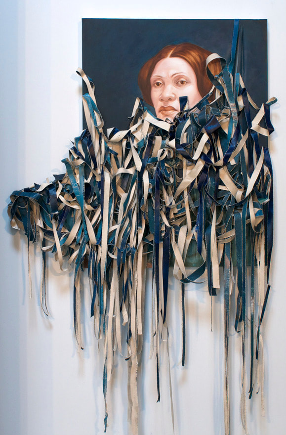
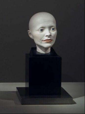
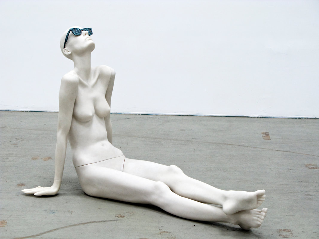
Additional Resources: fiftyfifty.country/ m.richmondfreepress.com/news/2018/mar/16/personality-john-d-freyer/ www.temporama.com/ arts.vcu.edu/photofilm/people/john-freyer/  Whoa. I was in awe of this collection. I actually just voice - recorded everything that we discussed so that I could give the artwork my undivided attention. Later, I listened to the audio recording and took notes in my sketchbook. This definitely wouldn't be an option I would have to complete all of the Experience assignments we have because I do not often have the free - time to essentially re - experience a whole field trip. However, I was able to do so for the Try - Me Gallery, and it worked wonderfully. While on the field trip, I felt totally present in the impact of the artwork and what we were learning about it all. I could listen to the information we were being given and take it for its holistic value. On my own, though, I could pause the recording and jot down my observations and personal reactions to what I saw and heard. I had control over the organization of what I was writing, such as how I formatted my documentation of the artists we discussed and analyses of their works. To bolster my comprehension, I revisited www.try-me.org/ to find artists with whom I felt a strong connection. It was truly an immersive and awe - inspiring experience. The field trip itself was fascinating. It was difficult for me to grasp the fact that the Try - Me gallery is actually Pam and Bill Royall's (that is SUCH a cool last name) private collection. The infrastructure was beautiful and obviously very modern and up - to - date. The similar content of the pieces created a subtle flow, which I found to be truly beautiful; for example, the analogous commentary of Kehinde Wiley and Amy Sherald about African American culture forces the viewer to consider their meanings. I understand that pieces are similarly arranged in curated galleries and museums, but I think it's different when the pieces have been purchased simply for the pleasure of the owner. The Royalls have specifically chosen to permanently own these artworks because of the profound impact they have had, and that is wild to me. Like, just knowing that there was something so special about the monoliths by Mariko Mori or busts by Elizabeth King to these two individuals that they wanted to cherish them for the rest of their lives... it changed the way I looked at the art. It made Michelle Florence's iguana self - portrait / household object, or David Schnell's "Moment" seem more accessible; I wasn't as intimidated by them as I would have been in a more formal setting, I think. I don't quite understand it myself, in all honesty. Nearly everything about the Try - Me Gallery just felt right. For my work in the future, I am interested in exploring Titus Kaphar's shredding technique. I have always been drawn to textured works, and the physicality of the mass of butchered canvas contrasting with the well - crafted portrait excites me. I also noticed that it looked like hot glue held the shreds together, which for some reason amused me. Furthermore, I am encouraged to exploring all - over compositions and trying to keep the balance within this kind of work so that I do not subconsciously create a focal point. This is something I struggled with a bit during my AbEx piece, so it's just a challenge I'd like to work through in experimental pieces. Finally, I have been inspired to consider using wire or string inside of my apple sculpture. I like the idea of criss - crossing string so that it resembles a kind of web inside of the apple, spilling out of the hole and onto whatever baseboard / pedestal I decide to use. I will definitely have to more carefully consider these options, a task which feels both daunting and exciting. Artists / Works I felt drawn to:
Additional Resources: kapharstudio.com/ thesizesofthings.com/ richmondmagazine.com/topics/try-me-gallery/ www.styleweekly.com/richmond/power-arts-and-culture/Content?oid=11066500
|
Archives
March 2021
Categories |


 RSS Feed
