|
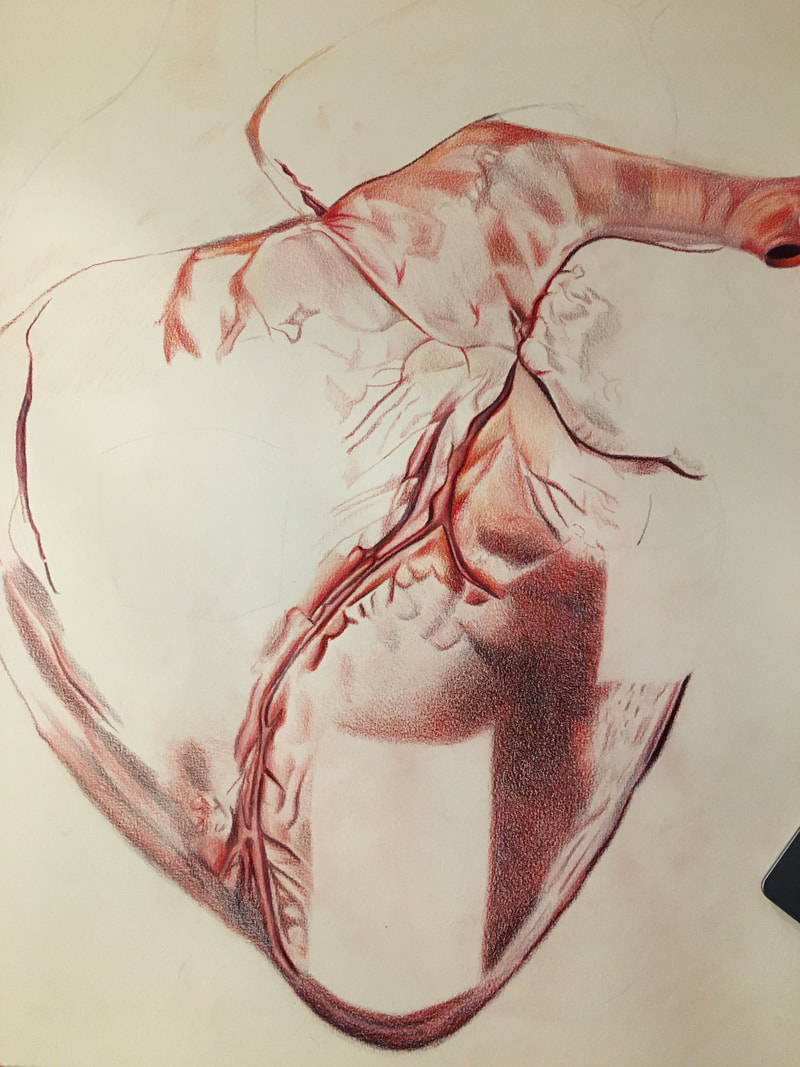
I had to meet with Coach Hall so he could help me figure out the perspective for the windows and door because I was struggling a lot. But, he helped immensely, and I was finally able to start actually adding the colors. Now, I'm working the details of the windows and door, and then I'll have color in the areas around them to make sure the integration isn't choppy. I'm happy with progress so far, and I'm excited to be almost done.
0 Comments
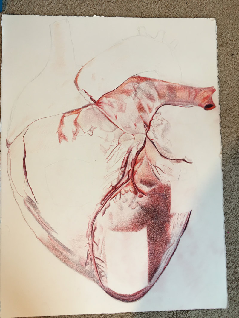
I'm still working on blending the colors on the heart to make them smooth and vibrant before I move on to the windows and door. I still have details on the middle to left part of the heart, but I'm making steady progress.
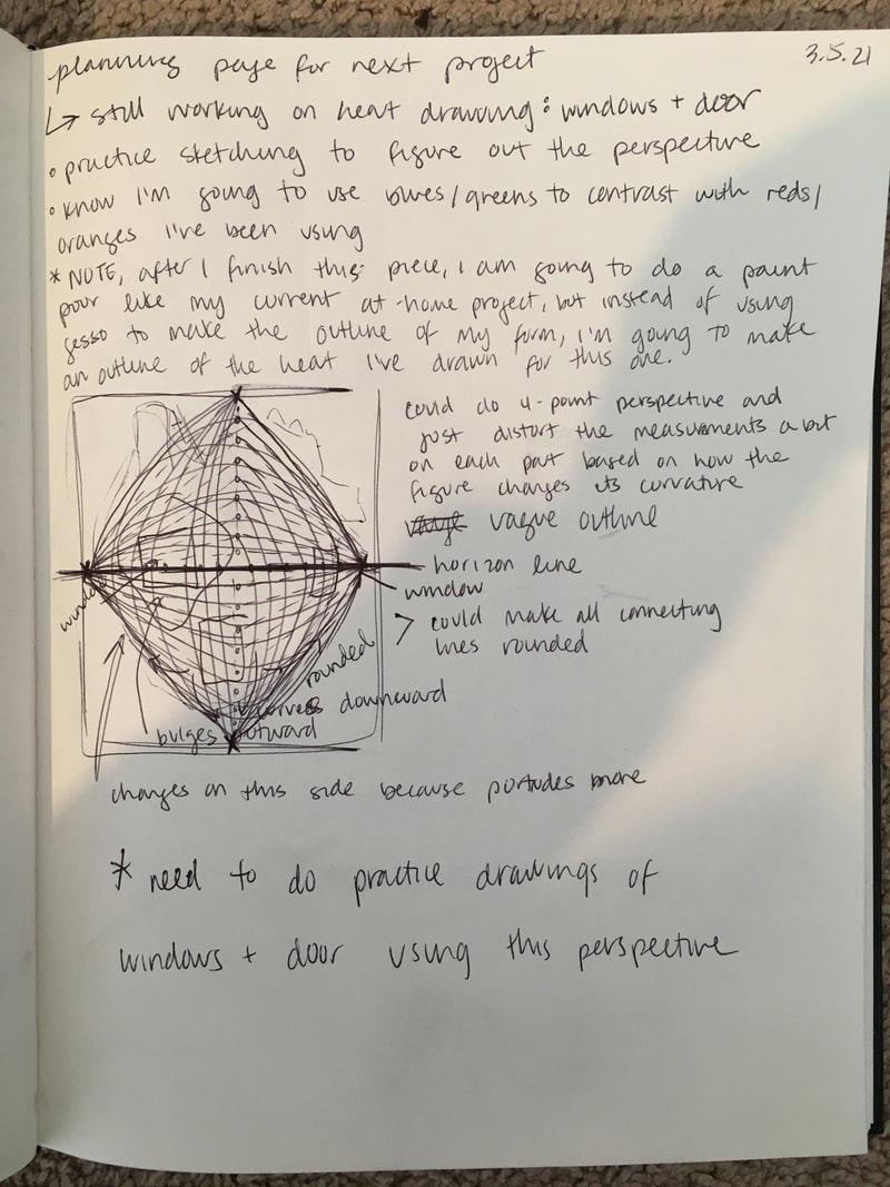
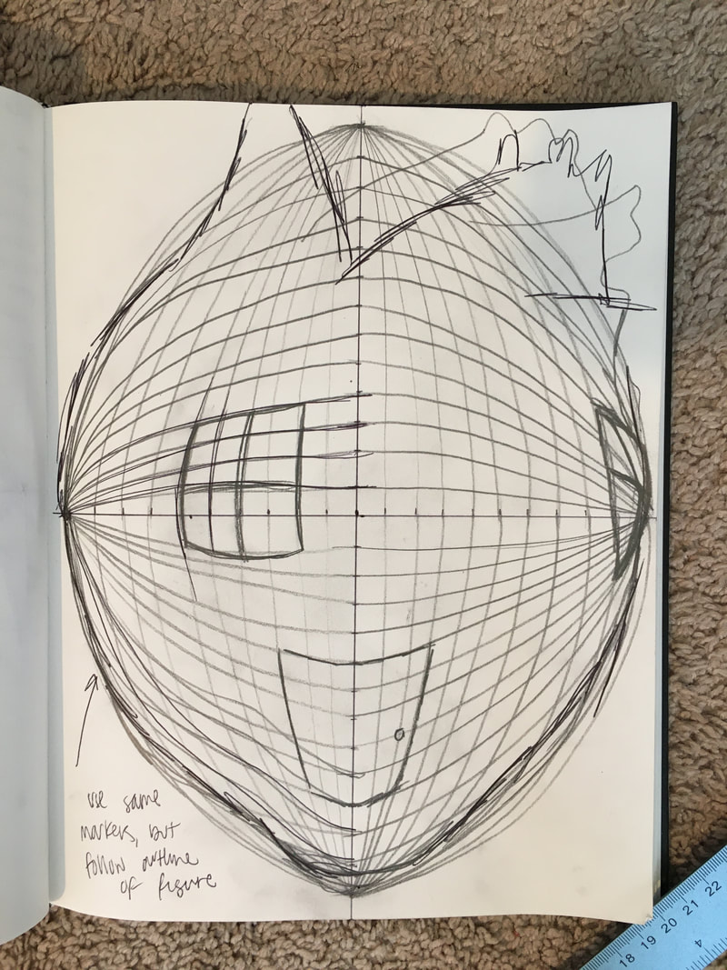
The images of the planning pages I've included from my sketchbook (above) pretty much sum up my next steps for this project. I still need to finish shading the heart itself and making sure the colors are as bold as I want them to be. I struggled with the textures of the upper left quadrant a lot, especially since there is a pretty large area of highlight in the photo that I wasn't sure how to capture. I explained my concerns about the areas with highlight to Coach, and he suggested I take a bit of artistic license. So, I am just sort of pretending like those highlights don't really exist because they are incredibly difficult to render using colored pencil. Once I finish coloring the heart, I'll begin on the windows and door. As depicted in my planning pages, I've been thinking about how to best portray the angles of the windows and door because I want it to be clear the heart has dimension and depth. It is tricky because it is not an even globe shape, so the angles are a bit different for each part. I think what I will probably do is begin with a horizon line and adjust the lines I use as markers according to the irregular curves. I think I'm going to follow Coach's suggestion of making the door inset so that there's an entryway and the door itself is set back into the heart. I think this would give a really awesome sense of depth to the piece and be more visually interesting than a regular door. Plus, as he pointed out, it would be very difficult to draw the door distorted on the surface of the heart.
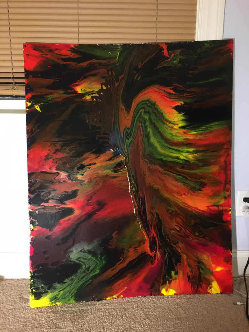
I'm both nervous and excited for these next steps in my progress... but mostly excited! 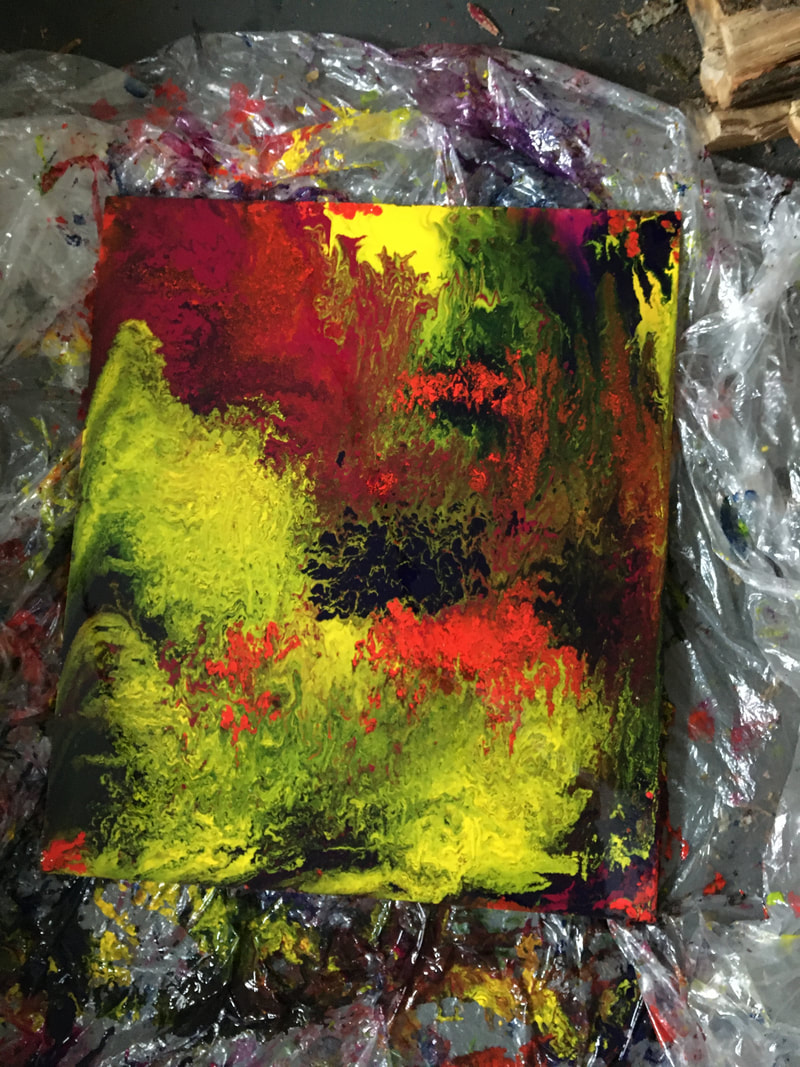 It's really difficult to take process pictures of the paint pour because it gets so messy and I can't stop in the middle of the process to take pictures with my hands all covered in paint. But, anyways, I finally went to Lowe's and got a super large piece of this very thick material that is similar to fiber board, but not quite the same (I don't remember what it's called). We got them to cut so that it would be the right size. Then, I could finally do the actual paint pour (after my first failed attempt). I ran into the same problem as I did with my first attempt, where there were these little pockets of empty space that the paint just sort of went around, rather than filling them in. So, I had to put paint on my finger and basically break whatever seal/barrier the paint had formed that kept it from not spreading to that space. It was kind of satisfying, but also time-consuming. Overall, this piece is alright. I am concerned there is not enough purple to balance the yellow that somehow managed to dominate the bottom left part of the board. But, the textures and patterns are really cool. I'm excited for the next phase: making the outline of the silhouette, using the same picture of myself that I used for my last piece. Originally, I was going to actually cut the outline out, but I need to see if that is actually feasible. As an alternative, I was thinking of maybe just using gesso to make a subtle outline, or something like that. I was also thinking that I could just fill in the outline with gesso, like a color block, rather than just outlining the figure.
  I've made some good progress on this piece. It's difficult to blend the colors correctly to get the right hues and shades, but I've enjoyed the process. I'm sort of dancing around the parts that are the most detail-oriented, especially where there are highlights. My fear is that I won't be able to execute the details, and the highlights will just look like blank spots, as if it's unfinished. I'm gonna have to get over it at some point, though, if I intend to finish.
I've made some decent progress thus far. All I'm really doing right now is using my reference photo to color and shade. It's a fun but slow process. I'm not following the reference picture exactly, but close enough for it to still be realistic. I am having a tricky time with the highlights on the right side -- I'm not sure how to depict them accurately. I might have to leave that part for the end so I have time to figure it out. Overall, I am content with where this piece is headed.
 This is not what I wanted to happen at all. I used foam board, and that was definitely a mistake: foam board is not firm when covered with a thick layer of paint, and it warped horribly. I didn't even really think about how the sides were bowed when I left it to dry, and then when I came back to check on it a few hours later, I saw this huge pool of paint at one end because all of the paint had run into the middle and then trickled towards the side that was curved downward. I still think it looks cool, and I'm going to keep it, but this is not what I want for this project. I'm going to re-do this paint pour with a much thicker, firm material as the base.
My goal for this project is to continue exploring surrealism through synthesizing house imagery with bodily organs. I chose to use the heart for this piece because I have focused very heavily on the head and brain and "thinking" aspects in my last few pieces, so I wanted to switch gears a bit and focus on the "feeling" part. Because the heart has such a strong connection to emotions, it felt right to use it in this manner. Plus, I think it's a cool extension from my last piece about where emotions live in your head. I mean, who says they are confined to that house? Maybe they also live in the four chambers of your heart (obviously, it's not physically true, but I'm thinking in very abstract terms here). I finally got some artist-grade colored pencils, for which I am excited. I'm nervous about how realistic I'll be able to illustrate the heart and distorted windows and front door. I think I'll be fine, as long as I remember to not rush through shading and adding fine details.
Images that have inspired me: My main goal for this project is to return to two art forms I have always loved: language and acrylic paint pours. I have never paired them together, though. I really want to try and get these distinct mediums to interact in an effective way. I am going to use original writing. My colors will be red, yellow, blue, and purple -- same as the colors I used to connote emotion in my last work. My first step will be to figure out the method in which I will do the paint pour. NEW IDEA THAT JUST CAME TO ME:
I did not meet the due date for the project, but I am still very close to being done. This project is one of the most ambitious I have undertaken. I enjoyed working with the colored pencil to blend and build the layers of color upon each other. At this point, the only thing really left to do is the hair. This is giving me some pause because I am unsure as to how to resolve the interaction between the hair and the house part of the head. The house is supposed to be inside of the head, so the hair should fall over it, but not completely obscure it. I was thinking about making it seem like there was a section of the hair that had been cut to accommodate for the hole that allows the house to be seen. My only issue with this is I am unsure how to draw the hair realistically enough in this manner to make it obvious is has been cut around the section. I will likely talk to Coach Hall a bit more before I commit to any sort of design moving forward.
In terms of my next project, I have no idea what I want to do. I am going to really have to consider what themes are most important to me right now before I do anything else. We shall see what happens. |
Archives
March 2021
Categories |
 RSS Feed
