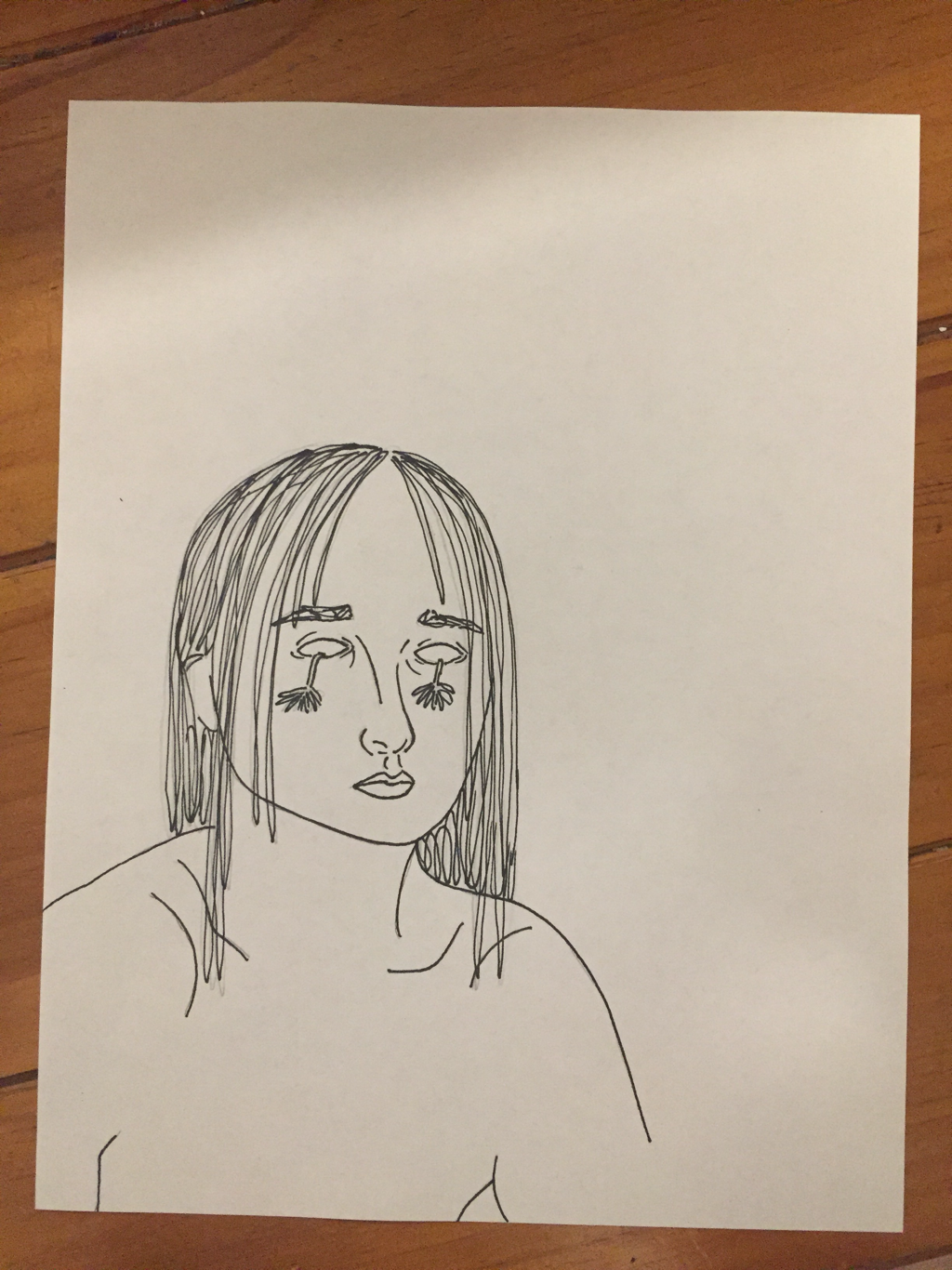
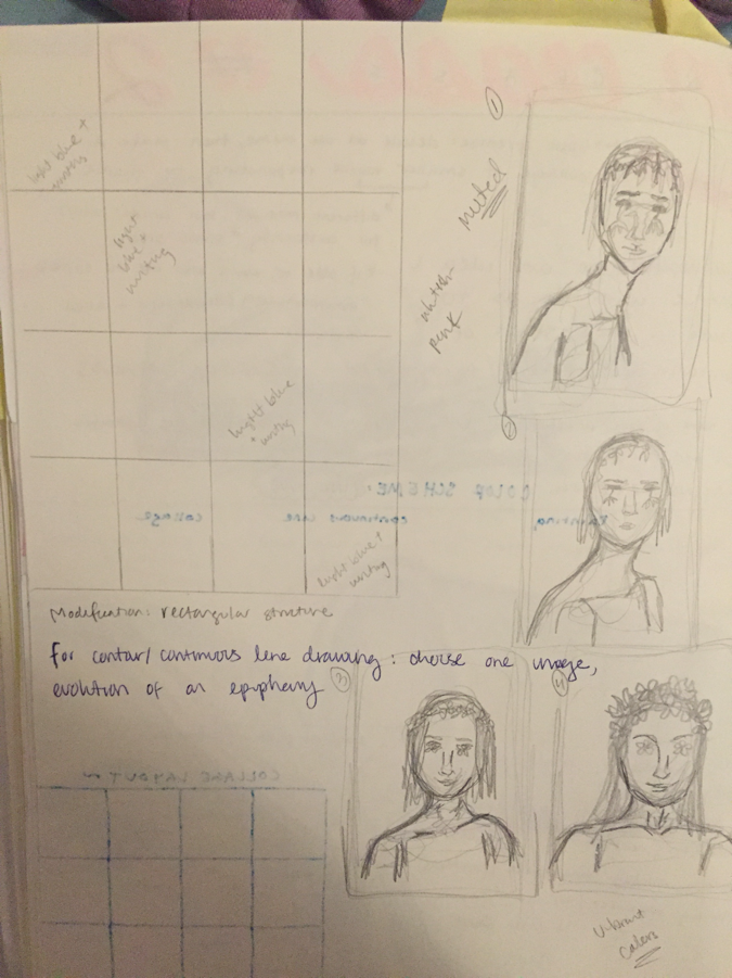
 I forced myself to make concrete decisions today regarding the subject of my line drawings. I researched tumblr drawings of flowers and girls for inspiration. Then, I took pictures of myself for reference when I draw the body position and facial expressions for the figures. I want for the images to express an evolution of growth and healing, same as the other sets of rectangles. The above picture is my first drawing. I am going to be drawing all of the images on paper first, and then I will put graphic on the back and transfer it onto the rectangles. This method will allow for me to make mistakes when initially sketching the figure without having tin make unnecessary marks on the final medium itself.
0 Comments
To give myself more time to think about what I want to do with the rectangles I painted blue last class, I decided to proceed with my paint pours. I was so excited to use the paint pouring technique because I spent a lot of time researching methods last year and watching videos. I am using the paint pours as a watch to convey conceptual growth, like the expansion of fluidity of thought and emotions. I purposefully left less and less negative space in each consecutive paint pour, moving from a lot to none at all. I am going to painting the negative space black with acrylic paint. The matte quality of the paint will contrast with the glossy paint pour. My goal with this set of visuals is to demonstrate how personal healing can combat the darkness of negativity. The unpredictability and seemingly randomness of human emotion should be embraced, rather than confined.
I took the paint pours home to work on over the weekend. I realized that it was pretty illogical of me to decide to paint the negative space black after I had already did the paint pour because that means I had to take the time to paint each crevice and carefully outline all of the edges of the paint pour. It was extremely tedious and time consuming, but definitely a learning experience. I am happy with the effect of the contrasting sheens of the two mediums. I like the added quality of dimension and texture. Now, though, I have to actually make decisions about my other pieces, rather than simply pushing them off to “give myself time to think.” ugh.
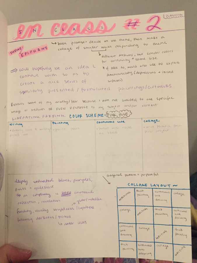
I have officially begun working on my second class project. I have been coming in during study hall to continue working, in addition to time in class. I think it's pretty obvious what my theme is for this piece, but I'm just gonna make sure that we are all on the same page and say that I am focusing on the topic of an "epiphany." I think that the real seed for this project was planted over the summer, when I started to listen to music pretty regularly, especially while walking my dog. Spotify recommended that I listen to the artist NF, and I immediately felt moved by his powerful, vivid style. One of his songs in particular stuck with me, and it is entitled (you guessed it) "epiphany." For some reason, the lyrics of that song stuck with me, especially when it says "something funny goin' on up in my house." I always envision a person with a house attached to their neck, with lights flickering behind swishing curtains. I had initially wanted to incorporate that image into this piece because I have such a deep personal connection to it, but the direction I am heading with this piece has veered away from that plan. I am currently working with 16 rectangles of medium density fiber board. The rectangles are 12" x 6". Each row, column, and diagonal line will have one of each of the four mediums I will be working with. From the top left corner to the bottom right corner, the general trend is one of progression and self - healing; the artwork is an epiphany of self - acceptance in and of itself. I will still be working with the same blues and pinks as I did during my last class project. I will also be incorporating my signature glitter / opalescence. The light blue rectangles will be my four continuous line drawings of the figure. I will be depicting the same figure on each of the four rectangles, but there will be an obvious improvement in saturation and general health of the girl and the crown of flowers that she will be wearing.
The rectangles which vary in shades of pink will be the backgrounds for my poems. I think I will have to condense my current poems because the rectangles are smaller than I had planned, but I am confident that I will nonetheless be able to effectively articulate the sentiment of an epiphany in a poetically aesthetic manner. i cried i cried like i wished i could've months ago i cried out all the anger the sadness the wanting and my mind and body sighed with relief because finally it was time time to begin again POEM#ONE and suddenly through the veil of pain i caught a glimpse of what life could be like and that that was enough POEM#2 do not waste your breath telling me that i am not like the others. trust me, i see it every time i look in the mirror: the contours of my body the curves of my muscle are unlike anything you will ever see. but do not mistake my clear sight for a clear mind, for i am still figuring out -- still deciding -- if i am okay with this this uniqueness that i possess. POEM#3 -steady who am i to decide the sublime purpose of my existence? i am nothing, no one, a whisper of life in the gaping shout of the Universe. but comparative size does not equate to insignificance. i am minuscule yet monumentally important. i have no purpose. freedom. freedom is daunting, but you know what’s not daunting? happiness. and i have the freedom to choose happiness. POEM#4 The paint pours are because I love paint pours. Something about the organic way the paint unfurls across the fiber board, swirling together -- untamable, mesmerizes me. I purposefully chose to create a gradient of lots of bare space to completely covered in paint. I am going to paint all of the bare fiber board with matte black paint. The purpose of the black is to represent that dark, oppressive energy which can sometimes grow so intense that it suffocates your spirit. With an epiphany, however, you may abolish such negativity. Let your heart fill with love to the point that there is no longer any room for hate. Very cliche, but that's only one aspect to the whole piece, which is exactly why I am enjoying it so much: I have given myself the opportunity to explore several responses to a single theme. The effect is engaging and multi - faceted and keeps me motivated to continue working and conquering the content. I still have not decided on what I am going to do for the fourth set of rectangles. I have been considering using this sort of pink metallic material that I found at the art supply store, as well as the blue iridescent fabric from my last class project. Perhaps I could also create mini - collages... important decisions to make. 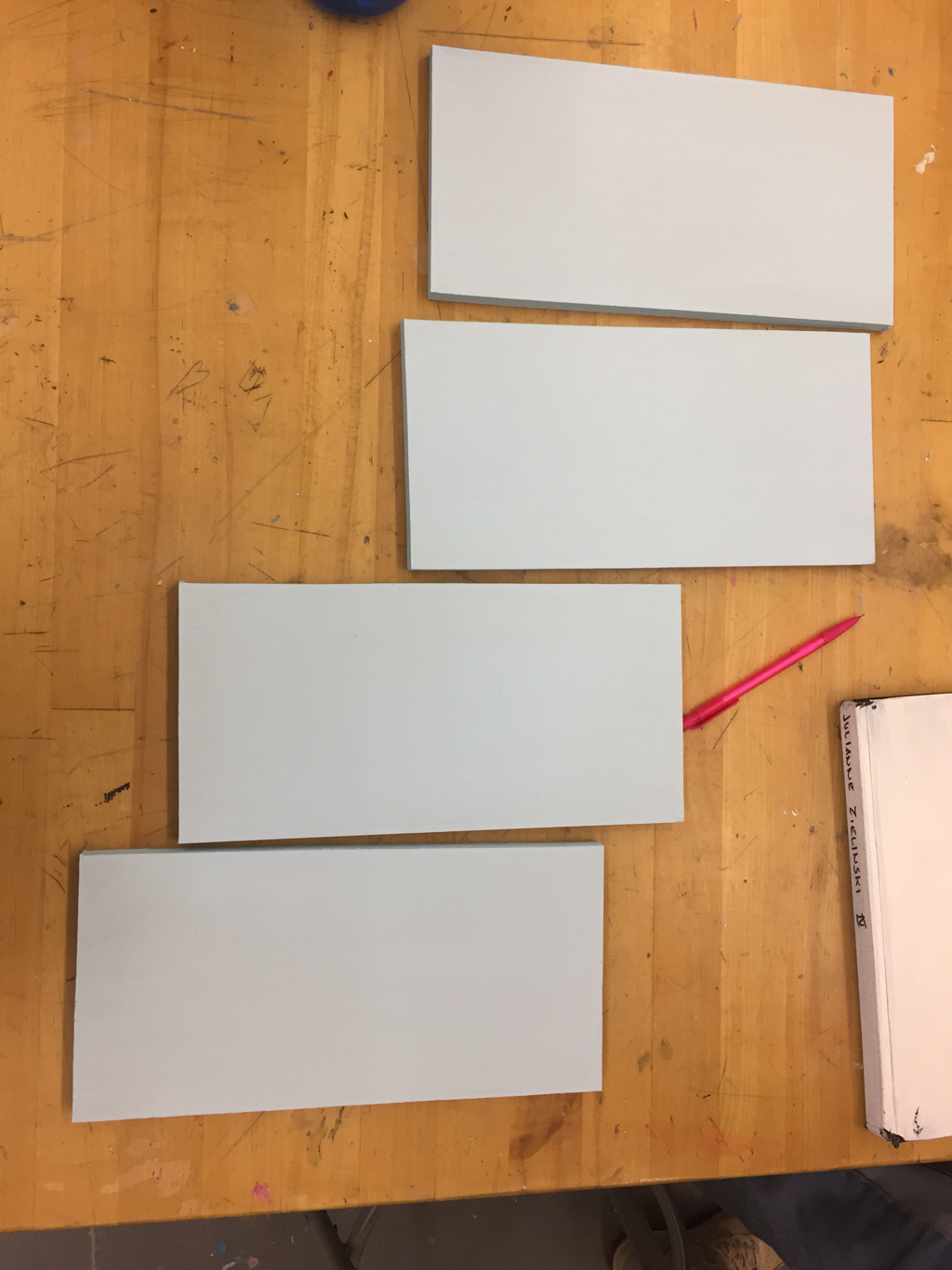 I began painting my rectangles today. I had to go to Lowe’s to buy medium density fiberboard, and we spent last class cutting them with the jigsaw. I had initially wanted to use squares, but the rectangular format worked better for my preferred dimensions. The rectangles are 12” x 6”. I know that my colors are going to be blues, pinks, and white. I chose to use a solid blue for this set because I want for the evolution of growth / healing to be portrayed in the illustration
FINALLY. The edits are D O N E. That was exhausting. 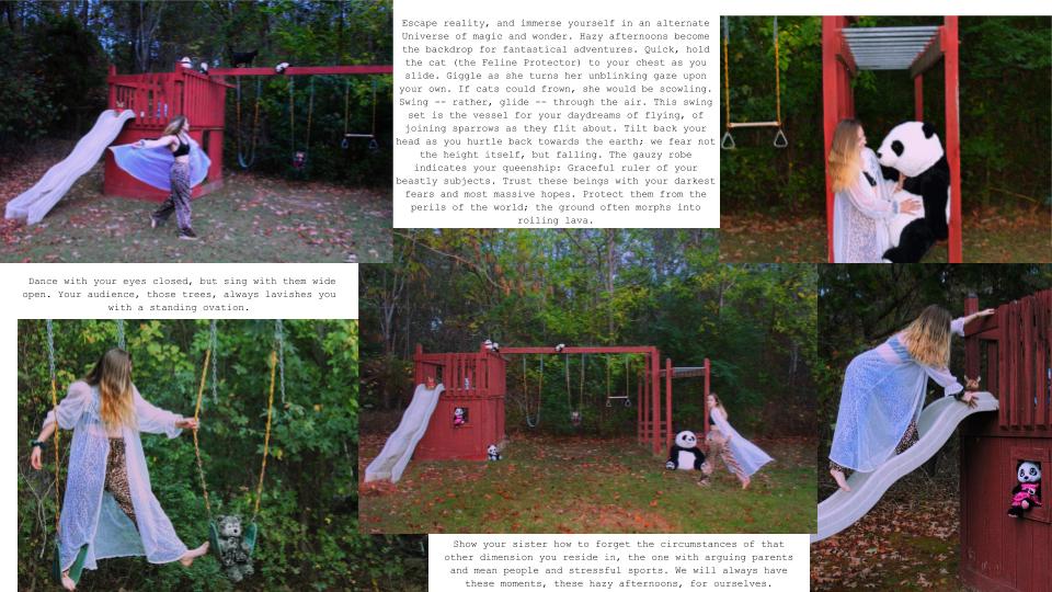 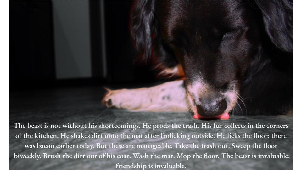 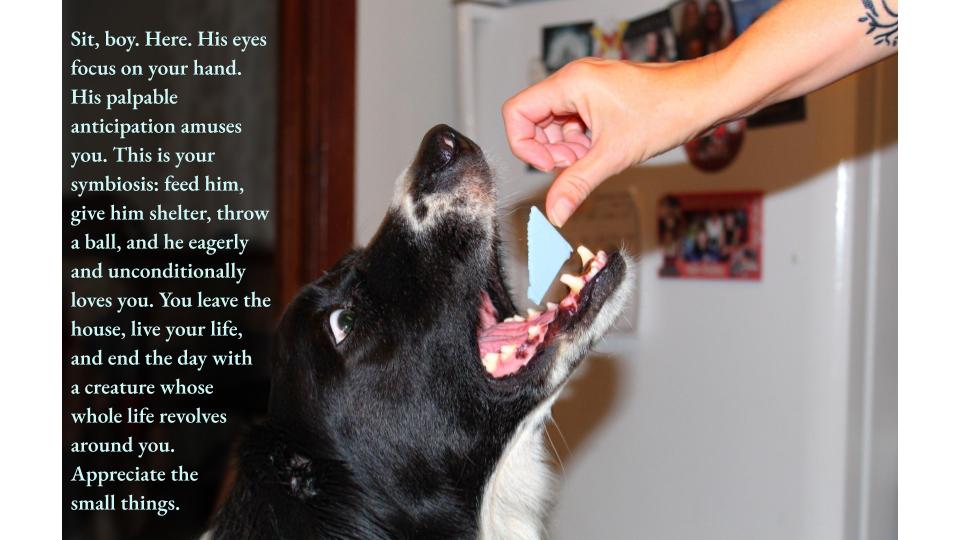 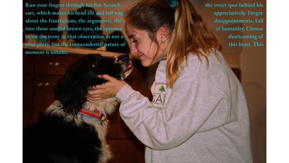 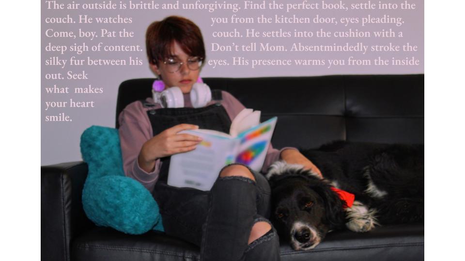 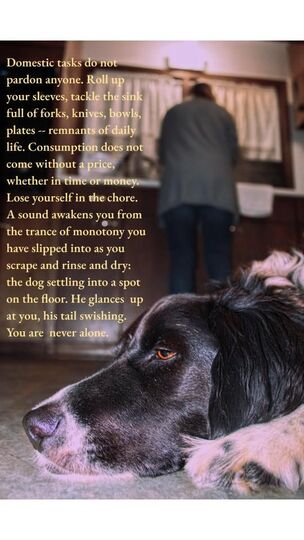 My second visit to the ICA in less than a week! As a class, we viewed the Great Force exhibition. In contrast to my abbreviated observation of the gallery on Friday, I spent a decent amount of time meandering through the first and second floors. I was able to recognize the themes of racism, black identity and culture, heritage, individuality, and defying stereotypes. Most of the works were extremely conceptual in presentation, which I both respect and dislike; I respect the artist's ability to develop an idea and express it in a manner that seems the most appropriate to them, but I dislike a complete disregard for formal techniques. Perhaps this sentiment makes me a bit old - fashioned, but I just prefer works that demonstrate foundational skills of observation and composition. With that said, my favorite piece from the exhibition was the installation piece entitle Colonial White by Charlotte Lagarde. While Lagarde does not have any tangible artwork displayed, the fact that she has actually challenged people to consider and respond to her comments about institutionalized racism inspires me. I value viewer engagement in a piece greatly, and the fact that people took the time and effort to carefully follow Lagarde's instructions and submit their own photographs proves the efficacy of carefully developing your content before thrusting it upon the viewer in a piece of tangible artwork. I can empathize with the difficulty of communicating your idea in a manner which appeals to a widespread audience because I myself had to tackle this obstacle in my sculpture last year. It was hard to figure out how I could persuade and inspire people to participate. Ultimately, such a task is rewarding because you do not truly recognize the value of connecting with another human being and having a sort of multi - dimensional, long - distance conversation with several different people regarding the same theme / topic. I had not initially planned on trying to incorporate viewer participation in one of my upcoming projects, but reflecting on Lagarde's work has exposed me to a whole slew of questions to consider, which could all be answered with interactive artworks: How can I create a dialogue between the text I incorporate in my works and the viewer's response? What can the viewer contribute to my theme? Why is it important to me that I have some sort of impact on the viewer, and how enduring do I want that impact to be? Would I truly be well - equipped to handle both good and bad feedback, should I choose to solicit it? What kind of viewer participation is most meaningful to me -- as in, would I rather someone contribute to the physical display of art or the concept?
I also enjoyed the other works I chose to feature in the above slideshow. Well, I didn't necessarily enjoy the video because i found it disorienting and much too vague for my taste, but I was intrigued by the presentation. However, I found the contrast of materials in Untitled by Radcliffe Bailey very appealing. I like the effect of the expanse of black glitter, as if the tarp is covered in basalt, as if it is situated on the shore of a volcanic island. The hazy photograph of the ocean creates a sense of displacement, as it is asymmetrically situated within a square of solid, sparkly matter. I definitely do not get any sense of the "forced migration" mentioned in the artwork's label, nor do I understand the connection to dehumanization, but I nonetheless am drawn to the artwork. I have no doubt that I would like it more, though, if I more clearly recognized the content so that I could self - ascribe a greater meaning and thus value it more. This experience encourages me to continue developing explicitly conveyed content so that the viewer knows at least a sense of my thoughts and feelings during the creation process. It is important to me to establish that connection between artist and viewer which transcends time and space. Here are the writings I have composed to exhibit in conjunction with my photographs:
Portrait of a Friend Run your fingers through his fur. Scratch the sweet spot behind his ears, which makes his head tilt and tail wag appreciatively. Forget about the frustrations, the arguments, the disappointments. Fall into those soulful brown eyes, the epitome of humanity. Choose to see the irony in that observation as not a shortcoming of your peers, but the transcendental nature of this beast. This moment is infinite. Sit, boy. Here. His eyes focus on your hand. His palpable anticipation amuses you. This is your symbiosis: feed him, give him shelter, throw a ball, and he eagerly and unconditionally loves you. You leave the house, live your life, and end the day with a creature whose whole life revolves around you. Appreciate the small things. The air outside is brittle and unforgiving. Find the perfect book, settle into the couch. He watches you from the kitchen door, eyes pleading. Come, boy. Pat the couch. He settles into the cushion with a deep sigh of contentment. Don’t tell Mom. Absentmindedly stroke the silky fur between his eyes. His presence warms you from the inside out. Seek what makes your heart smile. Domestic tasks do not pardon anyone. Roll up your sleeves, tackle the sink full of forks, knives, bowls, plates -- remnants of daily life. Consumption does not come without a price, whether in time or money. Lose yourself in the chore. A sound awakens you from the trance of monotony you have slipped into as you scrape and rinse and dry: the dog settling into a spot on the floor. He glances up at you, his tail swishing. You are never alone. The beast is not without his shortcomings. He prods the trash. His fur collects in the corners of the kitchen. He shakes dirt onto the mat after frolicking outside. He licks the floor; there was bacon earlier today. But these are manageable. Take the trash out. Sweep the floor biweekly. Brush the dirt out of his coat. Wash the mat. Mop the floor. The beast is invaluable; friendship is invaluable. Body in Place Escape reality, and immerse yourself in an alternate Universe of magic and wonder. Hazy afternoons become the backdrop for fantastical adventures. Quick, hold the cat (the Feline Protector) to your chest as you slide. Giggle as she turns her unblinking gaze upon your own. If cats could frown, she would be scowling. Swing -- rather, glide -- through the air. This swing set is the vessel for your daydreams of flying, of joining sparrows as they flit about. Tilt back your head as you hurtle back towards the earth; we fear not the height itself, but falling. The gauzy robe indicates your queenship: Graceful ruler of your beastly subjects. Trust these beings with your darkest fears and most massive hopes. Protect them from the perils of the world; the ground often morphs into roiling lava. Dance with your eyes closed, but sing with them wide open. Your audience, those trees, always lavishes you with a standing ovation. Show your sister how to forget the circumstances of that other dimension you reside in, the one with arguing parents and mean people and stressful sports. We will always have these moments, these hazy afternoons, for ourselves. For my Q1 Experience assignment, I attended the First Friday Art Walk in Downtown Richmond. It was amazing to meander around with two friends who are also passionate about art and soak in the galleries together. Most of the artworks did not appeal to my particular style, but I made a conscious effort to appreciate the artist's initiative. Below are some images from each of the three galleries we attended: The Institute for Contemporary Art (ICA), Artist Downtown Access (Ada), and Black Iris Gallery. The ICAThe atmosphere when we first entered the ICA was intensely chaotic and alternative. There was a DJ, party lights, and people in metallic wigs were milling about. We looked around the exhibition on the first floor. I could definitely tell that the works were contemporary because they were obviously much more conceptual than earlier art movements generally were. I do not have an image of it, but there was one installation which felt especially controversial to me. It was a video of a man army - crawling 22 miles to the Statute of Liberty. It took him five years, including his extensive research of various crawling techniques. I was appalled. The most interesting part of the whole installation, I think, was the part in the Artist Statement where it mentioned how, as he was crawling along the congested New York sidewalk, he was largely ignored. That aspect of his project was interesting because of what it implies about the ignorant and narcissistic nature of modern American urban life, but I was otherwise not impressed. It makes me feel guilty for thinking that his art is "lesser than" physical works because there is no application of formal skill. I understand that this notion of what defines "Art" is controversial and maybe even insulting for other people, but it's just a result of the value I have personally assigned to mastering traditional techniques of observation and realism. Now that I am thinking about it, though, that isn't a fair comparison because performative and applied arts are similar, not parallel. Still, I do not feel compelled to study crawling... The other works displayed in the ICA were generally interesting. Untitled (Colored People Grid) is a clever play on words, with the 'colored people' paired with the 'colored grids.' Just removing one word from the title gives the piece an alternate connotation and central point, which I appreciate. I like how the content is amorphously expressed, as if the artist is guiding the viewer's response in a general direction, but not in an overbearing manner. Sedrick Chisom's appealed to me in color scheme; I tend to work in pinks and blues. Plus, I like the weathered feel of the darker piece; I feel like I am viewing the piece through a water - streaked window. I have no clue what the purpose of the neon lights is, but obviously Shreya, Ria, and I enjoyed its effect. Ria pointed out how it was cool that the wires were left exposed, which I honestly had not even considered until she mentioned it. This exhibition further encouraged me to explore the conceptual aspect of my current pieces, as well as continuing to include vibrant pops of color. It would thrill me to include neon lights, but I am not sure how feasible that goal is. Nonetheless, I am glad for the experience. AdaAda had a much more mellow vibe than the ICA, as if the artists were more subtly alternative. Both Chris Musina and Sarah Trigg had places where they physically wrote their names on the wall beside their works, rather than having a printed label. I absolutely love the intimacy of this act because it feels so personal and much more engaging than a monotonous and austere matted artist statement. This doesn't mean that I do not appreciate the formality of traditionally presenting information about the artist (because I do), but it has inspired me to consider using the physical gallery space as part of my installation. Like, what if I created a work and then wrote my coordinating poem / reflection directly beside it?? That would be so edgy. Most of Sarah Triggs's works were very earthy and abstract, which Shreya and Ria both enjoyed. I was not a fan, but I was impressed by her creativity in using the hardened layer of house paint in her paint cans as the materials for her Cast Paint series. Plus, her focus on worldliness is evident throughout the whole gallery. Black Iris GalleryIf ICA is for the overt oddballs and Ada is for the mellow hipsters, then Black Iris Gallery definitely appeals to the grunge alternative crowd. The artists are two bearded, flamboyant old men (they were milling about the gallery and talking to people), and it was hilarious in an awe - inspiring way; like, wow, the world is so much more diverse than I know. It fascinates me how beautifully chaotic and wondrously weird people are, and even more so when they are comfortable enough in their chaos and weirdness to express it (although doing so in a deliberately ostentatious manner is off - putting to me). Anyways, I found many of these works entrancing in a disturbing manner, like you know that what you're seeing is tragic and you should look away, but something compels you keep looking. Also, the titles of the works fit the content wonderfully, which has inspired me to continue to carefully name my works, rather than rattling off a name just to be done with it (I do not do this, but I just mean that I do not want to fall into that habit). For example, there was one colorful piece done in oil and wax titled "Oh Happy Day," and I immediately began singing the gospel hymn in my head. However, this tune was absurdly incongruous with the distorted figures and pock - marked hands. I would not personally want to create works with such a dark connotation, but I am able to appreciate their distinctive artistic expression.
|
Archives
March 2021
Categories |
 RSS Feed
