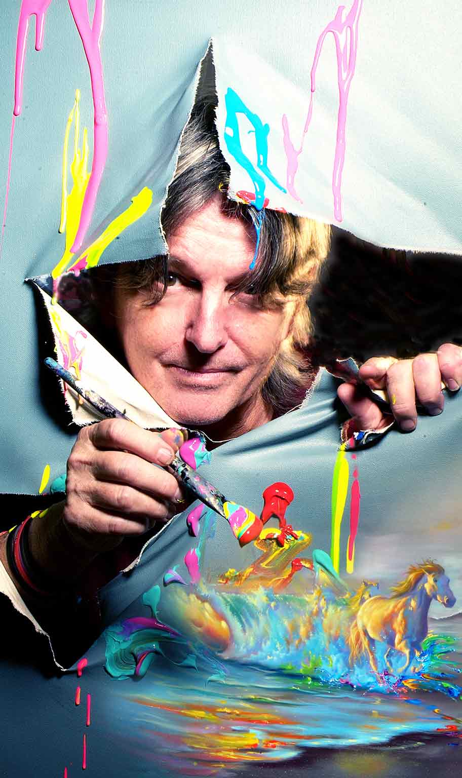
 Jim Warren began painting and selling his art in high school over 50 years ago. Now considered a “Living Legend of the Art World” much of Warren’s oeuvre is steeped in surrealism, portraying dreamlike, illogical and fantastical scenes with realistic details.
www.parkwestgallery.com/the-wonderfully-surreal-art-of-jim-warren/ www.parkwestgallery.com/artist/jim-warren/ **Artworks from: Jim Warren - Grammy Award Winning and Disney Fine Artist Some of My Favorite Artworks from his Website:**Note: These artworks are made to be reproduced, so they are not labeled with sizes because they can be reprinted as "high quality, limited edition Giclée on canvas prints. They are available in three sizes: 18×24″ (small), 24×30″ (medium) and 30×40″ (large)." I stumbled upon Jim Morrison's work by doing a Google search of "surrealist painters." One of his vibrant, eye-catching pieces popped up, and I proceeded to spend the next hour looking at all 16 pages of Fine Arts work he had posted on his website. 16 pages of pieces under only 1 of 4 categories of types of art in his portfolio (the other categories being portraits, Disney fine arts, and and illustrations). Many of his works are reiterations of the same ideas: the beach, animals (especially horses, dogs, and cats), vibrant colors which create high contrast.
Why I like each of the above images: 1. Heavenly Skies
0 Comments
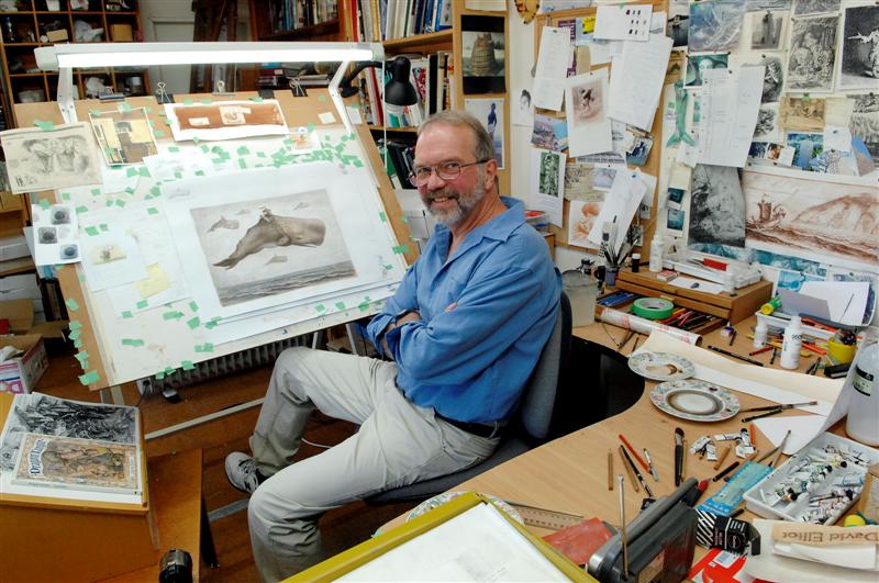 Book illustrator David Elliot in his workshop.  A book illustrator working digitally. About Book IllustrationFirstly, I chose this career to look into because I have always loved reading, perhaps more than I love making art. Once upon a time, I could entertain myself for hours pretending I lived in whatever universe I had been reading about in my latest novel. I even tried my hand at book writing and illustrating when I was about 8 (but, as you can imagine, my 8 year old attention span didn’t exactly foster follow-through with that project). So, I decided to give it a second look in this assignment. I have no intention of actually going to school to become a book illustrator, but I could absolutely see myself pursuing it as a hobby or part-time gig. The average annual pay for a book illustrator in the US is $60,360 a year according to ZipRecruiter. The range varies widely from from less than $31,500 to over $73,000. As such, it would seem as though education, skill, and experience could result in an increased pay. A bachelor’s degree in illustration or another art-related is the best bet for a college education. In Virginia, the best opportunities are:
Resources: How Do I Become a Book Illustrator? (learn.org) Book Illustrator Annual Salary ($60,360 Avg | Feb 2021) - ZipRecruiter The Illustration Academy — We're Going Digital I watched Ria's interview with sculptor and painter Keith M Ramsey. I found the interview interesting and helpful when thinking about my own relationship with art.
youtu.be/PBSV4BnacwQ I thought this interview was very interesting. Ramsey describes how him being let go from his job as a graphic designer in 2016 really ended up being one of the best things for him. He says how by that time, he was tired of being a graphic designer and having to tailor his projects specifically to his clientele, rather than having some artistic freedom. Personally, I like the idea of being a graphic designer because of the structure that having a client gives you, but I also understand that desire to just explore and be yourself. So, when Ramsey was let go, he took it as a sign from the universe that he would be okay on his own. He decided to make a career out of the art he was already making in his free time. Ramsey works with metalwork, ironwork, railings, tables, and furniture. He loves being able to take something useful, such as a grill or lamp, and making it completely original. His customers give him full control over the direction he takes his projects, which he appreciates. Ramsey is drawn to found objects because he believes they have a sort of personality that a new, freshly bought object simply lacks. He is the type of person to find a weird rusty nail on a sidewalk and put it in his pocket because he might want to use it in a project 2 years from now. Honestly, this type of thinking scares me because I feel like I would never stop just collecting things because I would always have that internal argument of if something is worth picking up; you never know what future-you will need, right? So, I prefer to sort of stay away from collecting found objects to that extreme, but it definitely works for Ramsey. I admire Ramsey's mindset of asking: "why not me?" By this, he means if someone else can make a cool painting or interesting sculpture, then why shouldn't he also be able to do so? I think this way of thinking is really empowering because it sort of carries an underlying message that if you apply yourself, then you can really achieve anything. One artist who really prompted Ramsey to ask the question "why not me?" is Melvin Edwards, a found-object sculptor. Ramsey was inspired by Edwards's work to create the largest metalwork sculpture he had ever done, which is actually located in Richmond. Ramsey's goals for the next year include continuing to make art every single day so that he can practice new skills with stainless steel and aluminum, expand his outreach, establish his own studio, and maybe hire someone to help him with installations. Kelly Malka is not a conventional contemporary artist, but I enjoy the work she produces. Malka a Los Angeles - native freelance designer and illustrator. She attended Parsons School of Design from 2011 - 2012. In 2015, Malka then received her Bachelor's degree in Fine/Studio Arts with an emphasis in Design. During her time at USC, Malka acted as the Director of Graphic Design for USC's Concerts Committee and Program Board. Career
 Image for the Golden State Warriors Playoff's Campaign 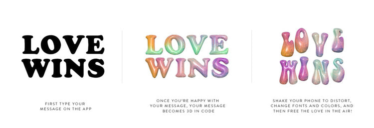 Promotional image for the Adobe: Free the Love campaign 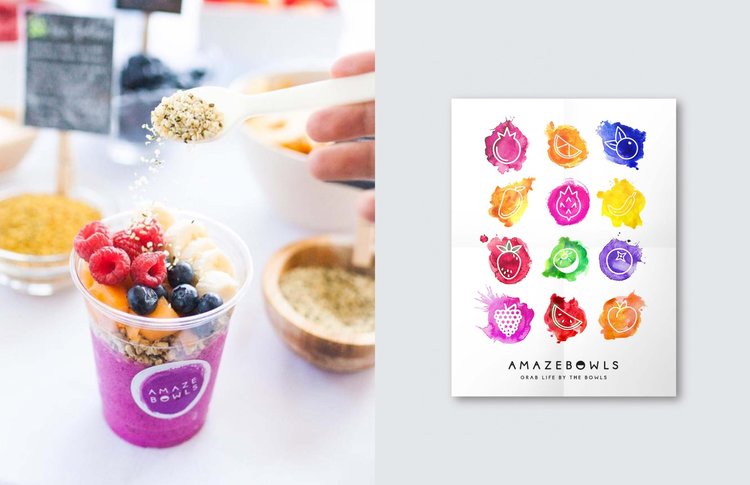 Social media publicity image and design for the Amazebowls promotional effort Endeavors in Illustration and Digital Art Her illustrations reflect an enduring fascination of the female form and nature, as well as messages of empowerment and motivation in regards to mental health and world issues. 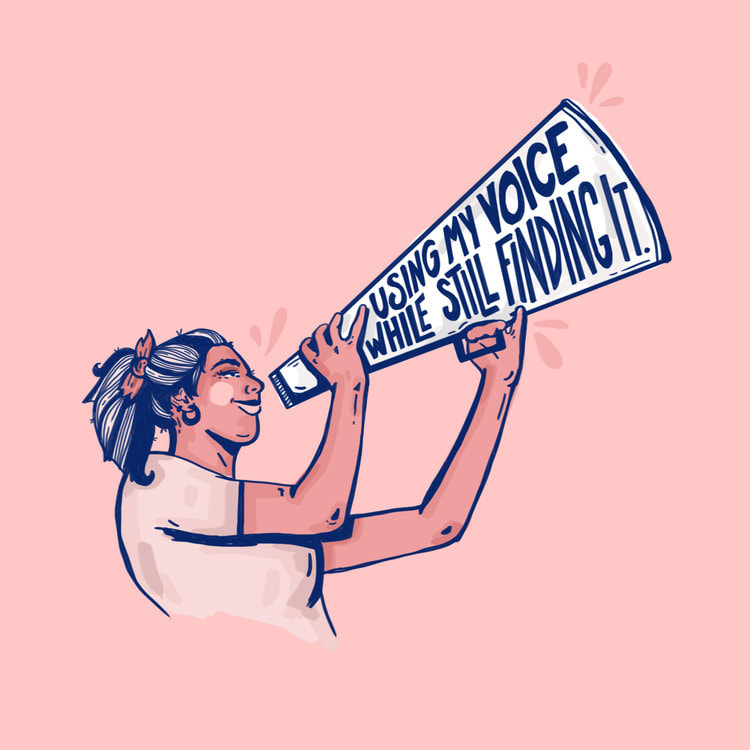 Voice. Digital illustration. I am immediately drawn to the simplicity of this image. I usually work in more vibrant colors, but the blues and pinks are similar to those I have worked with in my most recent artworks. I absolutely adore the clarity of the image and crispness of the lines; I highly value craftsmanship. The composition is simple yet strong, which makes me really focus in on the message: "using my voice while still finding it." I love the connection between the text and images. I think that words should be used to not only further define the work for the viewer, but also add to its meaning. The face of the woman is not quite cartoonish, so it maintains a professional finish -- even though there aren't many details. The use of both thin and thick diagonal lines makes the image dynamic and therefore more interesting, which I appreciate. It communicates active energy, as if the woman is in the process of raising up her megaphone/bullhorn thingy and speaking truth. The content is one of empowerment and growth, which is something I find myself drawn to in creating my own works. Looking at and analyzing this illustration and its effectiveness as a public - awareness piece has inspired me to embolden my text. I also the block shading technique used on the woman because it is relatively quick but still creates form and depth in the figure. This piece truly leaves me with a sense of encouragement and inspiration, and I want to carry that feeling forward and try to pour it into my own future work. 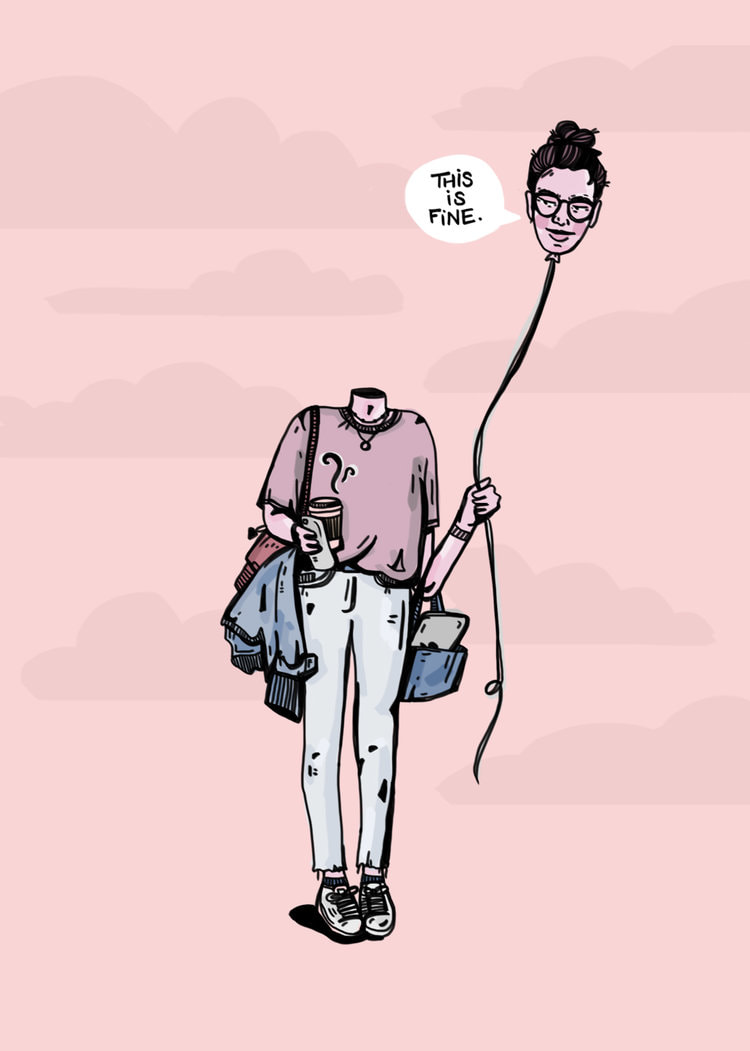 TLoosin' it. Digital illustration. This illustration does not have a traditionally formal composition, but I nonetheless think it is a particularly powerful piece. Again, the muted tones are different than the sorts of deeply saturated values I usually gravitate towards, but I like the humility of the whole work. The subtle clouds in the background create the illusion of space and depth. The sort of controlled messiness of the shirt, the open bag, and the jacket slung under an arm are important connecting points with the viewer. The way the toes of the figure point inward conveys a sense of shyness, of turning into one's self. But, the head on the balloon -- the head in the clouds -- has a sort of side-eyed smirk, as if to contradict the shyness of the body language. I find it especially interesting that the string attached to the balloon-head is sort of lax, rather than taut; the person's mind is comfortably detached from her body, but not actively pulling further away. The text suggests that purpose the woman is unsatisfied -- but with what? What better alternative does she have? And, what is she looking at -- or, what is she looking away from? This simple illustration begs answers to these questions, of which there are many more. It is sensational that such a minimalistic design can resonate with someone on such a personal level. Similar to Malka's work here, I hope to explore how an individual can encounter mental health challenges on a daily level, rather than those raw, intimate periods of loneliness in which we sometimes find ourselves trapped. This girl is dressed and ready to tackle the world, even if her mind is bobbing around in the vague space above her shoulders. I would like to experiment with the notion of detachment and severance between the mind and body. 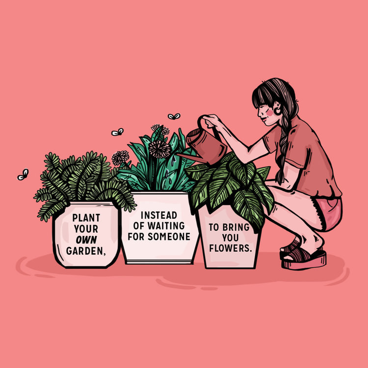 Grow ur garden. Digital illustration.
Here, the colors are reaching a saturation level closer to my preferred style. I like the asymmetrical arrangement of the boxy plants and more rectangular figure. The flies are sort of reminiscent of trash, but I appreciate how they are placed a little bit away from the plants to widen the perimeter of space actually used. The colors used for the woman's clothes and skin are altered just enough to distinguish her from the background without losing the sense of unity in similar colors. I couldn't help but notice the way the heels are lifted in the wedges, as if she is actively balancing in her crouch while watering the plants; it adds to the active energy, as if this is more than simply a still-life of living organisms, but a snapshot of a simple moment of mindfulness. The words are centered nicely within the frame of each pot, and I find the message of individualism and self-empowerment very heartfelt. There is an extra layer of meaning in having text referring to tending to your own garden while depicting a woman doing just that -- it begs the question: what is your garden? Also, the varied line weight contributes to capturing form, despite the simplified marksmanship. I especially appreciate how the shirt appears to billow out in a slightly-uneven tuck. Malka manipulates the line quality to effectively achieve this effect. I would like to pay closer attention to how one small line truly adds to (or detracts from) the whole piece. Malka's illustrations are boiled down to their rawest forms that even a tiny misplaced mark could misconstrue the entire image, and I appreciate her diligence. I hope to take these lessons in perceptiveness and clarity of message into the future.  Basic Facts:
CV: Museum Collections and Exhibitions
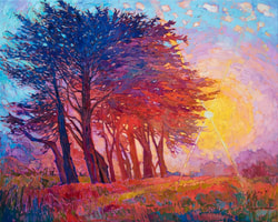 Cypress Fog, 2019, oil on canvas, Erin Hanson, 50 x 40 in. Cypress Fog, 2019, oil on canvas, Erin Hanson, 50 x 40 in. Immediately, my eyes are drawn to the sun and how the marks radiate around the center of it. I am enchanted by the rays which appear to be carved out of the paint. The trees are also wonderfully rendered in different values and tones to convey the illusion of distance and placement of the light source. 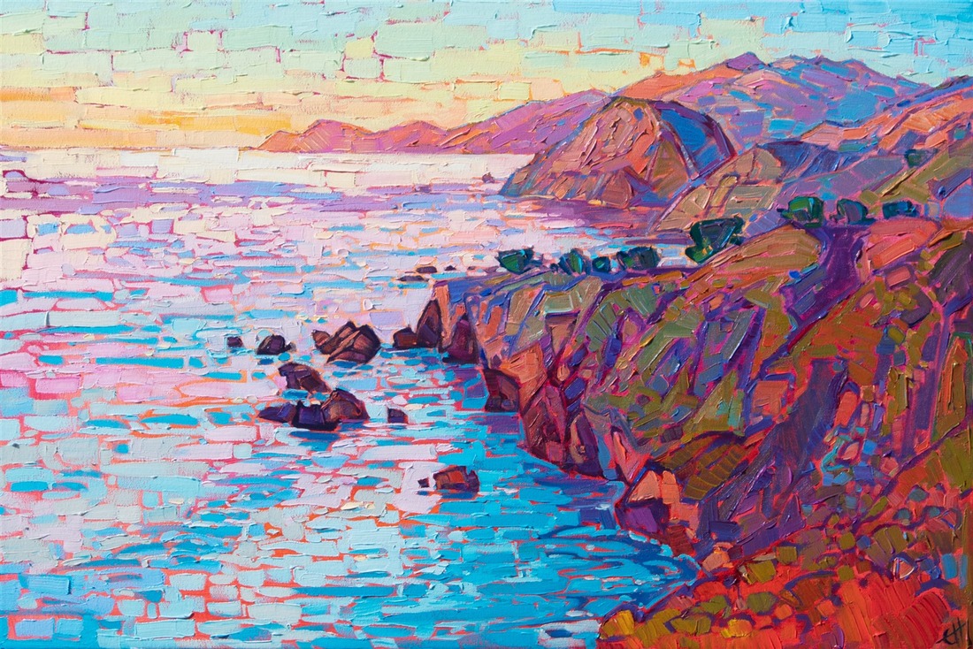 Coastal Lights, 2019, oil on canvas, Erin Hanson, 30 x 20 in. Coastal Lights, 2019, oil on canvas, Erin Hanson, 30 x 20 in. I am especially drawn to the brick - like horizontal strokes along the left side of the canvas, which effectively contrast with the horizontal marks on the coastline. The orange undertones of the ocean nicely compliment the top layer of blues. All of the above information comes from Erin Hanson's website For additional information, view the videos below: Reflection:
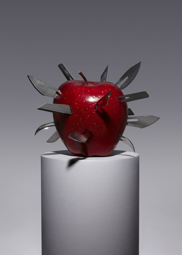
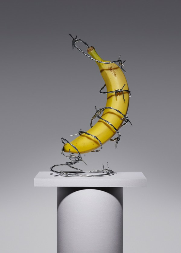
I am absolutely stunned by Hanson's work. Her art is powerful and beautifully rendered. I cannot imagine being so completely dedicated to Art from practically the very beginning of her life, in addition to exploring the field of biology in college. I admire her commitment to mastering technical color theory and application before comfortably developing her own style. Learning about her progression as an artist has encouraged me to more seriously consider the factual basis of aestheticism and how colors interact with one another in an effective manner. I usually kind of ignore or avoid the science of Art, but I now understand that, ultimately, this aversion will only hurt my artistic progress. Also, I am usually not of fan of simply natural landscapes because I find them mundane and over - done, but the vivacious Open - Impressionism of Hanson's truly inspire a deep emotional response within me. I feel like the colors are leaping from the canvas and encompassing me in an envelope of radiant natural beauty and peace. I love the positive energy and inherent dynamism. Also, it is obvious that Hanson is purposeful in her composition in her use of continuity and the rule - of - thirds, among other techniques. I appreciate her desire to create an interaction with the artwork and the viewer, rather than simply presenting it as is. I can relate to this sentiment because this is also one of my top priorities as an artist. In regards to medium, I am immensely intimidated by her use of impasto, limited colors, and only one layer of paint. I aspire to attain that level of confidence in my artistic vision. I am now curious about Open - Impression and would like to explore this emerging style in future projects. I think I would enjoy oil painting because I am fond of the ability to continuously mix and manipulate paints, not to mention the dimension that oil paint affords, which you simply cannot recreate with acrylic paint. I was also surprised that I was so drawn to Hanson's work because I am usually a fan of subtly blended, smooth forms. Obviously, Hanson prefers more mosaic - like strokes, but the purposefulness of each individual mark is captivating. I adore the fact that you can zoom in one of her pieces and observe the pure integrity of the colors she uses, since her palette usually consists of about four, and then back away to see how the nuances come together. Hanson is, in short, a breath - taking artist. After researching and reflecting on her work, I hope to continue exploring the many resources associated with oil painting and Open - Impressionism. Additionally, I am further encouraged to utilized color properties to mindfully choose and mix my paints.  Kyle Bean is a freelance illustrator, director, and set designer based out of Brighton, England. Even as a child, Bean enjoyed the artistic process of using critical thinking and tactile skills to creatively solve problems, noting that he also likes adding a whimsical element. He attended the University of Portsmouth from 2005 to 2006, earning a Foundation degree in Art and Design. Shortly thereafter, in 2009, Bean graduated from the University of Brighton with a bachelor's in illustration. He then began a career in exploring the boundaries of tactile media and animation. From April to June of 2015, Bean mentored Fashion students at the London College of Fashion during their work for a project concerning ""live visual merchandising for a well - known Fashion Brand." He provided both creative and practical support, even hosting workshops "to aid in a more hands - on approach." His projects have thus far consisted of editorial and commercial pieces, plus installations for fashion brands and events. Clients include: Wallpaper, Financial Times, Vogue, Diesel, Wired, New York Times, Selfridges, Hermes, Liberty, Rimmel, BBC, GQ Magazine, Rizzoli/Universe, Rubbish Magazine, HOW, Viewpoint Magazine, Casio, VMAN, Louis Vuitton, Scientific American, Intersection, Design Museum, CUT Magazine, Computer Arts, Peugeot, Time, Lloyds Bank, Men’s Health, Gucci, Nature, Fast Company, Eureka, AMV BBDO, Droga5, JWT, Havas Worldwide, The Guardian, Whole Living, The Atlantic, Seven, Matthew Williamson, BA Business Life Magazine, ICON, Intercontinental Hotels, MODUS, Mr Porter, EasyJet, Google, Prudential, Esquire, The Gourmand, Greensource, Moo, Rede, Emirates, Verizon, The Wellcome Trust, Wieden and Kennedy, Bloomberg, Kinfolk Bean's studio is based out of his home, but he regularly collaborates with other artists for big - name pieces, especially photographers. The conceptual imagery of his work, paired with appropriated everyday objects is both humorous and impactful to the viewer. Because he works for companies and businesses mostly, he has a keen awareness of the setting in which the artwork will be placed and its interaction with the audience and environment. Communication, in his opinion, is crucial, especially through images. Bean identifies his largest source of inspiration as the law of conservation of mass; how he can "[pair] down objects to that of a single desire." A collection of Bean's that relates specifically to my sculpture is his 2014 Forbidden Fruit collection. Forbidden Fruit was a collaboration with photographer Aaron Tilley and commissioned for The Gourmand. The works can be characterized as possessing a slightly sinister and mischievous tone; the fruits are embedded with - or, to some, protected by - devices for self - defense. This is a visualization of the widely overlooked 'dark side' of fruit. The collection explores the notion that even fruits can be harmful, therefore exaggerating even minor health risks.
Furthermore, another collaboration with Tilley that I found to be particularly interesting was a collection called In Anxious Anticipation for Kinfolk magazine. This series of works is a commentary on trivially uncomfortable circumstances that, even though we conceptually understand them to be simply renditions, still make our hearts race with anxiety. I was in awe of how distressing it was for me to observe the artwork; I was entranced, frozen by my conflicting feelings of appreciation for the craftsmanship and content and of uneasiness because of what the artworks symbolize. It is a truly powerful body of art.    Press and Publications: • Thread, The Station, Bristol, 22nd March 2018 • Papercraft Workshop, Haus of Victorinox, Wilderness Festival, August 2017 • London College of Fashion, London, Various Lectures, 2015-16 • The Story, Conference, Conway Hall, London, 21st February 2014 • Beacons Festival, Wood Carving Portraits Workshop, 17-18th August 2013 • BLAB, Band on the Wall, Manchester, 25th June 2013 • Meal Ticket, KK Outlet, London, 8th May 2013 • Skillswap ‘Does’, Lighthouse, Brighton, 17th April 2013 • Speaker at Design Brighton, The Old Market, Hove, 15th January 2013 • Nova Festival, Festival of Arts and Music, Craft Workshop, 6th July 2012 • Apple Store Talk, 235 Regent Street, London, 20th February 2012 • ADC Young Gun 9, Art Directors Club, New York, October 2011 • Glug Brighton, Brighton Pavillion, June 2011 • Work showcased at the BFI as part of the onedotzero festival, Sept 2009 • Shortlisted for the 2009 Penguin Design Awards for a book jacket design, June 2009 Exhibitions: • ‘Hamster - Hipster - Handy. Spellbound by the Mobile Phone. Museum Angewandte Kunst, Frankfurt April-July 2015 • ‘Save the Bees’, Forge and Co Gallery, London, September 18th-24th 2014 • ‘Paper Cut’, The Proud Archivist, London, September 2014 • ‘Motion Factory’ Curated by Yves Geleyn, La Gaîté Lyrique, Paris, April - August 2014 • ‘Materials & Messages’ An exhibition of work by Kyle Bean, Colette, Paris, July 15 - Aug 31 2013 • ‘Misuse: Creating Alternatives’, Cass Bank Gallery, London, March 2013 • ‘Then, Now, After’, University of Brighton, Brighton, Jan – Feb 2013 • dConstruct, Brighton Dome, Brighton, September 2012 • ADC Young Guns 9, ADC Gallery, New York, October 2011 • ‘Now we do Shellac’, Sassoon Gallery, London, August 2011 • THREEDEE, Jaguar Shoes, London, April 2011 • R.S.V.P.H.R.H – Exhibition of alternative royal wedding invites, The Rag Factory, London, April 2011 • International Design Biennial, St Etienne, France, Nov – Dec 2010 • ‘All connected’ Grenoble, France, Oct 2010 • Mobile Evolution project on public display, Young Creative Network, London, July 2009 • Graphic Design & Illustration Show, The Rag Factory, Brick Lane, London, July 2009 • University of Brighton Undergraduate Degree Show, Brighton, June 2009 Sources (can also be used for additional information, but you are not required to visit every website to answer the questions):
Brief biographical summary: https://www.hornetinc.com/kyle-bean.html, https://www.ba-reps.com/illustrators/kyle-bean Summation of Bean's artistic style and key works: https://popuppainting.com/2017/09/kyle-bean/ Personal website: https://kylebean.co.uk/about A delineation of Forbidden Fruit: https://www.designboom.com/art/kyle-bean-forbidden-fruit-self-defense-devices-07-02-2014/ More about Forbidden Fruit: https://www.trendhunter.com/trends/forbidden-fruit A reflective interview of Bean regarding his inspirations and aspirations: https://lectureinprogress.com/journal/kyle-bean Questions for consideration: 1. For your thumbnail, explore Bean's collection and sketch the work to which you feel the strongest instantaneous connection (no need to over - analyze!). 2. Much of Bean's work is aesthetically simplistic yet carries dense content. What about his style do you think is most effective in connecting to the viewer? How do you think this has helped him in creating commercial pieces? 3. Bean had not initially planned on making a living of creating art for companies and businesses. Would you consider being a freelance designer yourself? 4. After reflecting on Bean's oeuvre, what inspirations do you have regarding your own sculpture? Are there any aspects of his art / process that could be applied to your own? Why or why not? 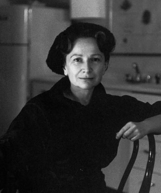 ABOUT In 1910, Hedda Sterne was born in Romania. She grew up with Surrealism and was greatly influenced by this style. Sterne began using color around the age of 17, and she gravitated to Dada and Constructivist works in her early years. She was very interested in reading, which was how she became aware of Paris and its nurturing artistic environment. Sterne moved to Paris in the 1930s. While in Paris, Sterne began by experimenting with sculpture, but she later turned to painting and collage. It was here that she participated in her first successful exhibition in 1938, earning herself some international recognition. Shortly thereafter, Sterne was able to escape the Nazis in 1941, fleeing to the United States via Portugal. She settled in New York, quickly becoming a part of the the New York School artists. She was moved by the music of the way things are, using elements from the frenetic activity of New York City and incorporating them into her paintings and drawings. She said, "I am only one small speck (hardly an atom) in the uninterrupted flux of the world around me." After a trip to Vermont, Sterne focused on the philosophical significance of machinery, as well as its importance to everyday life: "machines are unconscious self-portraits of people's psyches." By the end of the 1950s, her Machine paintings had morphed into large, gestural paintings that are viewed as commentaries on speed. The 1960s was a period of expansive growth in Sterne's content. She began to investigate qualities of light and space, then moving on to 'dense and intricate organic abstractions.' By the 1980s, Sterne had almost completely exhausted the realms of abstraction, creating both prism-like geometric designs and loose, fluid abstract paintings. Although Sterne never remained consistent with her composition, she never failed to forget her greatest belief: that art is ever-changing, forever a reflection of the stages in the artist's process of self-discovery. She described herself as "anti-ego," rejecting the notion that she held the power to change the world, an attitude that was contradictory to that of her fellow Abstract Expressionists. Furthermore, she refused to confine to any one label, therefore never actually considering herself to be an Abstract Expressionist. Sterne worked with a great sense of urgency. Her projects consist of a wide variety of styles, mediums, and compositions. She never once let herself settle and become complacent in her art; rather, Sterne continued to push deeper and force herself to consider life from drastically different viewpoints. She was humble yet larger than life, which is undoubtedly why she was such a successful artist during this time period.
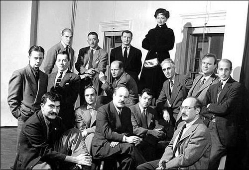 The Irascibles. Hedda Sterne is the only woman in this photograph. Questions for consideration (you do not need to use the additional resources provided): 1. Observe the selected works on the Hedda Sterne Foundation website. Which time period is your favorite? Why do you enjoy the aesthetic of these works more than the others? Are you able to understand how the composition reflects Sterne's place in her life? 2. What was Sterne's attitude towards her place in the world, both artistically and in general? 3. The core group of Abstract Expressionists are often referred to as "The Irascibles." Define this term. How do you think it can be applied to Sterne? Additional Resources:
For a brief biography and analysis of Sterne's life: www.ideelart.com/magazine/hedda-sterne A transcript of a 2003 interview of Sterne by Sarah Boxer: artlark.org/2018/08/04/hedda-sterne-against-the-abstract-expressionist-tide/ Seven reasons to commemorate her life: news.artnet.com/art-world/7-things-hedda-sterne-583409
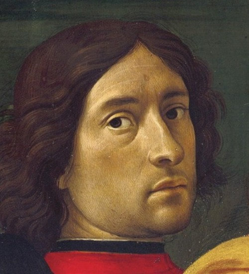
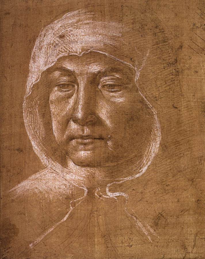
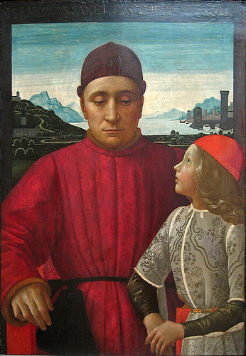
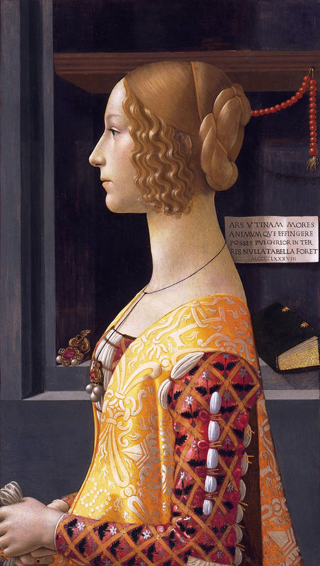
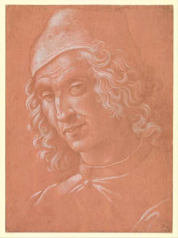
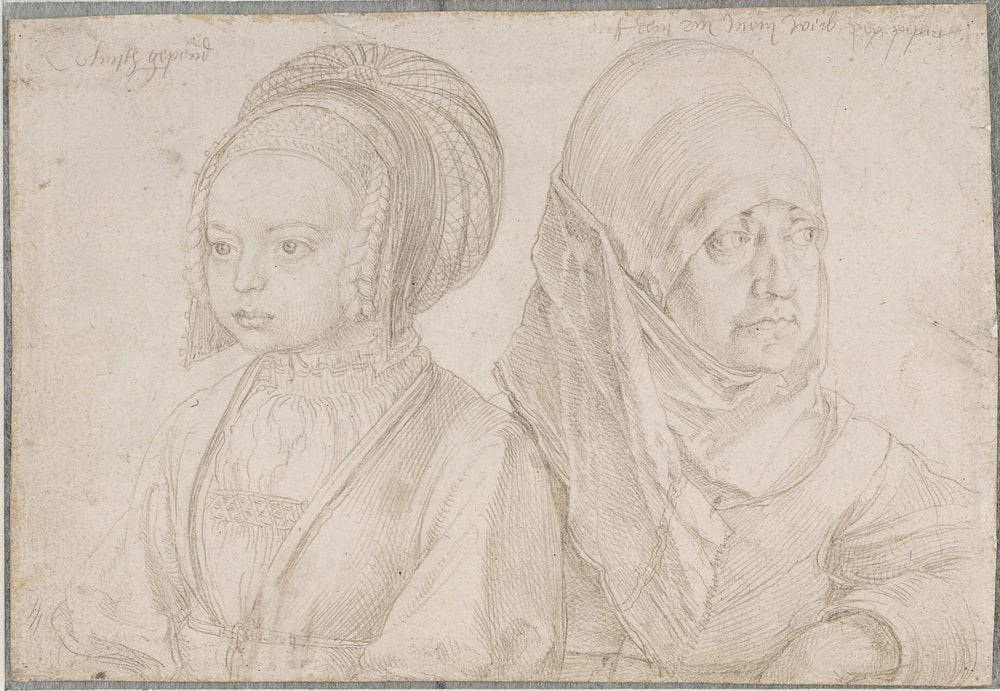
More info about Domenico Ghirlandaio (required): www.domenico-ghirlandaio.org/biography.html www.metmuseum.org/art/collection/search/436492 QUESTIONS: 1. How does the content of Ghirlandaio's artwork reflect the popular style of his time? 2. Observe the softness of Ghirlandaio's figures in his portraits, which contrasts to the sharp delineation of value in his silver point drawings. Which do you prefer? Why? 3. What is the significance of Ghirlandaio's frescoes (think about biblical and mythological references)? How do they relate to the time period in which he created them? METAL POINT: OVERVIEW
METAL POINT: IN-DEPTH
www.youtube.com/watch?v=vQaTEOXk4JA www.youtube.com/watch?v=4-1TXg9yUK4 Sources for BOTH Domenico Ghirlandaio and metal point: www.nga.gov/collection/artist-info.1336.html en.wikipedia.org/wiki/Domenico_Ghirlandaio www.domenico-ghirlandaio.org/ www.britannica.com/biography/Domenico-Ghirlandaio www.artistsandillustrators.co.uk/how-to/Drawing/1843/how-to-do-a-silverpoint-drawing www.apollo-magazine.com/silver-linings-the-art-of-metalpoint-drawing/ |
Archives
March 2021
Categories |


 RSS Feed
