|
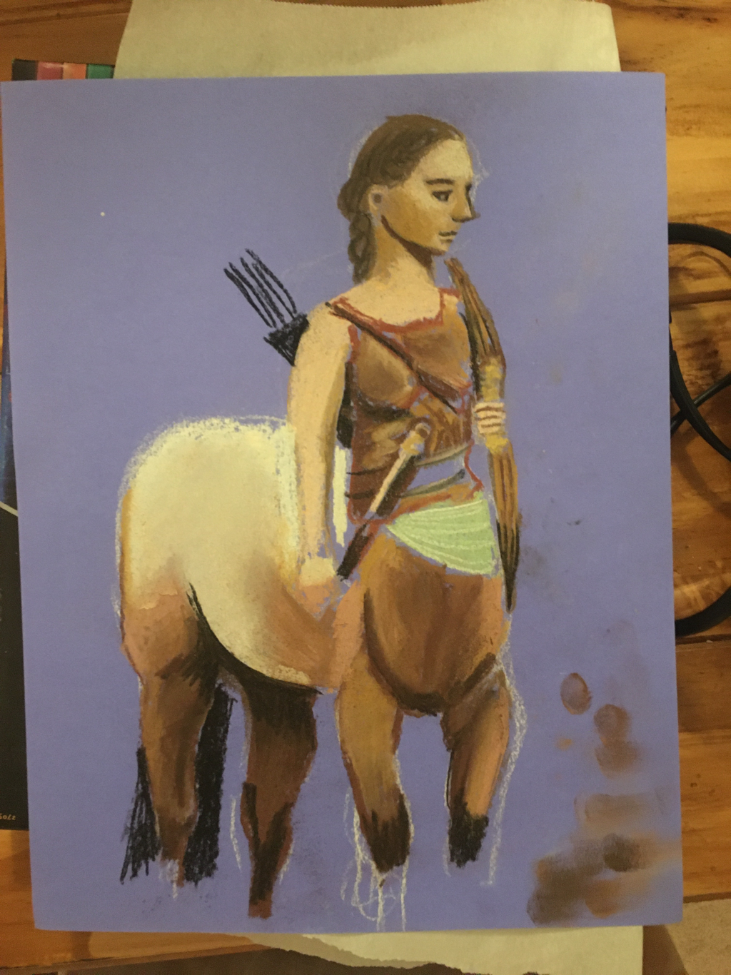
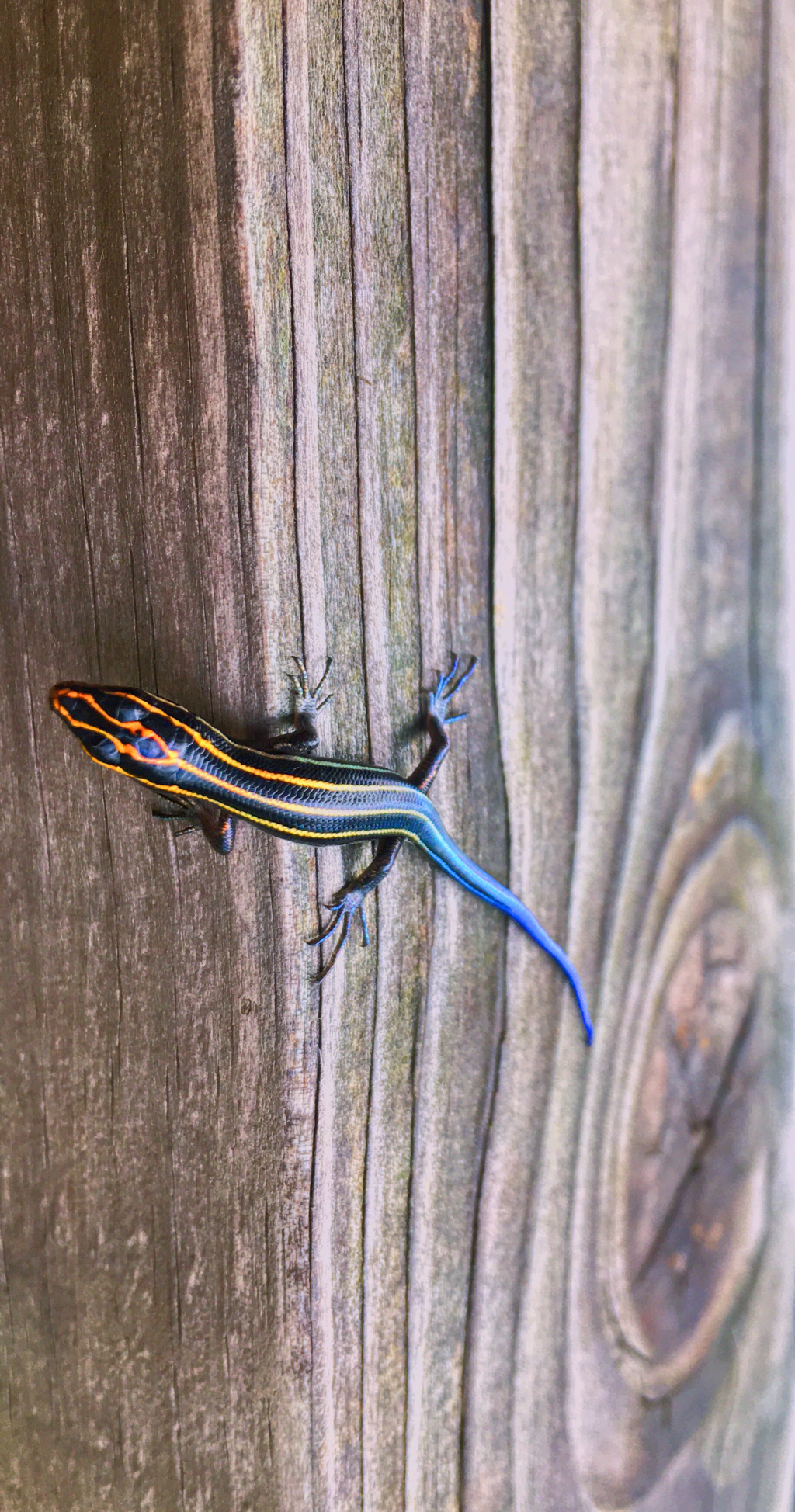
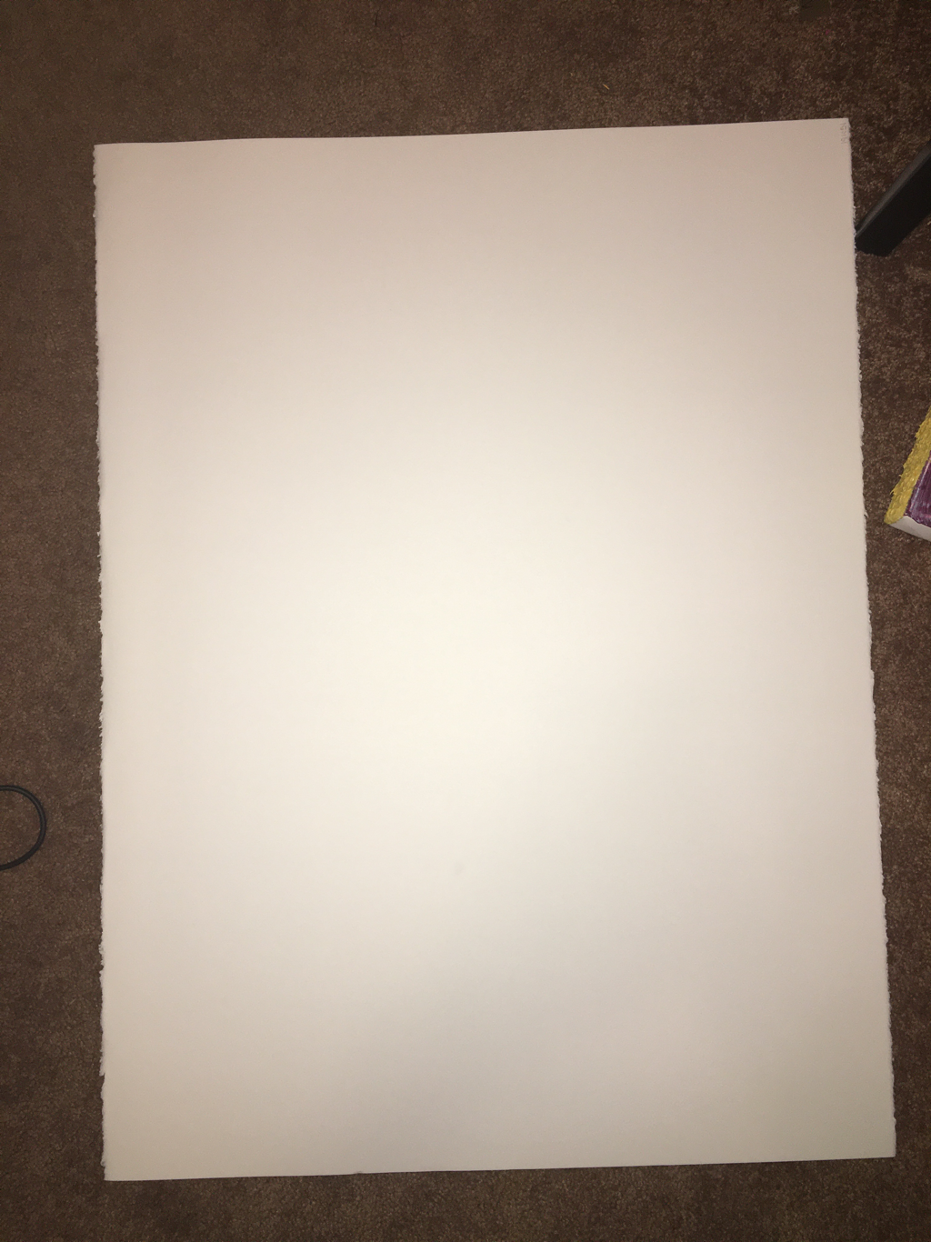
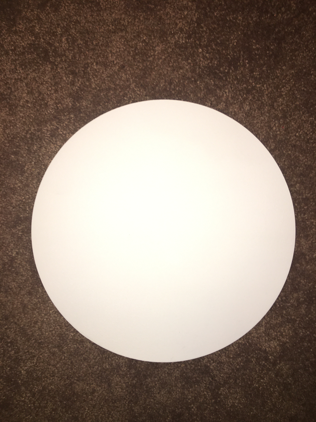
My initial plan for the independent project was to make two pieces following the instructions from “The Art Assignment.” Then, as I thought about it more, I realized that I wanted to produce something more thoughtful than simply responding to a prompt; I wanted to make a unique work that I would consider finished and of high quality. I was driving home from the gym when I got this nagging idea: what if I painted an image of a flower, or maybe draw it with oil pastel, and then use wire to outline the form and overlay it on top of the painting/drawing to add a 3D effect? The more I thought about it, the more I wanted to explore this idea. I decided that I really wanted to use oil pastels because I just got a wonderful set from the Art room that I’m itching to experiment with. I have several pictures of flowers that I considered using, but I still felt like that content was basic and hackneyed. I wanted a simply yet interesting subject with vibrant colors. Then, I found the picture I had taken of a lizard on my back porch. It immediately seemed like a good match for my intentions. I have spent the past week vacillating between whether I want to use a circular wood board I primed with white spray primer, or a piece of high-quality paper that Coach gave me. I have almost fully decided on the paper because it is much larger than the circular wood board, and I really want to be ambitious with my scale for this piece (similar to my reasoning for scaling up in my In-Class Project). I have done a few drawings with oil pastels just to practice and get a feel for how they work. I am really enjoying the ease with which they blend, although I still feel like I have a lot more to learn about in terms of keeping colors from getting muddied and getting rid of excess pastel dust. I plan on sketching the outline of the lizard next week, doing some practice drawings of the lizard on smaller paper with the oil pastels, and then getting to work on the real deal.
0 Comments
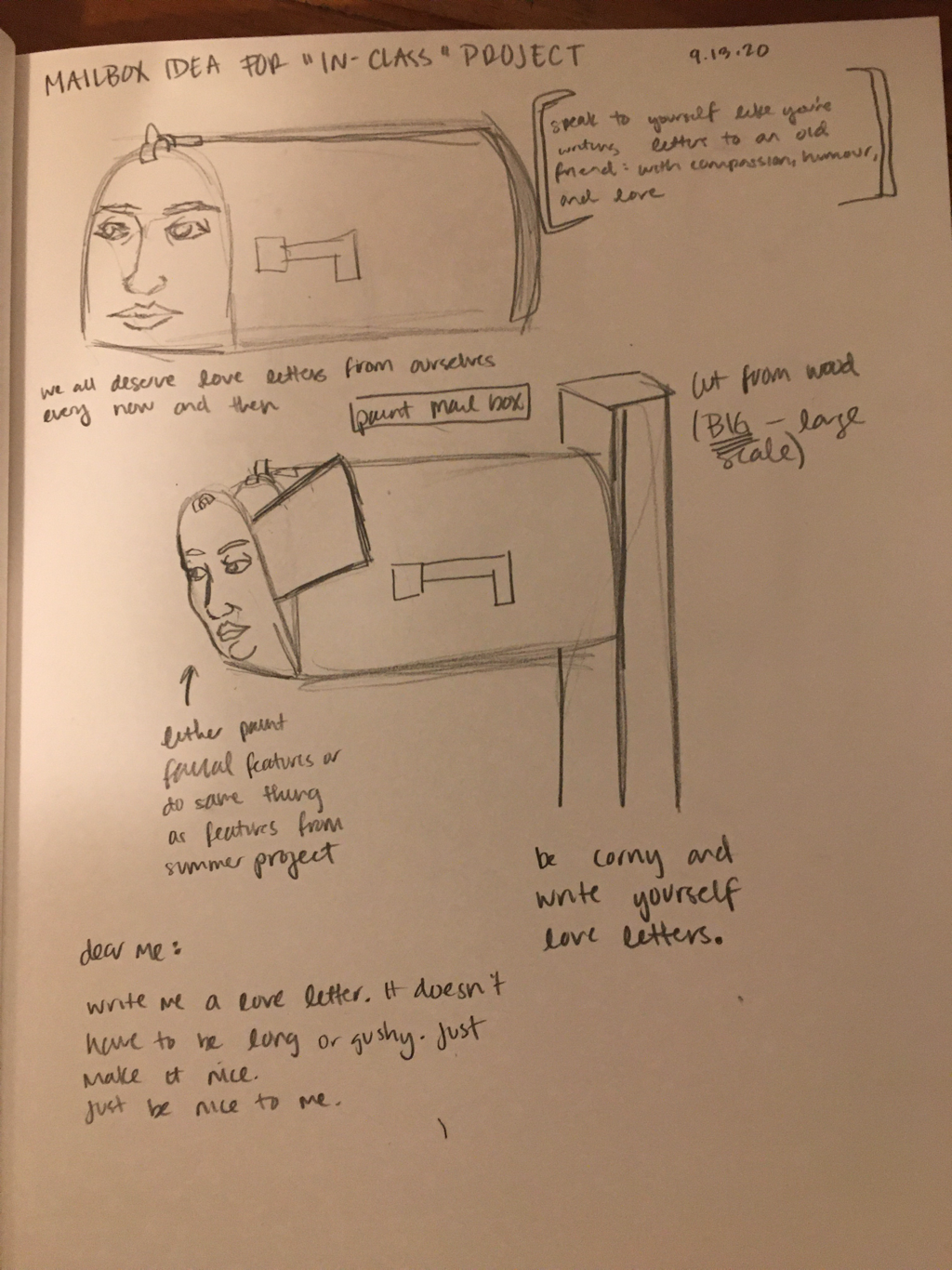
This is my first week of actually working on my project. I spent the first class period using the jigsaw to cut the form. It was hard because I had to free-hand the straight edges, but everything else was pretty easy to cut. I used a picture of myself as a reference photo for the facial features. I used black house paint and a roller for the black mailbox so part so that there wouldn’t be brush marks. I started painting the face with blocks of acrylic copper and gold paint. That’s when I realized that these paints weren’t thick enough to cover the wood pattern underneath, so I began paint the rest of the face with acrylic white paint as a background color to paint the rest of the features on top of.
After a few days of consideration, I have come up with my revised artist statement:
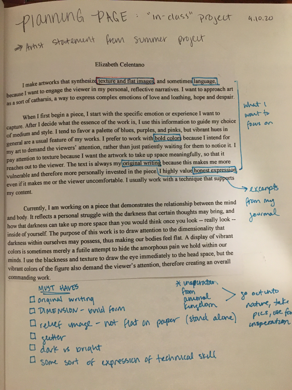
I make artworks that synthesize texture and flat images, and sometimes language, because I want to engage the viewer in my personal, reflective narratives. I want to approach art as a sort of catharsis, a way to express complex emotions of love and loathing, hope and despair. When I first begin a piece, I start with the specific emotion or experience I want to capture. After I decide what the essence of the work is, I use this information to guide my choice of medium and style. I tend to favor a palette of blues, purples, and pinks, but vibrant hues in general are a usual feature of my works. I prefer to work with bold colors because I intend for my art to demand the viewers’ attention, rather than just patiently waiting for them to notice it. I pay attention to texture because I want the artwork to take up space meaningfully, so that it reaches out to the viewer. The text is always my original writing because this makes me more vulnerable and therefore more personally invested in the piece. I highly value honest expression, even if it makes me or the viewer uncomfortable. I usually work with a technique that supports my content. Currently, I am working on a piece that demonstrates the relationship between the mind and body. It reflects a personal struggle with the darkness that certain thoughts may bring, and how that darkness can take up more space than you would think once you look -- really look -- inside of yourself. The purpose of this work is to draw attention to the dimensionality that darkness within ourselves may possess, thus making our bodies feel flat. A display of vibrant colors is sometimes merely a futile attempt to hide the amorphous pain we hold within our minds. I use the blackness and texture to draw the eye immediately to the head space, but the vibrant colors of the figure also demand the viewer’s attention, therefore creating an overall commanding work. |
Archives
March 2021
Categories |
 RSS Feed
