|
The format for this "Lunchtime Lecture" was so different than the ones we've had in the past, but I enjoyed the variety of perspectives it introduced to me. The speakers were all graduates of Maggie Walker: Lily May, who is a freshman at MICA; Eli, who attends VCU; Andre, who also attends VCU, Alex, who graduated from VCU (and she lectured for us either last year or the year before!); Jack, another VCU graduate; and Bailey, who is enrolled in the UVA Architecture program. As someone who does not see herself pursuing a degree in Art, I felt the most connected to Bailey's story about using creativity in practical applications. I thought it was interesting how he sort of fell into the major, as he had been dead-set on politics until the 2016 election. I could relate to the desire for a task that would allow for creativity in the process, as I often struggle with indecisiveness and that gray - fuzz which fills my brain when I hear the words "make whatever you want." How do I know what I want? What if what I want isn't right? You understand my predicament.
Nevertheless, I found the insights shared by the other speakers to be enlightening. I had never really considered what it would be like to participate in basic - level Art classes after having the education I've been fortunate enough to receive at Maggie Walker. I can understand how it would be frustrating and feel like a waste of time to spend hours reviewing concepts like Color Theory, but I also feel like those experiences are important to establishing relationships with peers. Also, idle time is perfect for brainstorming and sketching. Plus, there would undoubtedly be challenge areas -- things that one may not feel particularly confident in, like figure drawing -- that would force the student to revisit the topic. Some of the problems that the speakers shared about Art school surprised me. For example, I had never thought that there would be the types of bias that Lily has experience as an illustration major within the Art department. It's sad yet ironic that the Art department, which is widely inclusive in and of itself, would prioritize some "artists" over others. Also, I was not expecting for so many of the speakers to share common instances of the ungratefulness and sense of entitlement displayed by their peers. It seems like these well - established Art schools provide the students with such a wide - range of resources that the kids lose sight of the magnitude of these opportunities to work and explore. It is for this reason, among others, that Eli is considering the pros and cons to switching majors; as someone who never intended to follow a traditional career path, he is wrestling with the necessity of creating art in an institutionalized setting. He feels like the VCU Art community, rather than broadening his options, still imposes a set of expectations on him and his work that he dislikes. Interestingly, Jack shared that his impression of Art school was one of malleability; "make it what you want." He also said that the presence of grad students within the campus was motivating because of their intensity and dedication to their crafts. Furthermore, Andre brought up how unproductive, and sometimes even damaging, critiques can be. It makes sense that a work about the Queer, Trans, or Minority communities could not be helpfully critiqued some a majority of peers who have zero experience with the hardships that accompany such persons. He also presented a question that I think is important for all people of the Art world to consider: How do you critique a work that you don't understand? Critiques are incredibly subjective, but that quality of subjectivity can be taken advantage of when the people engaged in the critiques share either similar experiences or emotions that accompany a related situation. It's a reminder that even though I seem to have formed this notion of the Art world being spontaneous and accepting, it is still plagued by the same tensions between races, genders, and minority vs majority groups which we face in our everyday lives.
0 Comments
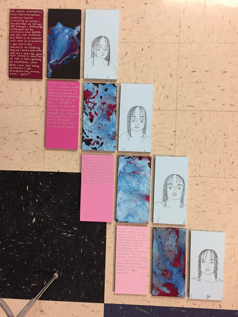 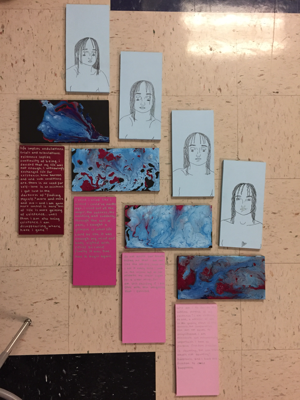 i finished! i had my heart set on making 16 rectangles because the number four makes me happy and four sets of four seemed optimal. but, i have absolutely no idea what to do for my fourth set. like, none. i didn’t want to make a fourth set just for the sake of taking up space, so i decided to just let it be. now, i am struggling with the display of my works. this display is incredibly important to me because i want for the individual pieces to interact in an effective and engaging manner. i made my planning page with the idea in mind that i would just stagger four rows in the same order. then, shreya suggested making the paint pours horizontal, and i really like that idea. If i were to just stagger the rows, then I feel like I need to include a single string of lights on the right side that go from not lit to bright — as an additional visual for healing and growth. by switching up the orientation, though, it makes the overall composition more interesting.
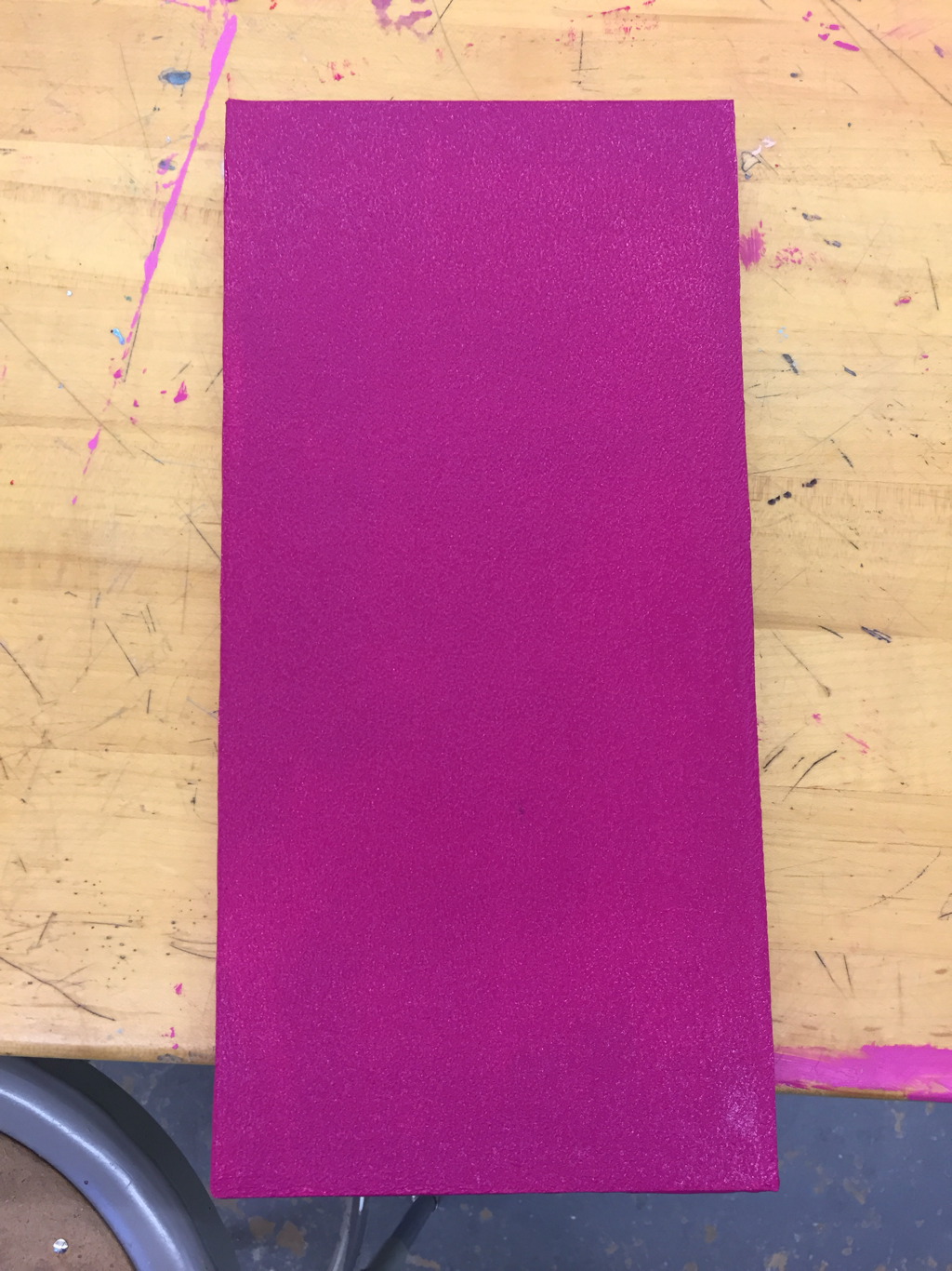 I had to come in during study hall today and repaint this rectangle for my writing set. Before, the value of this rectangle, which is supposed to be the darkest one, was too similar to the next - lightest rectangle. The painting isn’t as even as I want for it to be, but I plan on my writing covering nearly all of the rectangle and therefore drawing the viewer’s attention away from any variations in the paint. I have yet to write what I am going to put on this piece, but that has worked out we’ll because I can alter my writing based on the room I have within the rectangle, whereas it’s sad to have to edit my writing because of lack of space (which tends to happen if I write before considering the space I actually have).
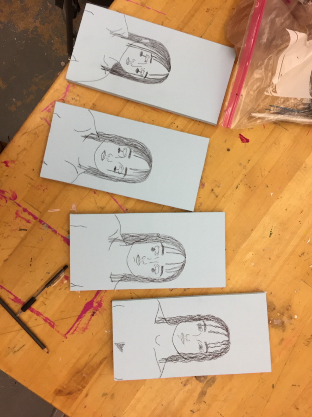 I finished my drawings last night and transferred them onto the boards in class today. I decided to use the light blue rectangles because then the focus is on how the drawings change. The flowers from the eyes and quality of the hair (from limp to wavy) are obvious ways in which the figures heal. The position of the body within the frame is more subtlety indicative of how the girl transforms from shrinking into herself to conveying confidence in her posture. I think I am also going to add puffy glitter glue to the images, but from none in the most weakened figure to an obvious amount in the most empowered. This additional element will similarly support my content
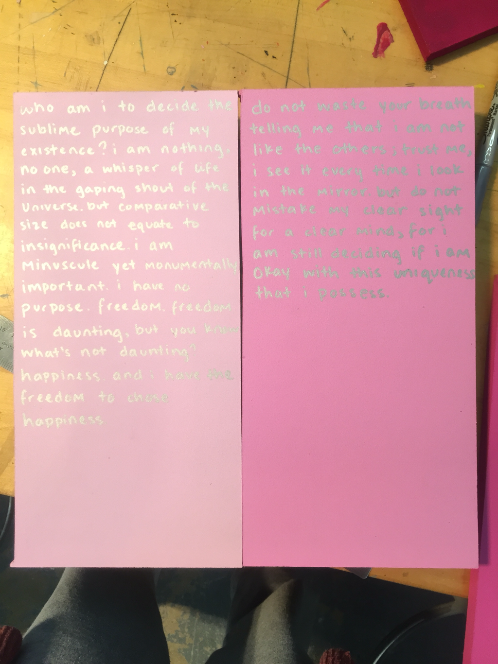 I painted my third set of rectangles today, which will feature my original writings. The pink is a gradient of dark for the writing with the most anguished tone, while the light pink signifies the light - hearted was of the sort of ‘conclusive’ writing in the little series. I chose to write in silver sharpie because I love the reflective quality of the metallic; it forces the viewer to get close to the work and really evaluate it to read the writing, but it’s not impossible. I was nervous to completely freehand the words, but I didn’t want to write in pencil first because it’s very difficult to erase marks on this type of painted surface. I planned out the size of my writing on a separate piece of paper before setting to work on the final medium. I am pleased with the straightness and uniformity of my writings.
|
Archives
March 2021
Categories |
 RSS Feed
