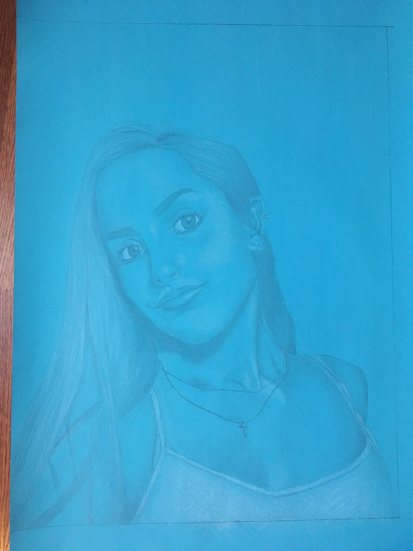
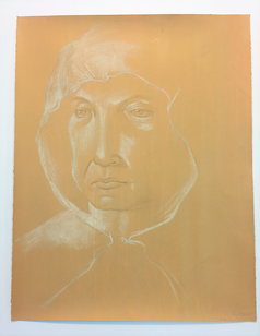
 Well. It is done. I am very content with my work. I absolutely loved using the metal point because of its subtlety, which allowed for me to add layers to create shadows and use hatching to capture depth and form. The white really brought out the highlights; I feel like it just made the whole piece more interesting in general. I may be adding some additional marks as I reflect back on my work, but I am done with the formal process. I am so excited to explore using this style for future uses, as I can definitely envision myself investigating portraiture and metal point.
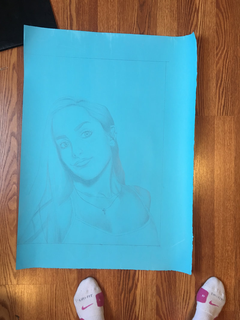 I have basically finished with the shading and am now going to begin adding highlights. I have white conte crayon to do this with, but I think that I will also be using white colored pencil because the lines are a bit smoother than those of the conte. I am really pleased with the proportions and details so far. I feel like I am doing a fine job of capturing the mark of my Old Master, which isn't too hard because the ways to use metal point are extremely limited.
This field trip was most likely the best school day that I have had this year. I not only got to spend time with great friends, but I got to observe -- and, in some cases, participate in -- beautiful displays of artistic expression. The sheer volume of works that were both technically impressive and symbolically meaningful left me speechless. Needless to say, I was exhausted by the end of the day, but it was definitely worth it. The above images are examples of Abstraction Expressionism pieces. The first two artworks are from the Smithsonian online collection, as I was not able to find pieces from the AbEx movement that really spoke to me. However, each of these paintings possess certain qualities that I would like to incorporate into my own abstraction. I feel much more familiar with the Abstract genre after carefully examining and interpreting these works. Radiante: Albizu was associated with vanguard Puerto Rican artists, whom were inspired by abstraction and nationalism. She studied art in New York, Paris, and Florence, finally returning to New York for the duration of her career. She explored Abstract Expressionism thoroughly, and studied under Esteban Vicente and Hans Hoffman. As was customary for her, Radiante was created through Albizu's rhythmic application of large blocks of pigment against a yellow background. She calls this a "conversation between color and form." Her artworks represent mood and temperature, rather than time and space. Thus, it is obvious that Albizu believed in the emotive power of color.
Blues: Gottlieb began his series of "burst" paintings in the late 1950s, a collection of which Blues is an example. These burst paintings are characterized by containing a contrast of dualities, like night/day, sun/earth, male/female. The bottom portion of Blues is like an action painting, as the pronounced brushstroke shows the twisting movement of the artist. The top portion, however, displays careful planning of shading and blending colors; the process was slower, more deliberate. To me, it seems like the content is chaos versus control. Gottlieb once said, "the idea that painting is merely an arrangement of lines, colors, and forms is boring." The combination of this statement and the actual artwork leads me to believe that the true meaning of Blues is the depiction of the two extreme views of abstraction: the seemingly meaningless designs that were created with lengthy planning, and the frenetic marks that came from a gut instinct with the artist.
Mountains and the Sea: Helen Frankenthaler had a specific "staining" process that she used to create her pieces: she thinned out paint and then poured it onto raw canvas. I may be mistaken in this assumption, but it appears that it was a running theme among AbEx painters to work on raw canvas. The transparency of Frankenthaler's colors added a depth that made the forms seem to float in space. The pastel blues and beiges of Mountains and the Sea also allude to a natural environment, which I'm guessing is why she entitled the piece Mountains and the Sea.
There were so, so many artworks that made me gasp with wonder at the craftsmanship, or forced me to stop and rake my eyes over it so that I could even begin to formulate an opinion of it and its content. I selected the images below based on how I immediately felt upon seeing them, and I gathered my thoughts into the following paragraphs after observing and reflecting on the artworks. Ex. 5 -- Mind's I: Translation #12: I was automatically drawn to this piece because of the texture. I find that texture engages the viewer, as it automatically stimulates the tactile sense, even if you cannot actually touch it. I'm not really a fan of muted tones in general, but it kind of suits the abstract/surreal/symbolic vibe that I got from this artwork. The underlying content, as near as I could tell, is all about perspective: reality differs from each individual, as their own ideas, feelings, values, experiences, etc. affect how they observe and process information. Thus, rather than beauty being in the eye of the beholder, it is more like Life itself is in the eye of the beholder. For my future play pages, I would love to experiment with maybe newspaper or a similarly textured medium for texture, as well as incorporate additional layers of meaning. Furthermore, I really want to study oil paintings and learn how to use them, especially since I have never really focused on painting. Plus, I really like the thickness of oil paint -- another way to create texture. Pumpkin: I immediately gasped with delight when I saw this sculpture. I'm not even sure exactly why, since I don't normally like yellow and black together. In this case, I guess, I was drawn to the combination of the asymmetricality of the whole sculpture and glossy surface. Plus, the uniformity of the lines of circles was aesthetically pleasing. And, after doing a little bit of research, I found out that Kusama sees the pumpkin as symbolic of radiant energy, possessing paradoxical endearing and grotesque qualities, and is therefore her most famous motif. Up to this day, my play pages have nearly all been 2-D works, and I want to expand my explored areas. Seeing this sculpture kind of jump-started my ambitions, and I realized that I want to have that kind of impact on someone else. I mean, I understand that I cannot do this after one measly play page, but everyone has to start somewhere. So, I am making it a goal of mine to find something as meaningful to me as the pumpkin is to Kusama (perhaps a softball, or maybe a sunflower), simplify the general form, and sculpt it. I'd then reduce the level of detail and promote a sense of continuity by decorating the sculpture in a pattern of one shape, just like Pumpkin. This sort of play page would force me to consider time efficiency, practicality, and my own desires, all important skills that extend beyond Art class. Portrait of Mnonja: Hands. Down. My. Favorite. Well, okay, I had a lot of "favorite" pieces that I saw on this field trip, but this was pretty high up on the list. Portrait of Mnonja is basically a larger and more detailed version of my signature play page focus: glitter portraiture. The composition is very sophisticated, closely following the rule of thirds. Thomas also used diagonal and intersecting lines to create a sense of dynamism. The portrait is exploring notions of sexuality and race through rituals associated with female beauty: the model had to dress up and apply makeup before posing; the rhinestones represent glitzy and girlish jewelry. Yet, the relaxed position of the model and the 1970's wood paneling background provides the viewer with information that indicates Mnonja's power and autonomy. I love how the rhinestones outline the forms; it adds texture, intrigue, and personality to the piece without seeming too kitschy. I do have to admit, though, that I do not like all of the background patterns because they seem overwhelming and simply distracting from Mnonja. For my play page that would be modeled off of this artwork, I would probably use the rhinestones to outline th forms-- same as Thomas -- but keep any sort of 'background noise' to a minimal. Other notable piece/exhibitions:
 I took some time today to add highlights to my initial outline. I think it's coming along nicely, although I will definitely have to increase the intensity of the shadows around my jawline. Plus, I haven't even begun filling in the hair, but I am saving that for one of the last parts because most of it will be done in white.
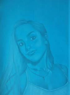
I worked on this for a very, very long time today; I mostly was just using this as an excuse to avoid studying for my global test on Tuesday. Oops.
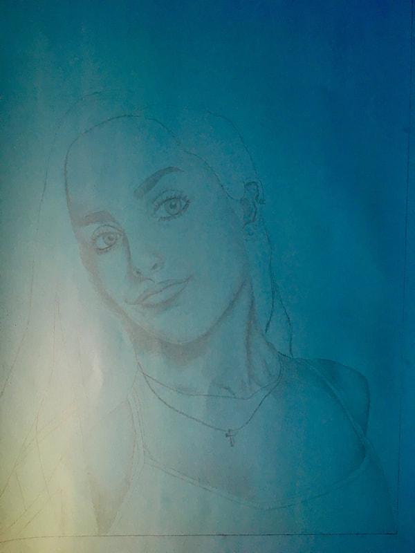
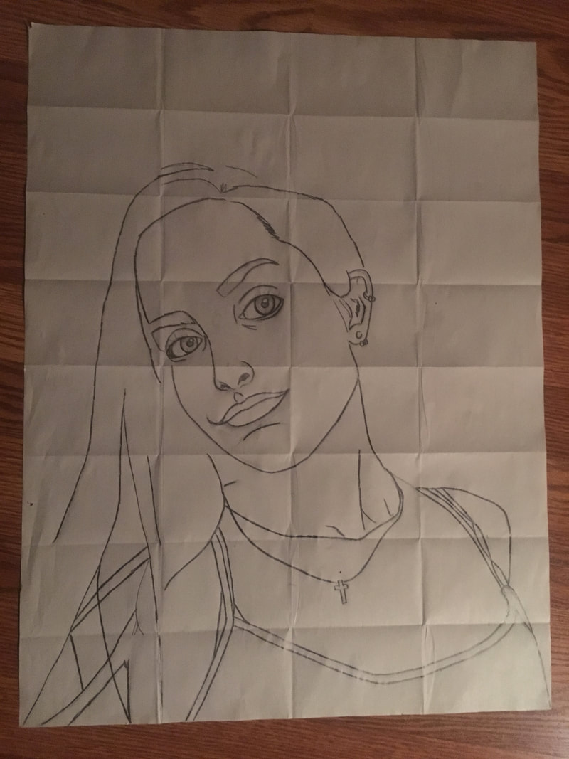
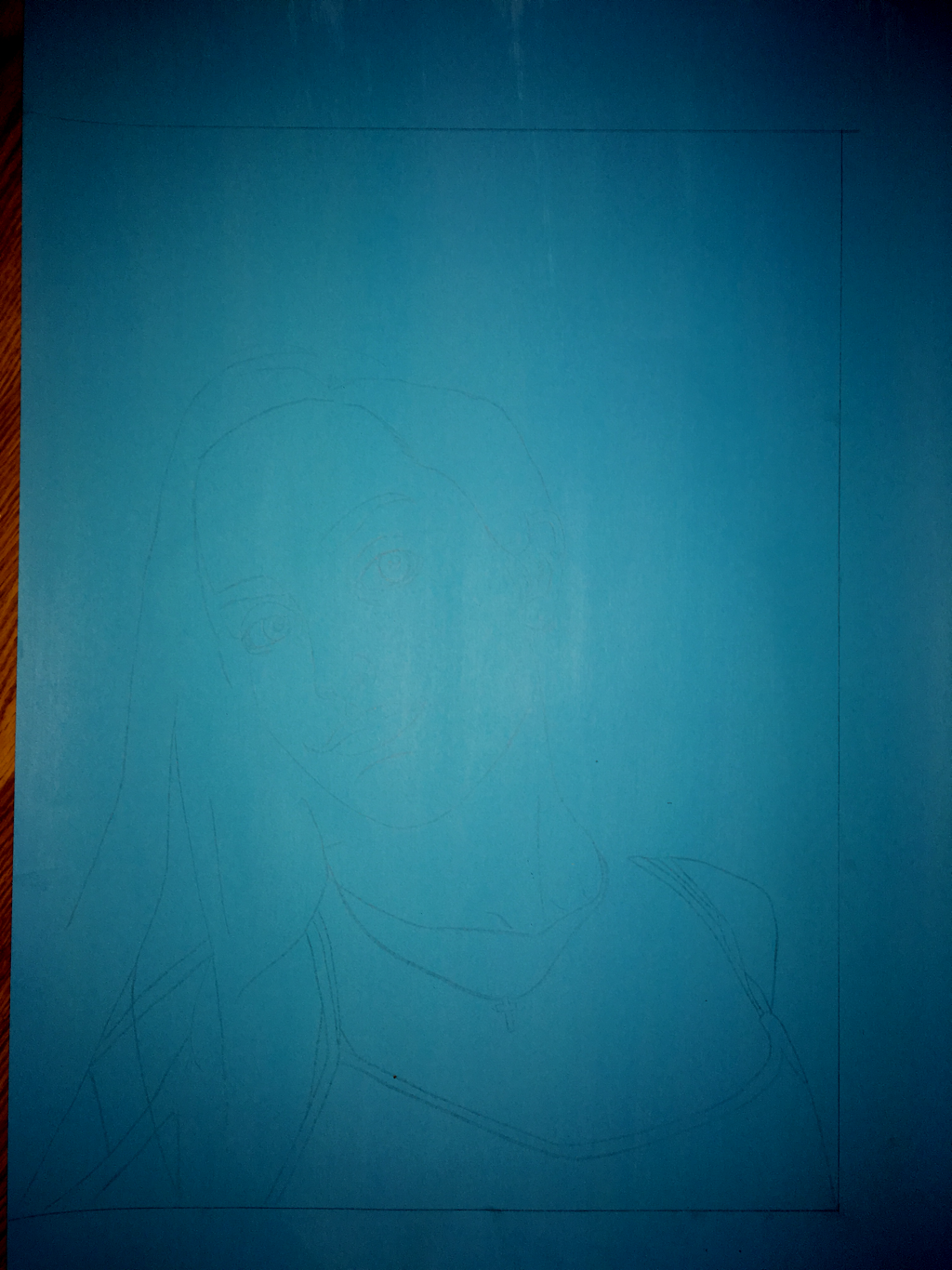
Anyways, I agonized over the proportions of the lips for a while, but I think that they ended up coming out alright. I plan on making any other necessary modifications while actually applying the metalpoint and white conte crayon. Using the contact paper really helped, especially since I could fold it to make a grid, in addition to the fact that I could erase and redraw without ruining my paper. Plus, transferring was super easy. Magical, even. I know that you really can't see it all that well on the right, but that's the best I could do; I don't want to make the outline too dark -- just light enough that I can see it while drawing over it. Also, there are some weird streaks on my ground that are lighter than the rest of the paper. I don't know why this is, but it was really bothering me. I realized, though, that since I had to make the image proportionate to the contact paper, I will have to resize my paper to be the same size as the contact paper. Now, I don't have to worry about the odd streaks because they will be cut off. And, I painted on the same side as the watermark... which was probably kind of dumb, but I figured that the side with the sticker on it would be the back of the paper, but I don't know now... anyways, the watermark will also be cut off. So, those two problems are taken care of. I plan on getting the metalpoint and conte crayon in class on Monday, and I hope to make steady progress throughout the week, although it's more realistic to expect that I will start working on it at, like, 10 pm Friday night and obsess over it for three hours straight. Whatever works, I guess. |
Archives
March 2021
Categories |
 RSS Feed
