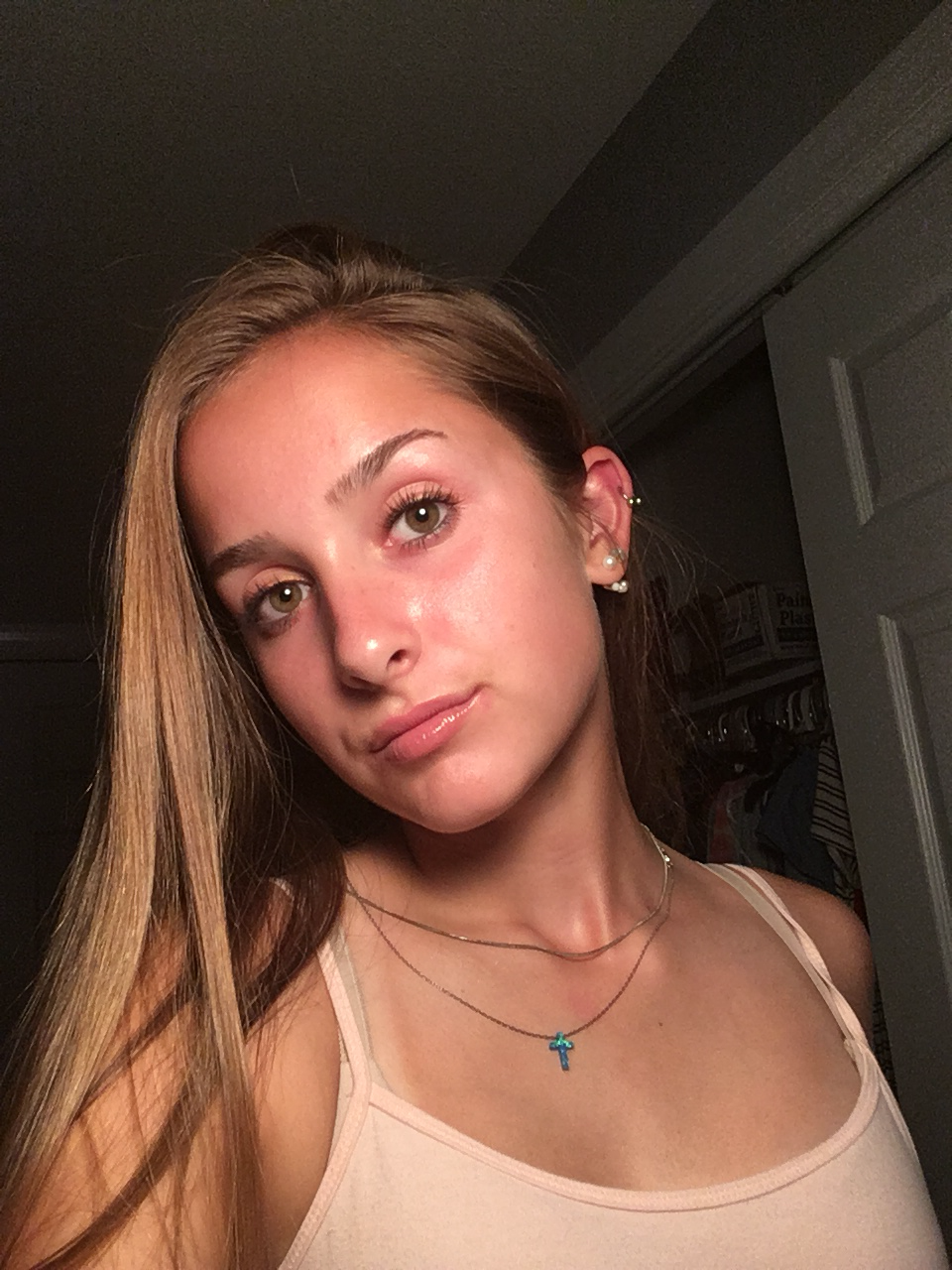
 I decided that i will will be using the image above for my self-portrait. I like this picture because it is similar to the modeling of the subject in Ghirlandaio’s work that I copied. I also am generally pleased with the picture itself, especially since I am not smiling — no teeth to agonize over!! (They always look so weird when finished).
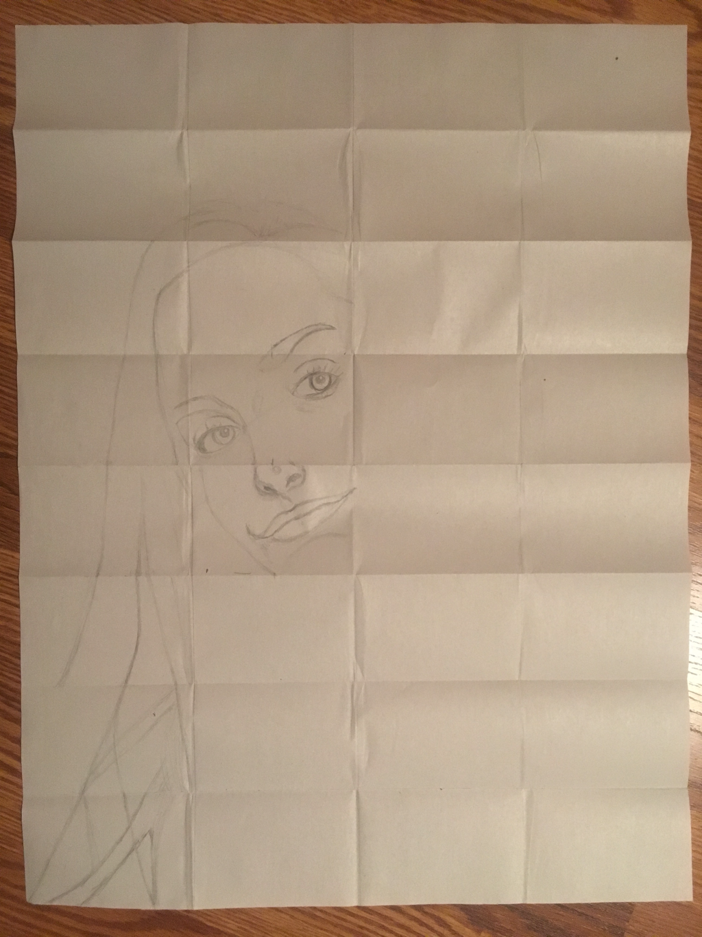
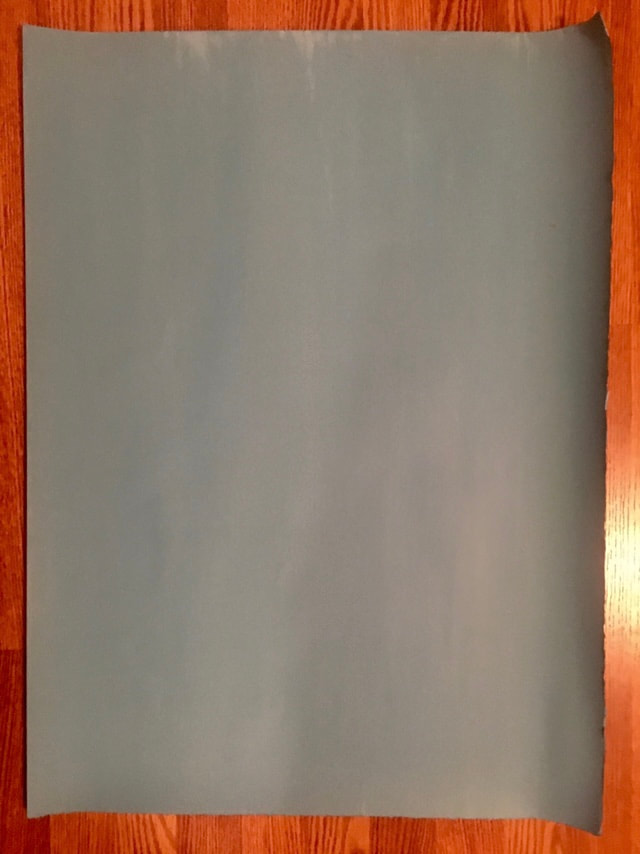
So this is my progress thus far. I have painted my paper with the ground medium, which I mixed with water colors to achieve the light blue. I am using contact paper to do my preliminary outline on, and then I plan on transferring it to my final paper via graphite. Something is a little bit off with the mouth, but I have confidence in my abilities to change it as I see fit. I feel a lot more capable after having done the Old Master Copy. I guess this is because I have a better idea of the expectations for this assignment, as well as a better comprehension of useful techniques (i.e. large, swift arm movements, taking a step back every now and then to observe from a distance, and focusing on each individual section. I look forward to making some more progress in the upcoming days!
0 Comments
Howardena Pindell: What Remains to be Seen 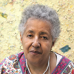 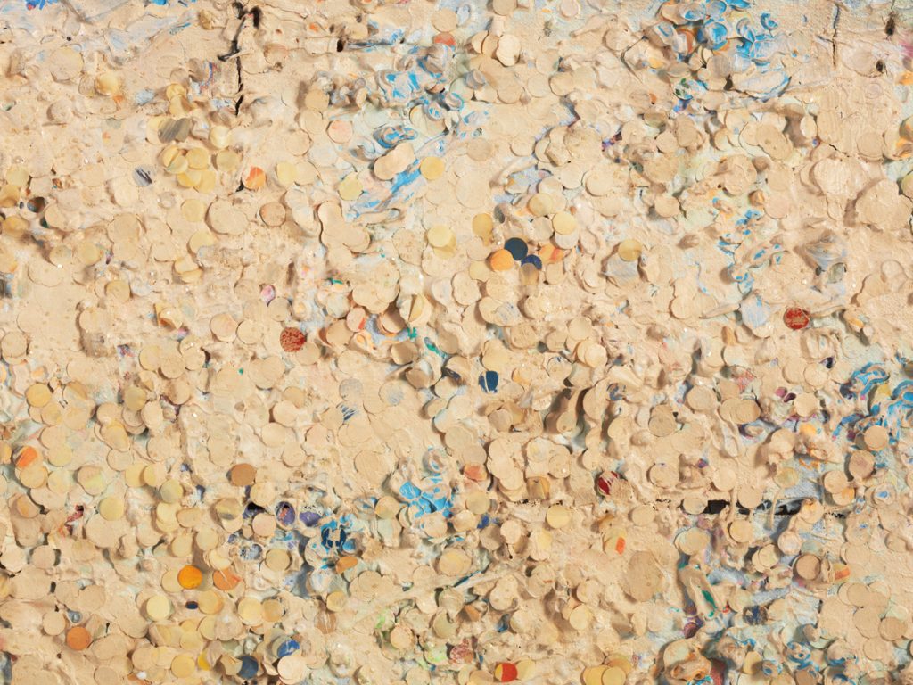 Untitled #20 (Dutch Wives Circled and Squared) (detail), 1978, mixed media on canvas. MCA Chicago, Gift of Albert A. Robin by exchange Untitled #20 (Dutch Wives Circled and Squared) (detail), 1978, mixed media on canvas. MCA Chicago, Gift of Albert A. Robin by exchange I am sad that I was unable to experience this exhibit in person, but I still managed to glean a great deal of information from the online resources that I accessed. To sum up my opinion of Howardena Pindell: sensationally iconoclastic. Pindell grew up fully immersed in the art world, her parents making it a point to take her to galleries, enroll her in classes, and introduce her to both black and white artists, all of which was the result of one of her elementary school teachers frankly telling her parents that she was gifted, and they needed to explore and develop her talents as much as possible. Pindell continued down this path to artistry, and she attended Boston University for her BFA and then Yale. She spent much of her time at Boston learning how to render form, and thus was well-practiced with the traditional skills and principles associated with art-making. The School of Fine Arts at Boston had a quota of one black student and one Asian student per year, so her peers were mostly white women. The inequalities that she experienced at Boston came as a shock, and so she spent much time in the Isabelle Gardner museum to avoid confronting her prejudiced peers. As Pindell matured in her capabilities and style, she struggled with figuration. She continued to explore this style, though, and finally began to hone the narrative and composition of her work. While at Yale—and her teachers and colleagues at Boston disapproved of this, Pindell began to experiment with abstraction. It took her years to be mindful of political problems, but she did manage to pinpoint one subject that would inspire numerous works: circles. Pindell worked in a library, and one of her tasks was to punch holes. The process mesmerized her, and she became entranced by the form of the circle. She called this experience a catalyst, that her use of circles and ellipses were metaphors for the cosmos. Below is a work that perfectly exemplifies this notion: In this work, Pindell sees each individually punched hole as a minute universe, infinitesimally larger than anything we could possibly imagine, yet smaller than my thumbnail. I’m not sure of the precise significance of the varying colors, but I feel it has to do with the compositional success of the work by adding some contrast to the beige holes, engaging the viewer. Pindell notes that she undoubtedly would have ended up an abstract artist no matter what, but an interesting fact is that she developed an allergy to lead paint from using it early in her career. Consequently, Pindell had to switch to acrylic paint, the popular medium for abstract art. Here is another piece that expresses Pindell’s fascination with circles and ellipses: 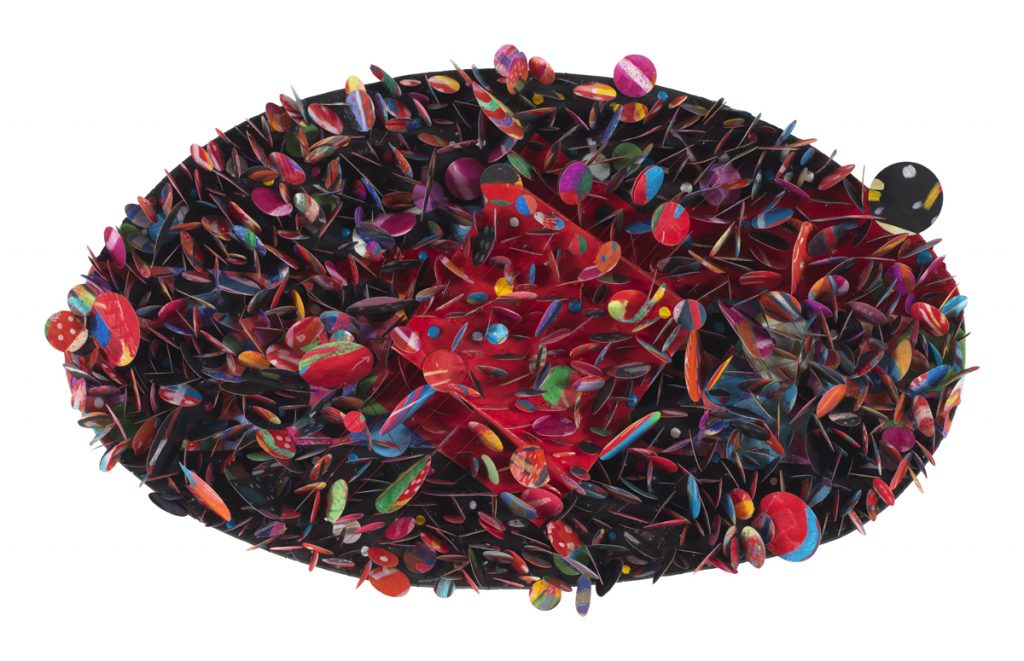 Untitled #5B (Krakatoa), 2007. Mixed media on paper collage; 13 × 22 × 4 in. Garth Greenan Gallery. Photo courtesy of the artist and Garth Greenan Gallery, New York. The first thing that I noticed in this piece is how much more dynamic and energetic it is than the first example; the piece is unapologetically abstract, whereas the previous work is much more subdued. Also observe the difference in time between the first and second examples. My theory is that she gained more confidence as her artistic vision matured. This resulted in her use of rich colors and unconventional materials, creating a sumptuous and ethereal quality. Pindell’s fascination by the cyclotron also influenced her rendering of this piece, accounting for the multi-dimensionality, the organized chaos of Untitled #5B (Krakatoa). Below is a much more recent work of Pindell’s: 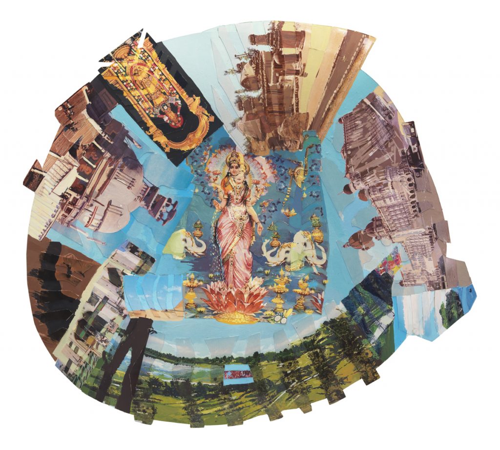 Autobiography: India (Lakshmi), 1984, mixed media on board. Courtesy of the artist and Garth Greenan Gallery, New York Here, Pindell has fully embraced abstraction in her juxtaposition of rural landscapes, architecture, and scenes of a traditional-looking Indian woman. She is technically creating “paintings,” but the collage form indicates her experimentation with form. Especially in her Autobiography series, Pindell has transformed her body (the Indian woman) into the work, literally and figuratively. The composition is technically weak with the focal point in the center, but the images that decorate the outer edges creates a sense of dynamism and continuity. Additional notes:
mcachicago.org/Exhibitions/2018/Howardena-Pindell www.howardenapindell.org/ youtu.be/GYfu8XgZP4s Abstraction and Mark-making
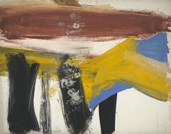
This exploration of both abstract and non-objective art was actually really challenging; I have a hard time grasping the true meaning of an abstract piece, and the idea of non-objective is just mind-boggling. So, I really had to push the limits of my cognitive and analytical skills. Abstract art still has an underlying meaning or significance greater than the actual piece. It begins with a subject from reality that the artist conceptualizes and incorporates in the essence of their work. Conversely, non-objective art is made purely for the sake of making art. The artist does not perform any sort of preliminary planning or designs. This is similar to the principle of aestheticism, but non-objective art is even more simplified: it’s not even expected to be aesthetically pleasing; non-objective art is simple expected to be. Willem de Kooning was inspired to create Lisbeth’s Painting when he observed his two – year – old daughter placing her paint-smeared hands all over his canvas. Abstract art embraces improvisation, and so this unexpected turn of events led to the establishment of his daughter’s handprints as the subject. The content, as near as I can tell, is the admonition of the quick, harried lifestyle that so many get caught up in. Obvious the frenetic, messy brushstrokes, the uneven blending, the splotches of smudge paint. These aspects of the painting fade to mere background noise, though, because of the small white handprints that run vertical down nearly the middle of the page. I could not even begin to tell you the purpose of Wavy Brushstrokes. I do not understand the reasoning of the artist; I have no knowledge of his thought process, which I guess is the whole point of non-objective art: it is human nature to overanalyze and—sometimes futilely—make connections. Non-objective art gives the mind of the viewer a rest, allowing for the visual senses to digest what is happening and take the artwork only at face value. There is no contemplation, no analysis, involved. But, is simply doing whatever feels right enough of a purpose to qualify a piece as Art? Where is the definitive line between non-objective art and, well, non-art? What are the qualities of a successful non-objective piece—or are there none, since the artist is not creating the artwork with the intention of attracting and engaging the viewer? 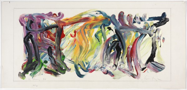 HV, May 16, 1981, Charles Clough, enamel and graphite on paper, 11 7/16 x 25 1/8 in, Modern and Contemporary Art collection HV very clearly falls into the Abstract Expressionism category because the artist, Charles Clough, is very intentional in his composition, which just so happens to result in an abstract design. Similar to the beliefs of the first abstract expressionists, Clough emphasizes dynamic, energetic gesture. He views art as a means to examine paradoxes, especially that of intentions versus desires. Therefore, HV may seem like nothing more than random strokes of paint, but the foundation for its conception was very meaningful. It is the tangible evidence of Clough's exploration of his subjective emotional expression. 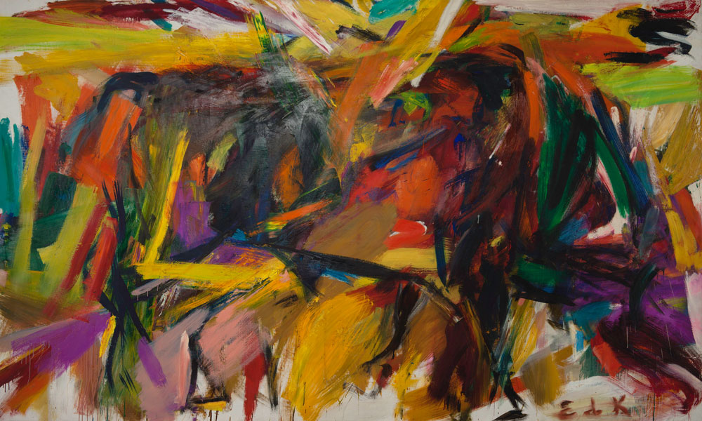 Elaine de Kooning, Bullfight (1959). Courtesy of the Denver Art Museum, Vance H. Kirkland Acquisition Fund, © Elaine de Kooning Trust. Mark-making: I chose this piece because the marks are very clearly defined, which creates depth within the piece. However, some areas are blurred, the colors smudged, which suggests a paradox of chaotic unity. The marks vary in length, but all are thick. No one line is simply vertical or horizontal; each individual mark either is a diagonal or contains some sort of turn. These marks were likely created at a fast pace, which is implied by both the quantity of lines and their seemingly careless quality. 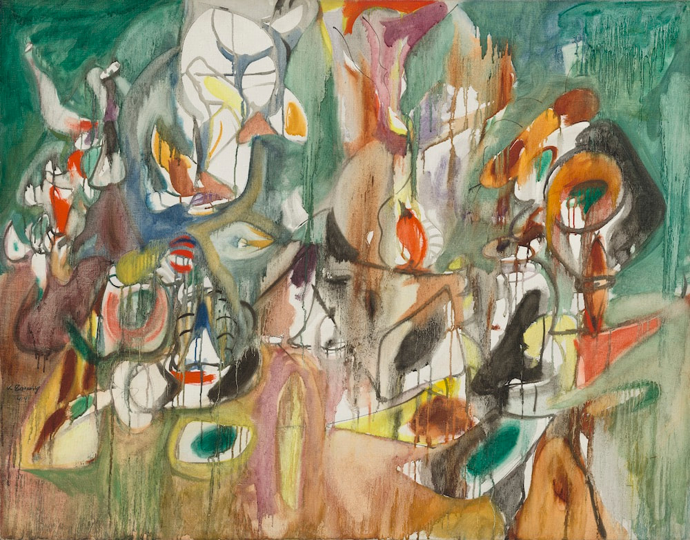 One Year the Milkweed, 1944, Arshile Gorky, oil on canvas, 94.2 x 119.3 cm Mark-making: Gorky uses many different kinds of marks in this piece, which is why I chose it; I like the contrast of the dripping paint with the otherwise solid and muted patches of color. The marks have blurred together, which creates continuity. The earthy hues suggest a pastoral scene, as do the forms that appear as a result of the thinner and more concrete marks. These marks likely took a long time to make, judging from the variations in color and multiple shapes. The process of creating the marks in this work probably started with the outlined white spaces, then built outward into the surrounding space. 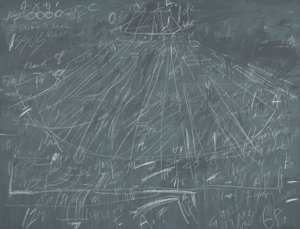 Synopsis of a Battle, 1968, Cy Twombly, commercial oil-based paint and wax crayon on canvas, 79 x 103 1/8 in, Lewis Contemporary Galleries, Modern and Contemporary Art collection Mark-making: The artist's use of lines in this piece is, in my opinion, very unique. Every line is similarly thin in width, but there is a variety of lengths and directions. However, the most eye-catching lines are the long ones that seem to radiate from the top center of the canvas. I feel like the artist was aiming for an old-school, battle-plan-on-a-chalkboard effect. The harried quality of the marks conveys the anxieties of a general, the sparse areas where it looks as if the marks have been wiped away hinting at mistakes and consequent revisions that have been made. I feel like the process of actually creating these marks took a long while, as there are many lines, each purposeful in its imperfectness. 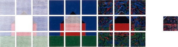 237 Lafayette Street, 1978, Jennifer Bartlett, enamel over silkscreen grid on baked enamel steel plates, 38 x 142 in, collection of the Virginia Museum of Fine Arts Artist Use...: I interpret this piece as the artist making a conscious effort to defy the rule of thirds by emphasizing the middle square. Because of the time period in which this piece was created, Bartlett likely used this as a narrative to contradict traditional standards of successful art. The transfer of the image on the middle square among the collective squares is an abstract sort of continuity within the work. The use of various textures enhances the plainness of the houses. The white spaces between the small squares contrasts efficiently with the deeply pigmented sky, grass, and house. 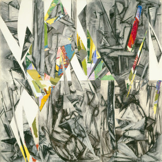 Imperative, 1976, Lee Krasner, oil, charcoal and paper on canvas, 127 x 127 cm (50 x 50 in.) Artist Use...: I really find this piece aesthetically pleasing. I find the contrast of the irregular blank spaces with the surrounding marks really engaging; they encourage the movement of the viewer's eyes throughout the whole piece. Krasner also follows the idea of avoiding a centrally located focal point. The blank spaces also create the illusion of form, which adds depth. The goal of Krasner was probably to depict the fragmented nature of a black and white existence, punctuated by bursts of color or blank spaces of mundanity. 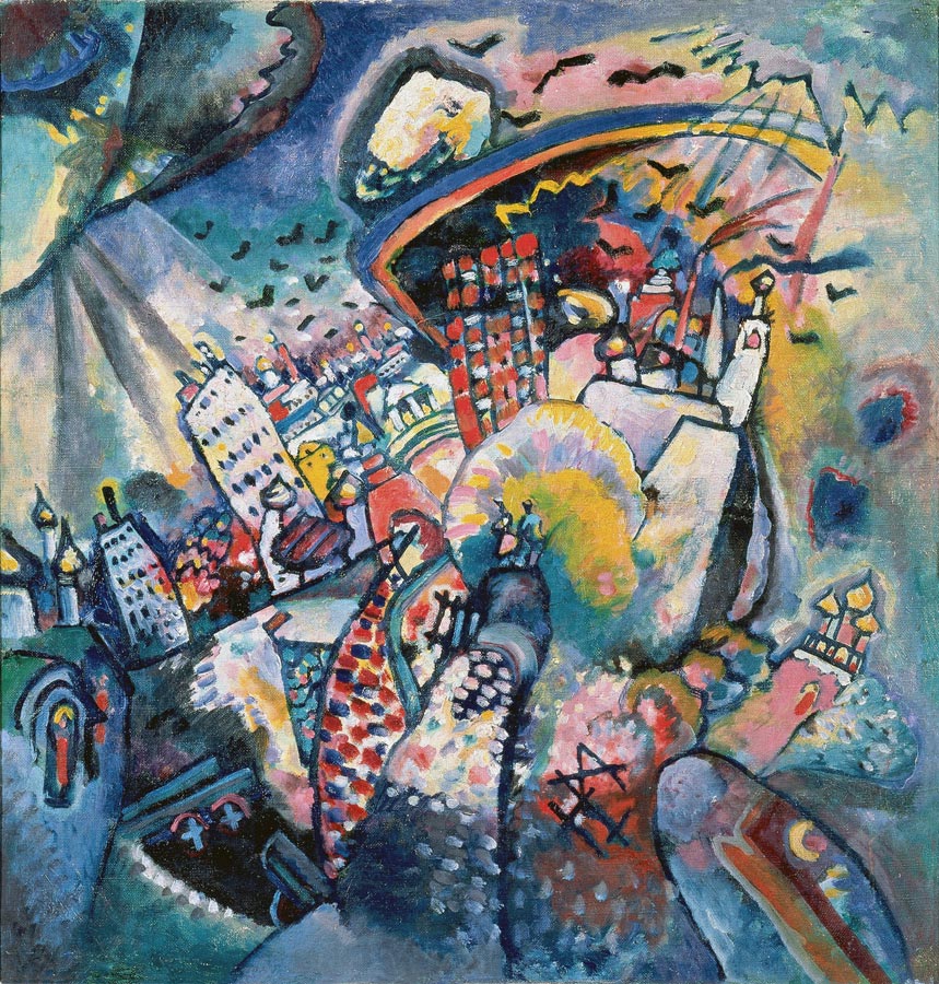 Moscow. Red Square, 1916, Wassily Kandinksy, oil on canvas, 20.3 x 19.5 in, Moscow, The State Tretyakov Gallery Artist Use...: Kandinsky's use of vibrant colors paired with areas of shadows and highlights creates a contrast within the piece that urges the movement of the viewer's eyes. The diagonal lines used to form the tilt of the shapes has a dynamic effect. Kandinsky's marks are curiously irregular and imperfect when up close (a theme among abstract artworks), but come together nicely when the viewer is farther away. Plus, most of the individual marks are multi-colored. In this, Kandinsky is attempting to capture the essence of Moscow and its inhabitants. He sees it as a vibrant, rich, multi-dimensional city. Kandinsky delineates the evolution of Moscow as a modern place, especially in how there are more detailed colors and buildings at the top of the central form-- this is the most recent version of Moscow, which is filled with life.
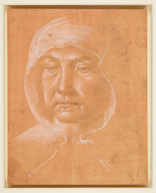
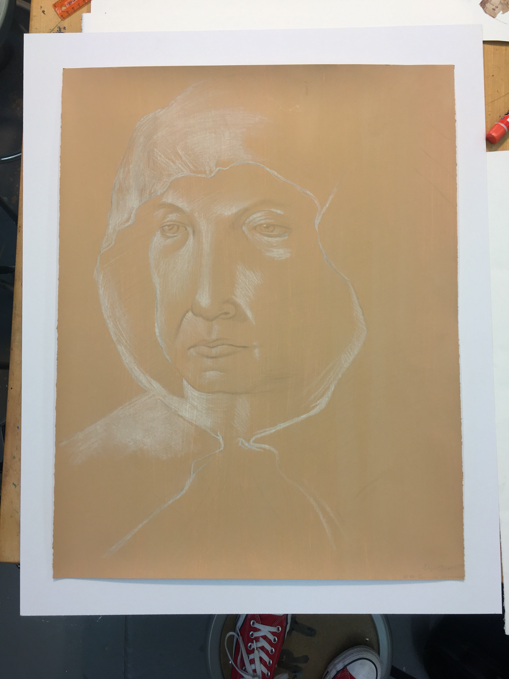
Well. This is it. The final comparison of the original image (left) and my completed piece (right). I am mostly satisfied. The face is definitely elongated, but otherwise proportionate. I know that this is because I did not actually use a physical grid to section out the portrait; instead, I cut a sort of viewfinder that was the same size as the original image and laid it atop my paper. Then, I focused on drawing whatever fit inside of the space within the viewfinder from the original. Tricky, I know. But I really did not want to draw on the ground, or physically fold the paper. Now, though, I have some experience to work with and improve upon. I am extremely excited to begin work on my self-portrait-- I have already begun brainstorming colors and poses. It will likely be the most time-consuming (but most important!) piece of work that I have ever done. I am so ready for the challenge.
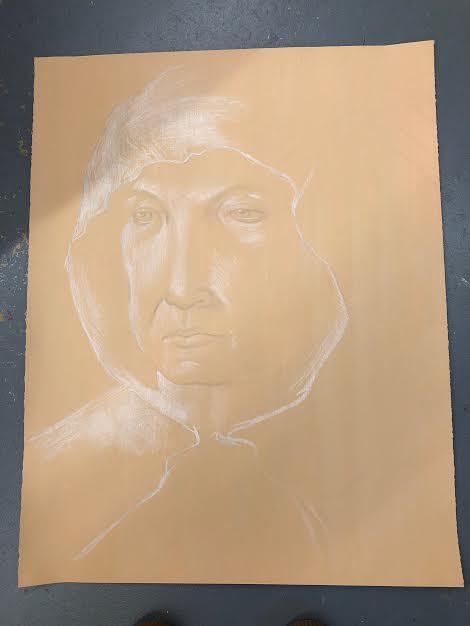 I'm not sure that there is much visual difference between my result from today's work and my result from Wednesday's work. Nonetheless, I did work on it today, fixing the highlights in the bottom left-hand corner. I also deepened the values of the highlights and shadows overall. I tried to fix the curve of the left cheek some. I will definitely try to get in some studio time during lunch on Wednesday before we do critics.
|
Archives
March 2021
Categories |
 RSS Feed
