|
This field trip was most likely the best school day that I have had this year. I not only got to spend time with great friends, but I got to observe -- and, in some cases, participate in -- beautiful displays of artistic expression. The sheer volume of works that were both technically impressive and symbolically meaningful left me speechless. Needless to say, I was exhausted by the end of the day, but it was definitely worth it. The above images are examples of Abstraction Expressionism pieces. The first two artworks are from the Smithsonian online collection, as I was not able to find pieces from the AbEx movement that really spoke to me. However, each of these paintings possess certain qualities that I would like to incorporate into my own abstraction. I feel much more familiar with the Abstract genre after carefully examining and interpreting these works. Radiante: Albizu was associated with vanguard Puerto Rican artists, whom were inspired by abstraction and nationalism. She studied art in New York, Paris, and Florence, finally returning to New York for the duration of her career. She explored Abstract Expressionism thoroughly, and studied under Esteban Vicente and Hans Hoffman. As was customary for her, Radiante was created through Albizu's rhythmic application of large blocks of pigment against a yellow background. She calls this a "conversation between color and form." Her artworks represent mood and temperature, rather than time and space. Thus, it is obvious that Albizu believed in the emotive power of color.
Blues: Gottlieb began his series of "burst" paintings in the late 1950s, a collection of which Blues is an example. These burst paintings are characterized by containing a contrast of dualities, like night/day, sun/earth, male/female. The bottom portion of Blues is like an action painting, as the pronounced brushstroke shows the twisting movement of the artist. The top portion, however, displays careful planning of shading and blending colors; the process was slower, more deliberate. To me, it seems like the content is chaos versus control. Gottlieb once said, "the idea that painting is merely an arrangement of lines, colors, and forms is boring." The combination of this statement and the actual artwork leads me to believe that the true meaning of Blues is the depiction of the two extreme views of abstraction: the seemingly meaningless designs that were created with lengthy planning, and the frenetic marks that came from a gut instinct with the artist.
Mountains and the Sea: Helen Frankenthaler had a specific "staining" process that she used to create her pieces: she thinned out paint and then poured it onto raw canvas. I may be mistaken in this assumption, but it appears that it was a running theme among AbEx painters to work on raw canvas. The transparency of Frankenthaler's colors added a depth that made the forms seem to float in space. The pastel blues and beiges of Mountains and the Sea also allude to a natural environment, which I'm guessing is why she entitled the piece Mountains and the Sea.
There were so, so many artworks that made me gasp with wonder at the craftsmanship, or forced me to stop and rake my eyes over it so that I could even begin to formulate an opinion of it and its content. I selected the images below based on how I immediately felt upon seeing them, and I gathered my thoughts into the following paragraphs after observing and reflecting on the artworks. Ex. 5 -- Mind's I: Translation #12: I was automatically drawn to this piece because of the texture. I find that texture engages the viewer, as it automatically stimulates the tactile sense, even if you cannot actually touch it. I'm not really a fan of muted tones in general, but it kind of suits the abstract/surreal/symbolic vibe that I got from this artwork. The underlying content, as near as I could tell, is all about perspective: reality differs from each individual, as their own ideas, feelings, values, experiences, etc. affect how they observe and process information. Thus, rather than beauty being in the eye of the beholder, it is more like Life itself is in the eye of the beholder. For my future play pages, I would love to experiment with maybe newspaper or a similarly textured medium for texture, as well as incorporate additional layers of meaning. Furthermore, I really want to study oil paintings and learn how to use them, especially since I have never really focused on painting. Plus, I really like the thickness of oil paint -- another way to create texture. Pumpkin: I immediately gasped with delight when I saw this sculpture. I'm not even sure exactly why, since I don't normally like yellow and black together. In this case, I guess, I was drawn to the combination of the asymmetricality of the whole sculpture and glossy surface. Plus, the uniformity of the lines of circles was aesthetically pleasing. And, after doing a little bit of research, I found out that Kusama sees the pumpkin as symbolic of radiant energy, possessing paradoxical endearing and grotesque qualities, and is therefore her most famous motif. Up to this day, my play pages have nearly all been 2-D works, and I want to expand my explored areas. Seeing this sculpture kind of jump-started my ambitions, and I realized that I want to have that kind of impact on someone else. I mean, I understand that I cannot do this after one measly play page, but everyone has to start somewhere. So, I am making it a goal of mine to find something as meaningful to me as the pumpkin is to Kusama (perhaps a softball, or maybe a sunflower), simplify the general form, and sculpt it. I'd then reduce the level of detail and promote a sense of continuity by decorating the sculpture in a pattern of one shape, just like Pumpkin. This sort of play page would force me to consider time efficiency, practicality, and my own desires, all important skills that extend beyond Art class. Portrait of Mnonja: Hands. Down. My. Favorite. Well, okay, I had a lot of "favorite" pieces that I saw on this field trip, but this was pretty high up on the list. Portrait of Mnonja is basically a larger and more detailed version of my signature play page focus: glitter portraiture. The composition is very sophisticated, closely following the rule of thirds. Thomas also used diagonal and intersecting lines to create a sense of dynamism. The portrait is exploring notions of sexuality and race through rituals associated with female beauty: the model had to dress up and apply makeup before posing; the rhinestones represent glitzy and girlish jewelry. Yet, the relaxed position of the model and the 1970's wood paneling background provides the viewer with information that indicates Mnonja's power and autonomy. I love how the rhinestones outline the forms; it adds texture, intrigue, and personality to the piece without seeming too kitschy. I do have to admit, though, that I do not like all of the background patterns because they seem overwhelming and simply distracting from Mnonja. For my play page that would be modeled off of this artwork, I would probably use the rhinestones to outline th forms-- same as Thomas -- but keep any sort of 'background noise' to a minimal. Other notable piece/exhibitions:
1 Comment
Howardena Pindell: What Remains to be Seen  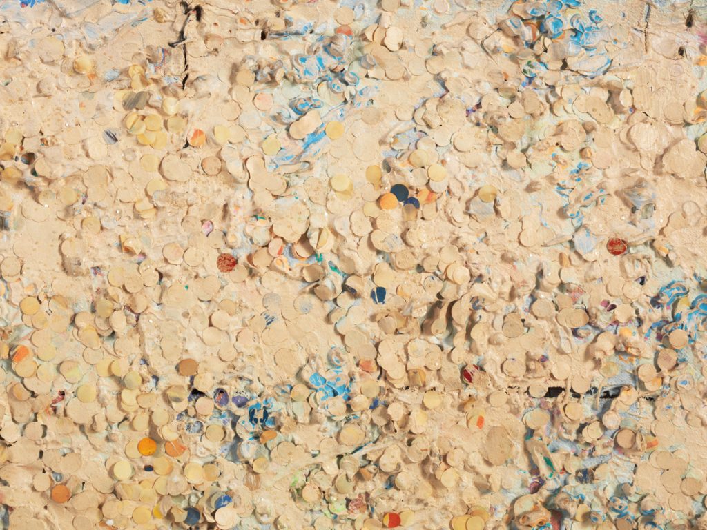 Untitled #20 (Dutch Wives Circled and Squared) (detail), 1978, mixed media on canvas. MCA Chicago, Gift of Albert A. Robin by exchange Untitled #20 (Dutch Wives Circled and Squared) (detail), 1978, mixed media on canvas. MCA Chicago, Gift of Albert A. Robin by exchange I am sad that I was unable to experience this exhibit in person, but I still managed to glean a great deal of information from the online resources that I accessed. To sum up my opinion of Howardena Pindell: sensationally iconoclastic. Pindell grew up fully immersed in the art world, her parents making it a point to take her to galleries, enroll her in classes, and introduce her to both black and white artists, all of which was the result of one of her elementary school teachers frankly telling her parents that she was gifted, and they needed to explore and develop her talents as much as possible. Pindell continued down this path to artistry, and she attended Boston University for her BFA and then Yale. She spent much of her time at Boston learning how to render form, and thus was well-practiced with the traditional skills and principles associated with art-making. The School of Fine Arts at Boston had a quota of one black student and one Asian student per year, so her peers were mostly white women. The inequalities that she experienced at Boston came as a shock, and so she spent much time in the Isabelle Gardner museum to avoid confronting her prejudiced peers. As Pindell matured in her capabilities and style, she struggled with figuration. She continued to explore this style, though, and finally began to hone the narrative and composition of her work. While at Yale—and her teachers and colleagues at Boston disapproved of this, Pindell began to experiment with abstraction. It took her years to be mindful of political problems, but she did manage to pinpoint one subject that would inspire numerous works: circles. Pindell worked in a library, and one of her tasks was to punch holes. The process mesmerized her, and she became entranced by the form of the circle. She called this experience a catalyst, that her use of circles and ellipses were metaphors for the cosmos. Below is a work that perfectly exemplifies this notion: In this work, Pindell sees each individually punched hole as a minute universe, infinitesimally larger than anything we could possibly imagine, yet smaller than my thumbnail. I’m not sure of the precise significance of the varying colors, but I feel it has to do with the compositional success of the work by adding some contrast to the beige holes, engaging the viewer. Pindell notes that she undoubtedly would have ended up an abstract artist no matter what, but an interesting fact is that she developed an allergy to lead paint from using it early in her career. Consequently, Pindell had to switch to acrylic paint, the popular medium for abstract art. Here is another piece that expresses Pindell’s fascination with circles and ellipses: 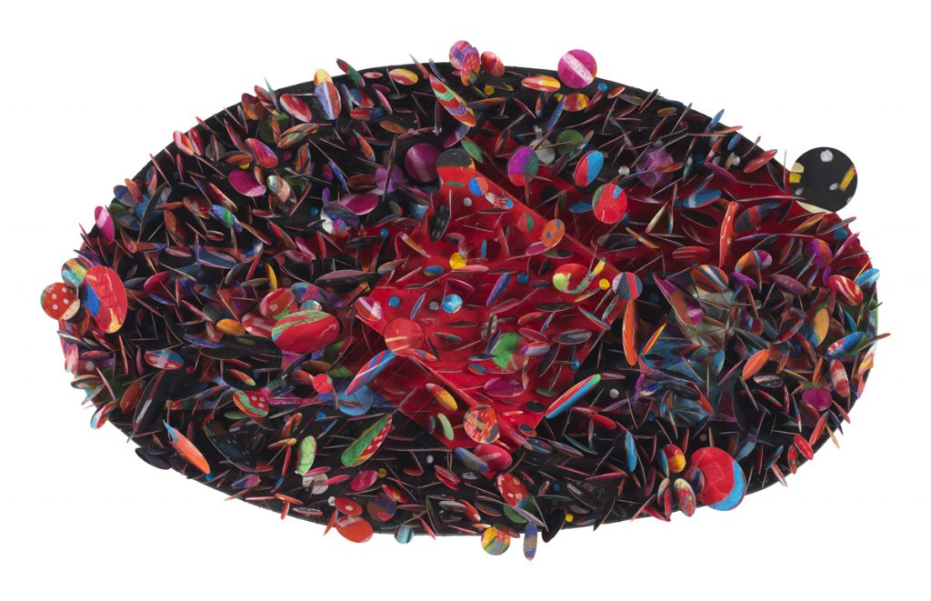 Untitled #5B (Krakatoa), 2007. Mixed media on paper collage; 13 × 22 × 4 in. Garth Greenan Gallery. Photo courtesy of the artist and Garth Greenan Gallery, New York. The first thing that I noticed in this piece is how much more dynamic and energetic it is than the first example; the piece is unapologetically abstract, whereas the previous work is much more subdued. Also observe the difference in time between the first and second examples. My theory is that she gained more confidence as her artistic vision matured. This resulted in her use of rich colors and unconventional materials, creating a sumptuous and ethereal quality. Pindell’s fascination by the cyclotron also influenced her rendering of this piece, accounting for the multi-dimensionality, the organized chaos of Untitled #5B (Krakatoa). Below is a much more recent work of Pindell’s: 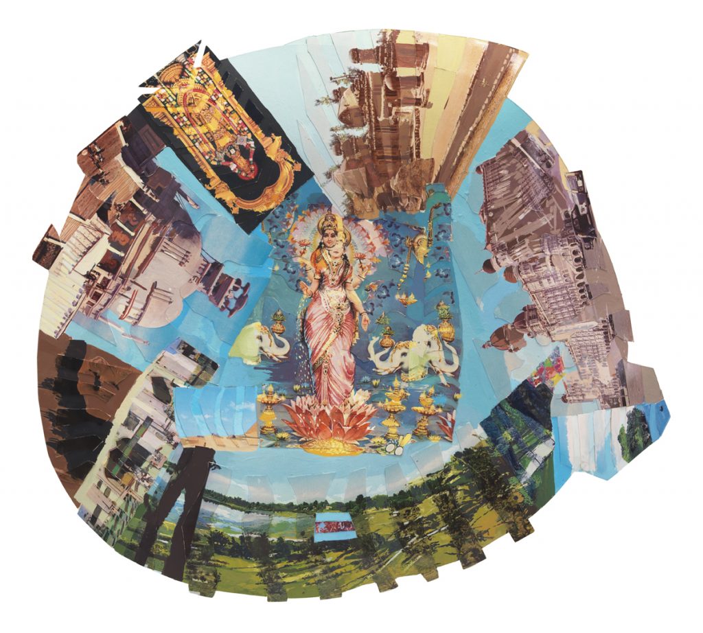 Autobiography: India (Lakshmi), 1984, mixed media on board. Courtesy of the artist and Garth Greenan Gallery, New York Here, Pindell has fully embraced abstraction in her juxtaposition of rural landscapes, architecture, and scenes of a traditional-looking Indian woman. She is technically creating “paintings,” but the collage form indicates her experimentation with form. Especially in her Autobiography series, Pindell has transformed her body (the Indian woman) into the work, literally and figuratively. The composition is technically weak with the focal point in the center, but the images that decorate the outer edges creates a sense of dynamism and continuity. Additional notes:
mcachicago.org/Exhibitions/2018/Howardena-Pindell www.howardenapindell.org/ youtu.be/GYfu8XgZP4s Abstraction and Mark-making
This exploration of both abstract and non-objective art was actually really challenging; I have a hard time grasping the true meaning of an abstract piece, and the idea of non-objective is just mind-boggling. So, I really had to push the limits of my cognitive and analytical skills. Abstract art still has an underlying meaning or significance greater than the actual piece. It begins with a subject from reality that the artist conceptualizes and incorporates in the essence of their work. Conversely, non-objective art is made purely for the sake of making art. The artist does not perform any sort of preliminary planning or designs. This is similar to the principle of aestheticism, but non-objective art is even more simplified: it’s not even expected to be aesthetically pleasing; non-objective art is simple expected to be. Willem de Kooning was inspired to create Lisbeth’s Painting when he observed his two – year – old daughter placing her paint-smeared hands all over his canvas. Abstract art embraces improvisation, and so this unexpected turn of events led to the establishment of his daughter’s handprints as the subject. The content, as near as I can tell, is the admonition of the quick, harried lifestyle that so many get caught up in. Obvious the frenetic, messy brushstrokes, the uneven blending, the splotches of smudge paint. These aspects of the painting fade to mere background noise, though, because of the small white handprints that run vertical down nearly the middle of the page. I could not even begin to tell you the purpose of Wavy Brushstrokes. I do not understand the reasoning of the artist; I have no knowledge of his thought process, which I guess is the whole point of non-objective art: it is human nature to overanalyze and—sometimes futilely—make connections. Non-objective art gives the mind of the viewer a rest, allowing for the visual senses to digest what is happening and take the artwork only at face value. There is no contemplation, no analysis, involved. But, is simply doing whatever feels right enough of a purpose to qualify a piece as Art? Where is the definitive line between non-objective art and, well, non-art? What are the qualities of a successful non-objective piece—or are there none, since the artist is not creating the artwork with the intention of attracting and engaging the viewer? 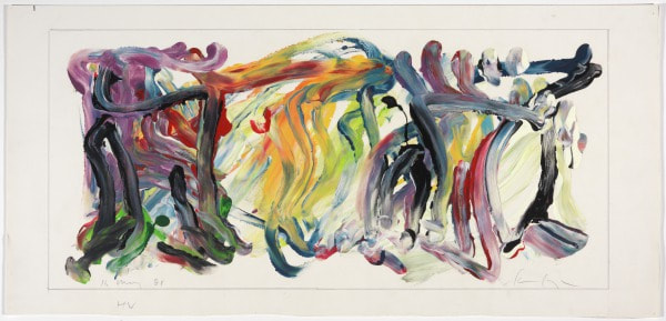 HV, May 16, 1981, Charles Clough, enamel and graphite on paper, 11 7/16 x 25 1/8 in, Modern and Contemporary Art collection HV very clearly falls into the Abstract Expressionism category because the artist, Charles Clough, is very intentional in his composition, which just so happens to result in an abstract design. Similar to the beliefs of the first abstract expressionists, Clough emphasizes dynamic, energetic gesture. He views art as a means to examine paradoxes, especially that of intentions versus desires. Therefore, HV may seem like nothing more than random strokes of paint, but the foundation for its conception was very meaningful. It is the tangible evidence of Clough's exploration of his subjective emotional expression. 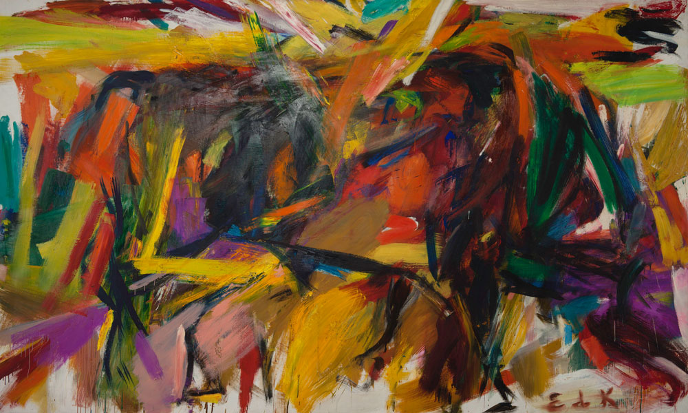 Elaine de Kooning, Bullfight (1959). Courtesy of the Denver Art Museum, Vance H. Kirkland Acquisition Fund, © Elaine de Kooning Trust. Mark-making: I chose this piece because the marks are very clearly defined, which creates depth within the piece. However, some areas are blurred, the colors smudged, which suggests a paradox of chaotic unity. The marks vary in length, but all are thick. No one line is simply vertical or horizontal; each individual mark either is a diagonal or contains some sort of turn. These marks were likely created at a fast pace, which is implied by both the quantity of lines and their seemingly careless quality. 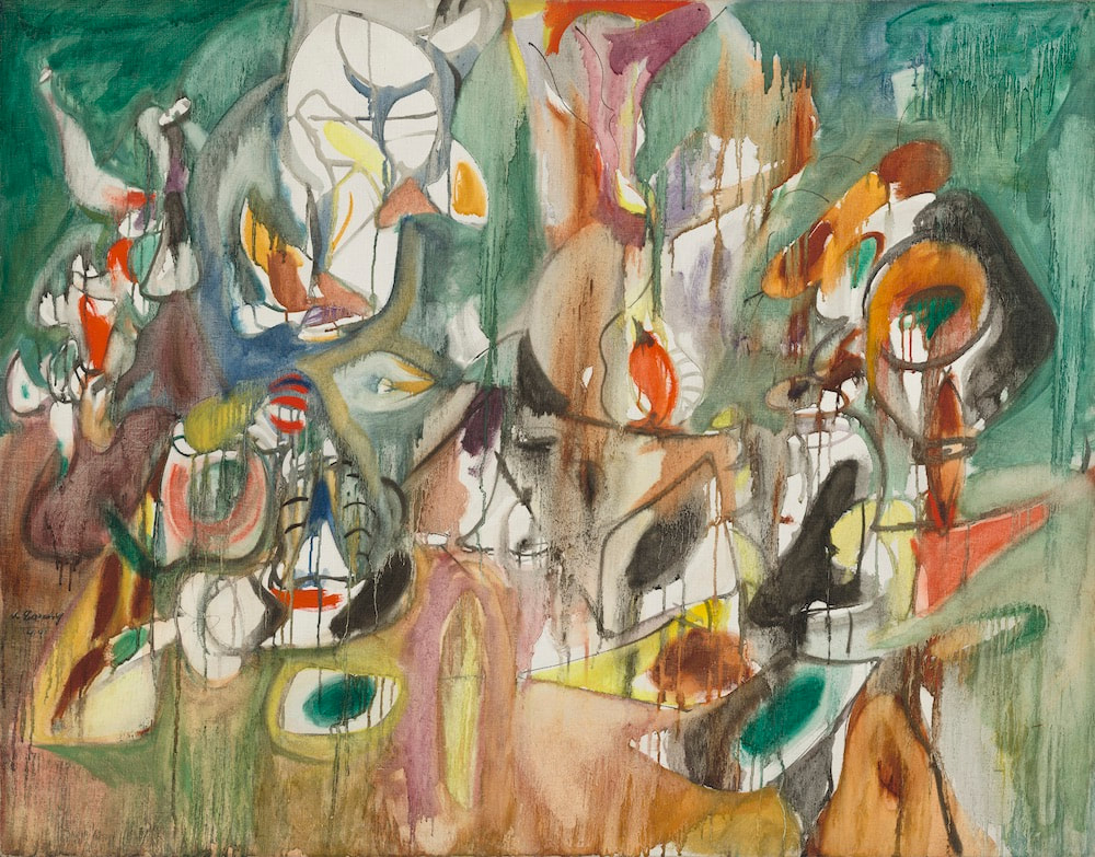 One Year the Milkweed, 1944, Arshile Gorky, oil on canvas, 94.2 x 119.3 cm Mark-making: Gorky uses many different kinds of marks in this piece, which is why I chose it; I like the contrast of the dripping paint with the otherwise solid and muted patches of color. The marks have blurred together, which creates continuity. The earthy hues suggest a pastoral scene, as do the forms that appear as a result of the thinner and more concrete marks. These marks likely took a long time to make, judging from the variations in color and multiple shapes. The process of creating the marks in this work probably started with the outlined white spaces, then built outward into the surrounding space. 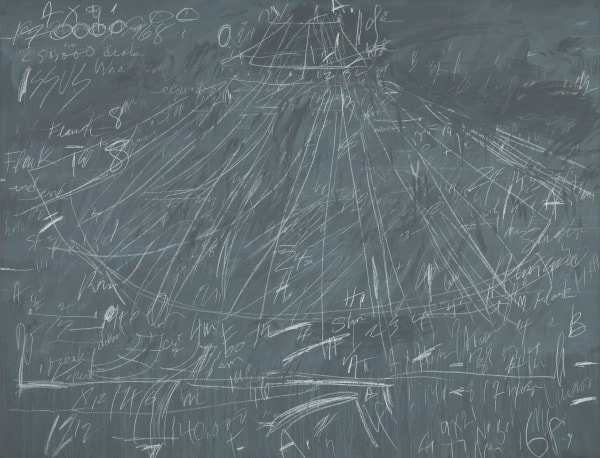 Synopsis of a Battle, 1968, Cy Twombly, commercial oil-based paint and wax crayon on canvas, 79 x 103 1/8 in, Lewis Contemporary Galleries, Modern and Contemporary Art collection Mark-making: The artist's use of lines in this piece is, in my opinion, very unique. Every line is similarly thin in width, but there is a variety of lengths and directions. However, the most eye-catching lines are the long ones that seem to radiate from the top center of the canvas. I feel like the artist was aiming for an old-school, battle-plan-on-a-chalkboard effect. The harried quality of the marks conveys the anxieties of a general, the sparse areas where it looks as if the marks have been wiped away hinting at mistakes and consequent revisions that have been made. I feel like the process of actually creating these marks took a long while, as there are many lines, each purposeful in its imperfectness.  237 Lafayette Street, 1978, Jennifer Bartlett, enamel over silkscreen grid on baked enamel steel plates, 38 x 142 in, collection of the Virginia Museum of Fine Arts Artist Use...: I interpret this piece as the artist making a conscious effort to defy the rule of thirds by emphasizing the middle square. Because of the time period in which this piece was created, Bartlett likely used this as a narrative to contradict traditional standards of successful art. The transfer of the image on the middle square among the collective squares is an abstract sort of continuity within the work. The use of various textures enhances the plainness of the houses. The white spaces between the small squares contrasts efficiently with the deeply pigmented sky, grass, and house.  Imperative, 1976, Lee Krasner, oil, charcoal and paper on canvas, 127 x 127 cm (50 x 50 in.) Artist Use...: I really find this piece aesthetically pleasing. I find the contrast of the irregular blank spaces with the surrounding marks really engaging; they encourage the movement of the viewer's eyes throughout the whole piece. Krasner also follows the idea of avoiding a centrally located focal point. The blank spaces also create the illusion of form, which adds depth. The goal of Krasner was probably to depict the fragmented nature of a black and white existence, punctuated by bursts of color or blank spaces of mundanity. 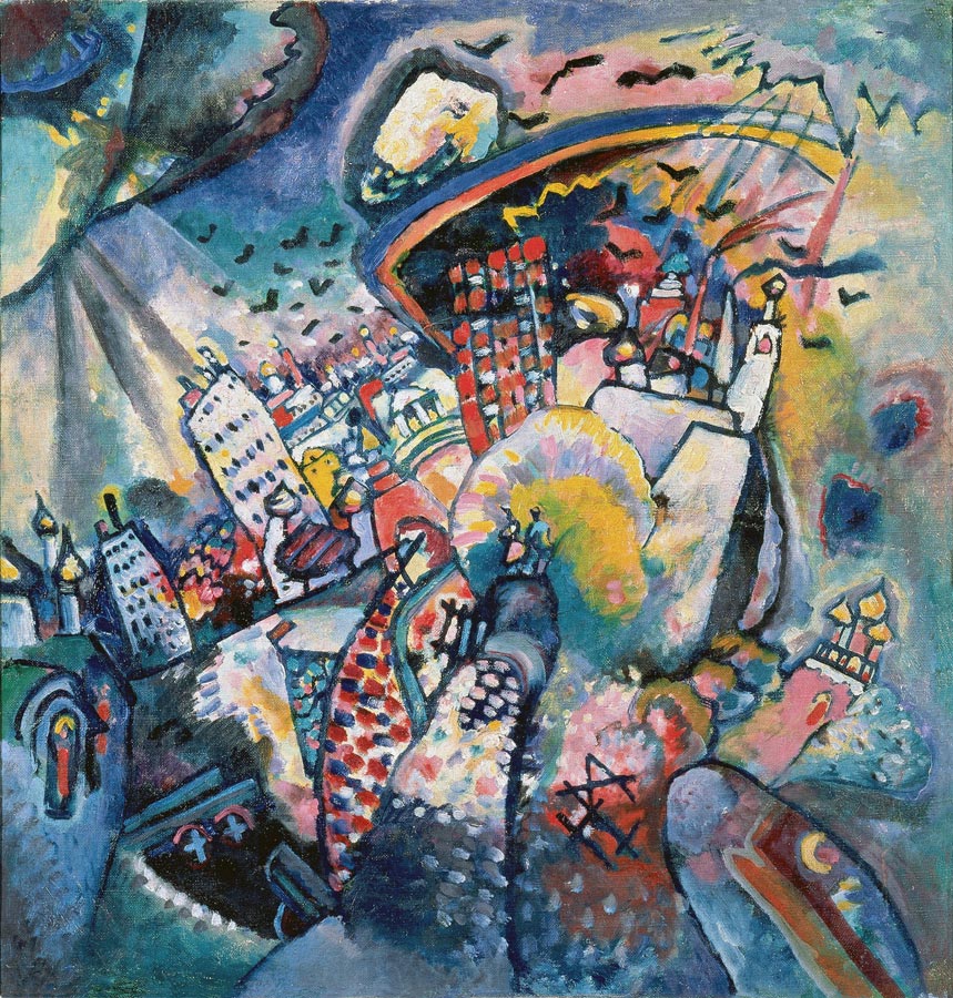 Moscow. Red Square, 1916, Wassily Kandinksy, oil on canvas, 20.3 x 19.5 in, Moscow, The State Tretyakov Gallery Artist Use...: Kandinsky's use of vibrant colors paired with areas of shadows and highlights creates a contrast within the piece that urges the movement of the viewer's eyes. The diagonal lines used to form the tilt of the shapes has a dynamic effect. Kandinsky's marks are curiously irregular and imperfect when up close (a theme among abstract artworks), but come together nicely when the viewer is farther away. Plus, most of the individual marks are multi-colored. In this, Kandinsky is attempting to capture the essence of Moscow and its inhabitants. He sees it as a vibrant, rich, multi-dimensional city. Kandinsky delineates the evolution of Moscow as a modern place, especially in how there are more detailed colors and buildings at the top of the central form-- this is the most recent version of Moscow, which is filled with life.
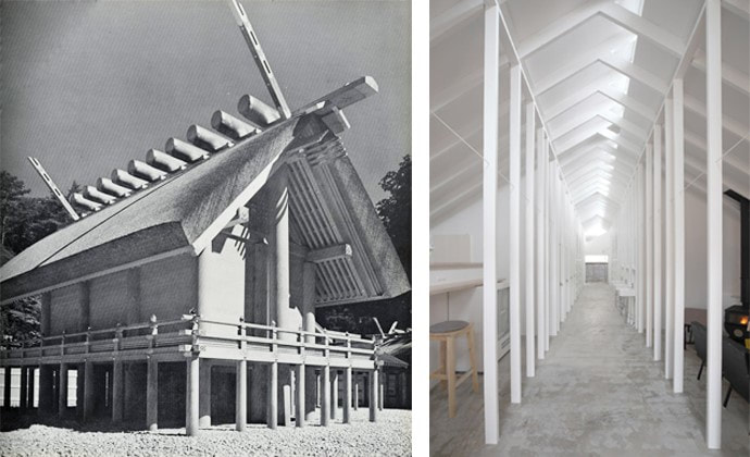
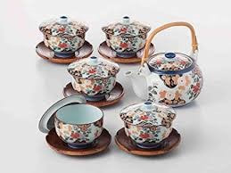
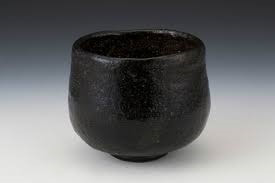
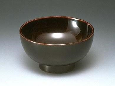
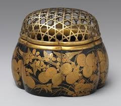
Related Resources Japanese Pottery: www.youtube.com/watch?v=9Xu3WymR6oc The Grand Shrine of Ise: www.isejingu.or.jp/en/ Japanese Aesthetics General Information: ntieva.unt.edu//download/teaching/Curr_resources/mutli_culture/Japan/Aesthetics/Japanese%20Aesthetics_Wabi-Sabi_Tea%20Ceremony.pdf plato.stanford.edu/entries/japanese-aesthetics/ This presentation was so cool! I was nervous that it would be boring because it seemed like more of a strictly scholarly lecture than the loose and conversational lectures we have done in the past, but it ended up being pretty interesting. I really liked how I could connect it to what we’re learning in Global right now about Japanese culture; it augmented the austerity and wholesomeness that permeates Japanese society. And, I remember from last year the lecture that Alex Norman gave, in which she talked about her fascination with wabi-sabi. Reflecting on that lecture with my current amount of knowledge makes the message more impactful and concrete. Honestly, I’ve always found Japanese art to be particularly attractive. Sometimes a little messy—and by messy I mean without the harsh edges and rigidity of some art movements—but soothing to look at. Tranquilizing. And now that I understand the Japanese principles of celebrating the mundane, imperfect, despondent aspects of life, I get why I am drawn to Japanese art: the content is so powerful that it extends beyond the confines of the artwork and captures the viewer’s attention; the stillness is so powerful that it relaxes the mind; the rawness is so powerful that it moves the subconscious to a state of profound silence. (I feel like I am reading way too much into this, but I thoroughly enjoy thinking deeply about these topics. Sometimes making connections that are tenuous seem substantial is the most helpful way to grasp a concept.) I find Tanizaki’s notions particularly thought-provoking, as I understand where he is coming from in his desire for an uncomplicated and subliminally melancholy society. However, I feel like the need for pitch-black ceramics and no electricity is a bit extreme; Confucian principles (Chinese philosophy, but still relevant) teach the significance of balance in life, no matter what the extremes to either side may be. I think that Tanizaki overlooked the fact that the lifestyle he promoted was an extreme aversion to frivolous desires—an extreme nonetheless—in his bemoaning of the decadent extreme that he feared was the result of Western immersion. Basically, I’m super grateful for this experience. I feel better knowing that I was presented with this lecture as a resource for both future Global and Art lessons. I might even consider picking a Japan-related topic for my two-page spread this quarter… maybe something to do with Tanizaki, or traditional versus modern Japanese architecture (which I would obviously narrow down and put into question form). I am looking forward to considering wabi, sabi, and yugen aesthetic principles in future projects. |
Archives
March 2021
Categories |
 RSS Feed
