|
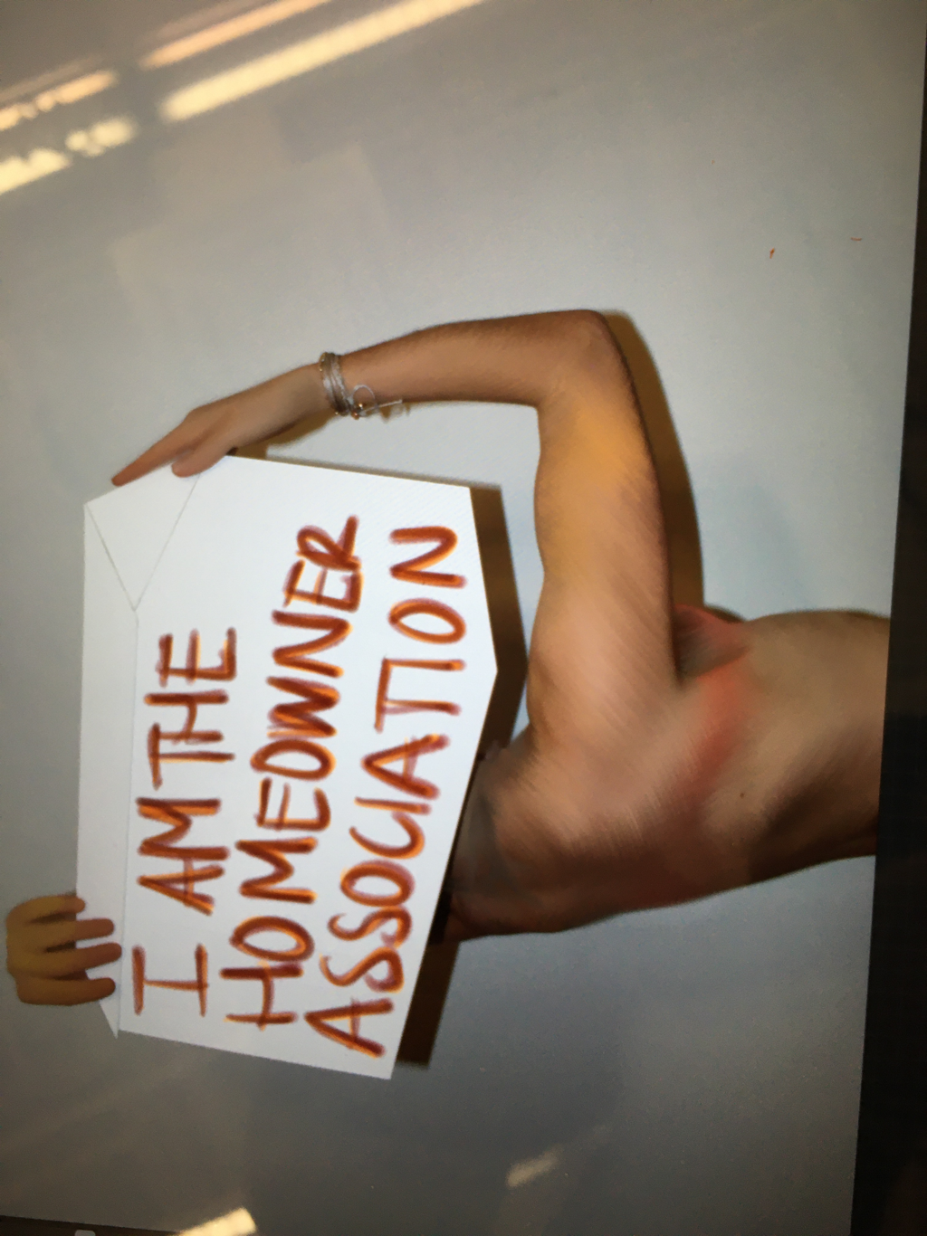
It's almost annoying how easy it is to click one simple button and erase 30 minutes of work. I did this a lot because I would start on a detail, such as adding an accentuating line, and then I would get carried away. After a while, I would realize that the work was either sloppy or not relevant to my content. It was a maddening process. Plus, I couldn't decide exactly how I wanted to include the text. Part of me want desperately to draw it onto the house itself because that was in my original plan; however, my initial sketch was done with the intention of working on paper, and this piece was put together digitally. So, incorporating the text onto the house was much too tricky with the angles and dimensions to be worth my time. I also wanted to find a way to bring continuity to the two different arbitrary colors on either side of the figure. I was content with the colors themselves because a palette of blues and pinks is a recurrent theme in my most recent works, but I wanted to unify them. The negative space above the house was bothering me, too, so I began to explore adding text in that way. I made up my mind that adding text along the top outline of the house would be the best use of words and space... but what was I trying to say? My original plan had a sort of melancholy feel to it, but nothing about the bold pose of the figure or vibrant colors seemed to corroborate sadness or despair. I realized that this piece is truly about empowerment and owning your own space. This is my house, and I have my own rules. Short yet meaningful -- very different to my longer, more poetic text in other works. I think it fits the style of this piece well, though. The last two images demonstrate my process of adjusting the dimensions of the picture itself to align with the right side of the page.
Overall, I am pleased with how this project turned out. I think it marks a sort of starting point for my interests in multimedia artworks and personal narratives.
0 Comments
 I spent more time adding accent colors to the body today because I want to add more arbitrary colors and blur the boundary between form and line. Also, I really like the aesthetic of the bright blue against the orangish skin. Blues, purples, and pinks are a recurring color scheme in my works that I intend on maintaining.
I spent some time brainstorming the type of text I want to incorporate. I came up with the following ideas:
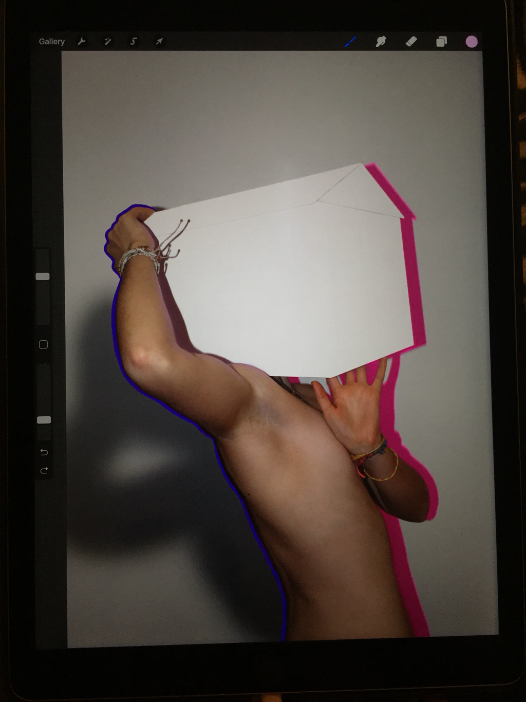
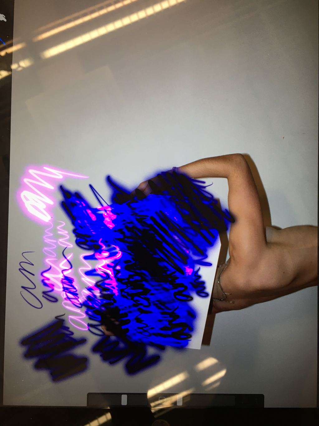
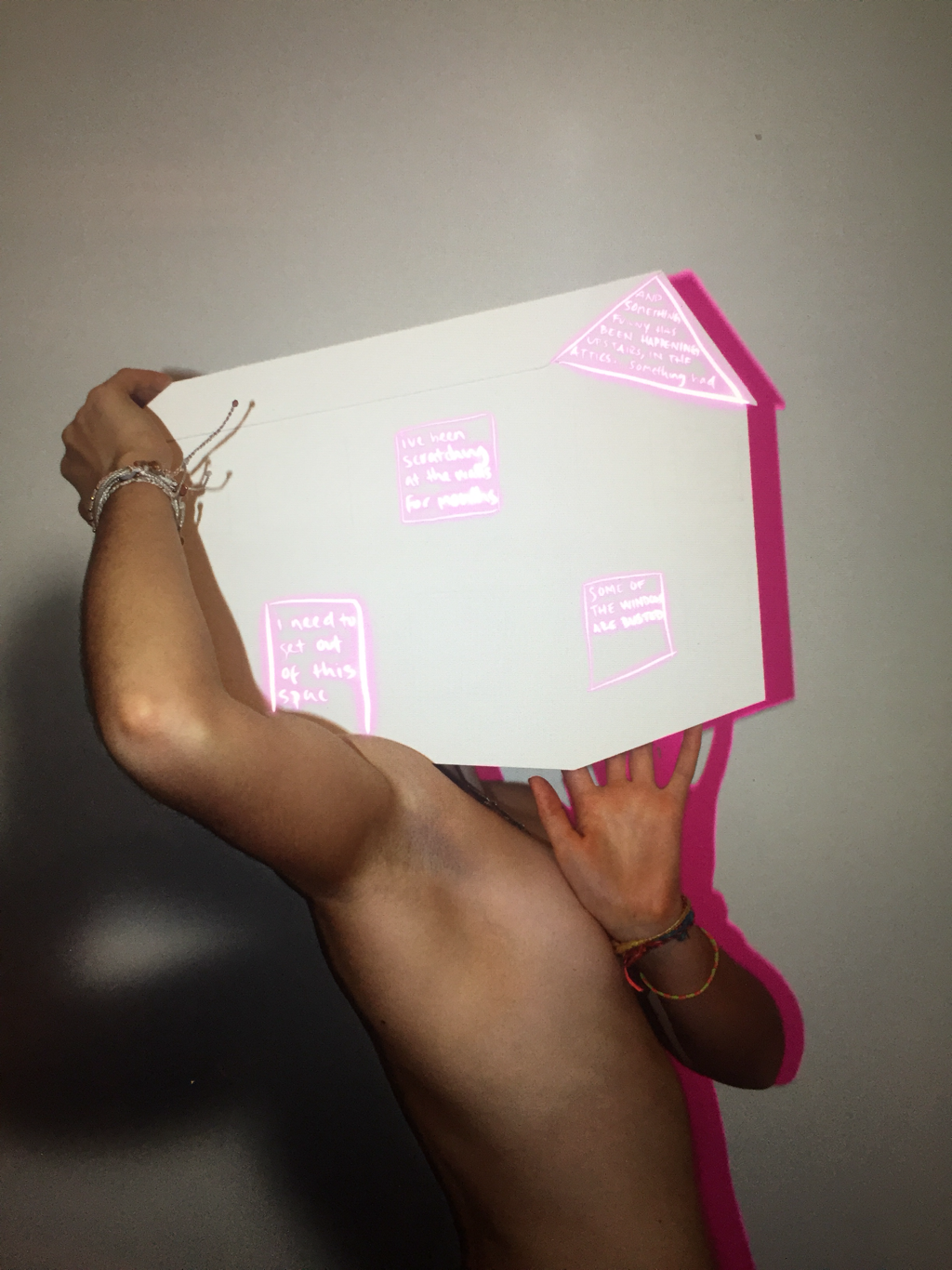 Editing this picture has taken longer than expected. I forget how easy it is to just play around with the different drawing utensils on the iPad, and then just delete it all with the click of a button. I added the pink shadowed when I edited the picture on my iPhone. I ultimately chose this one because it has a dynamic energy to it, and I like the way I am interacting with the house in a way that makes it seem 3D, rather than just a flat piece of cardstock. Right now, I am exploring how I want to incorporate text into the image itself, which is one of my goals for this project. I had initially planned on the text decorating the house like paint or siding, but that idea doesn't translate well into this specific image because of the way the arm blocks the left side of the house. I want to continue using pinks, blues, and purples, so I just added the glowy-pinkish writing to give myself a visual. I was thinking about what it would look like to make the text form the shapes of the door and windows because it would add to the dimensionality and sort of optical illusion of the house, but I haven't been able to find a technique that seems formal enough for the effect I am trying to create. I am going to spend some time figuring out exactly what I want to say, first, before I make a decision on the placement of the text. I think I want to communicate an idea about how your mind is your space, your house, and you should feel safe there. However, sometimes the foundation crumbles a bit, or the organization of the rooms no longer fit your style. This does not mean that you should be apologetic, but try to find the comfort in the vulnerability of opening yourself up to people, airing out the windows a little bit. Sometimes we want to just rip up our house, erase all the thoughts from our head and start anew, but that's pretty much impossible.
 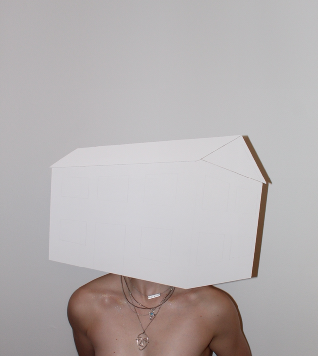  I had to completely remake my house before shooting these photos. I was struggling with linear perspective and figuring out the angles of the windows and such in my other house. Something wasn't quite adding up, though. I talked to Coach Hall. He showed me a trick for conquering linear perspective, and I realized that the right part of the house was not angled correctly, nor was it deep enough. For the sake of realism and precision, I decided to scrap the whole thing and restart.
These are my three favorite pictures from the photos I asked my sister to take for me. I understand that are revealing, and I will admit that they make me uncomfortable to look at. I do not want people to think any less of me for choosing such personal content to share with, essentially, the world. However, there is nothing overtly offensive about these pictures; my body is covered just as much as it is in a bathing suit. I usually shy away from looking at myself head-on because it has elicited such strong negative emotions in myself in the past, but I want to challenge this internal narrative. This is not an effort to suddenly decide how gorgeous and perfect I am and become conceited, but at least acknowledge that there is something sort of raw and powerful and a little bit beautiful about vulnerability. Plus, it is about coping with the space you live in, and making it your own. Your mind is your home, your body is your home. Collectively, they (YOU) are worthy of respect in the most basic manner, but it often takes us a long dialogue of questions and answers to reach this understanding. This is the essence of my piece. 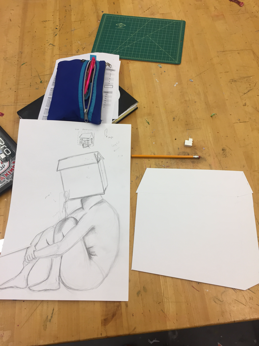 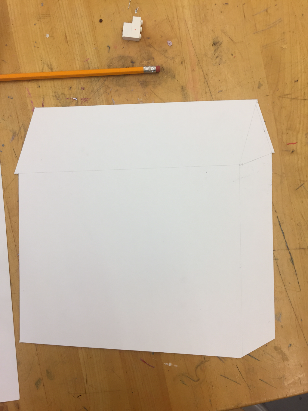 I started my 3rd in-class project today. I had gotten this idea before break started, but I hadn't really solidified my thoughts. I was inspired by an NF song in which the lyrics are "Somethin' funny’s goin’ on up in my house/Yeah, I started thinkin' maybe I should move out/You know, pack my cart, take a new route/Clean up my yard, get the noose out." When I listened to those words, I envisioned a person with a house instead of a head. The more I thought about it, the more I wanted to give this mental image I had created a tangible quality; I wanted to make it into Art.
We don't have very long for this project, so I am going to keep the main body very simple -- maybe just a black outline of the contours and light shading. I was talking to Coach Hall about collage, and he suggested incorporating a photographic element. I would like to use photography for the small figure balancing on the knee, whose purpose is to write words onto the house as if giving it a new paint job. The concept is revitalization; "home" (as in self) improvement. I will likely model for both figures. The house will probably be plain, but I carefully planned the dimensions because I want for there to still be an element of realism in the dimensions, plus I like the idea of distorting the perception of depth. For emphasis, think that the small person will be the only thing in color. I have not decided on what exactly I will be writing on the house, but something original. It will likely not be a poem (as I usually write), but more of an essay or reflective piece. I went ahead and designed the house first so that I could base the dimensions of the two people off of it. Hopefully this plan works out well. I am hoping to create something simply crafted yet powerfully designed. Kelly Malka is not a conventional contemporary artist, but I enjoy the work she produces. Malka a Los Angeles - native freelance designer and illustrator. She attended Parsons School of Design from 2011 - 2012. In 2015, Malka then received her Bachelor's degree in Fine/Studio Arts with an emphasis in Design. During her time at USC, Malka acted as the Director of Graphic Design for USC's Concerts Committee and Program Board. Career
 Image for the Golden State Warriors Playoff's Campaign 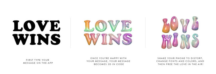 Promotional image for the Adobe: Free the Love campaign 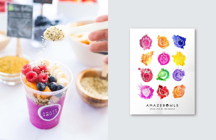 Social media publicity image and design for the Amazebowls promotional effort Endeavors in Illustration and Digital Art Her illustrations reflect an enduring fascination of the female form and nature, as well as messages of empowerment and motivation in regards to mental health and world issues. 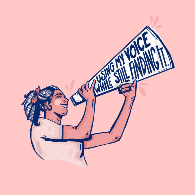 Voice. Digital illustration. I am immediately drawn to the simplicity of this image. I usually work in more vibrant colors, but the blues and pinks are similar to those I have worked with in my most recent artworks. I absolutely adore the clarity of the image and crispness of the lines; I highly value craftsmanship. The composition is simple yet strong, which makes me really focus in on the message: "using my voice while still finding it." I love the connection between the text and images. I think that words should be used to not only further define the work for the viewer, but also add to its meaning. The face of the woman is not quite cartoonish, so it maintains a professional finish -- even though there aren't many details. The use of both thin and thick diagonal lines makes the image dynamic and therefore more interesting, which I appreciate. It communicates active energy, as if the woman is in the process of raising up her megaphone/bullhorn thingy and speaking truth. The content is one of empowerment and growth, which is something I find myself drawn to in creating my own works. Looking at and analyzing this illustration and its effectiveness as a public - awareness piece has inspired me to embolden my text. I also the block shading technique used on the woman because it is relatively quick but still creates form and depth in the figure. This piece truly leaves me with a sense of encouragement and inspiration, and I want to carry that feeling forward and try to pour it into my own future work. 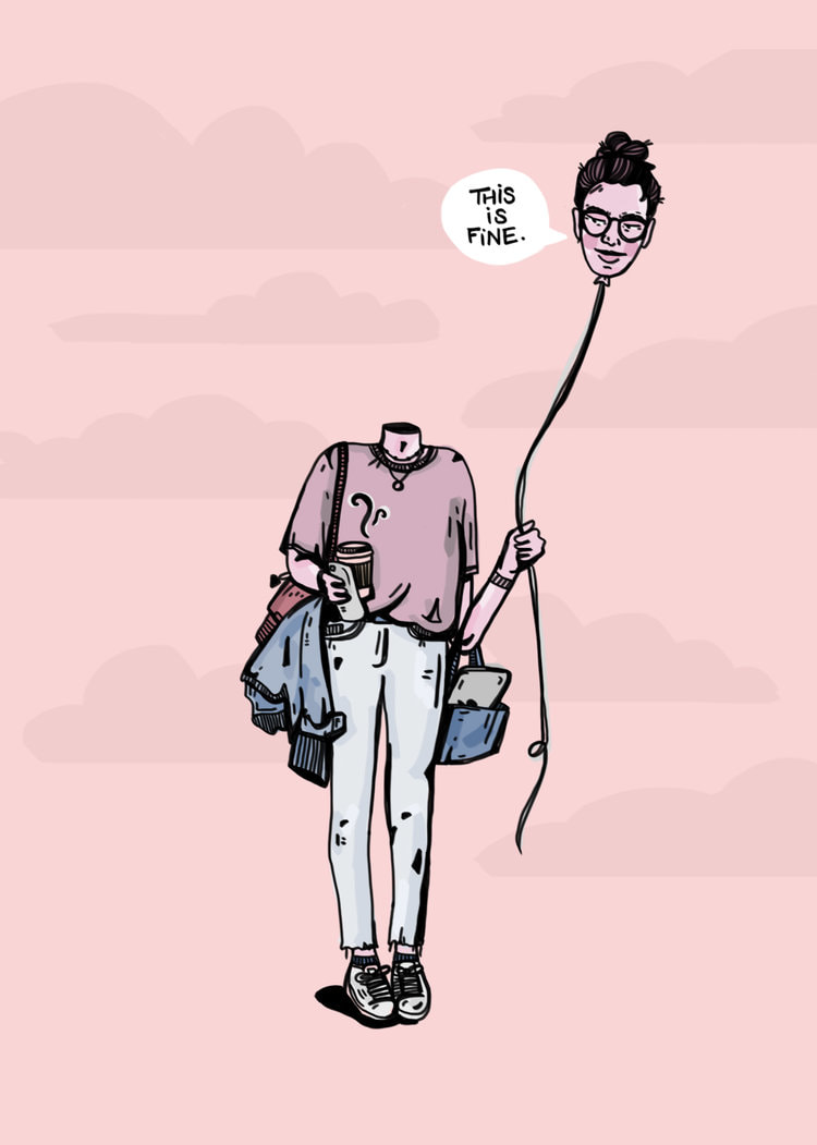 TLoosin' it. Digital illustration. This illustration does not have a traditionally formal composition, but I nonetheless think it is a particularly powerful piece. Again, the muted tones are different than the sorts of deeply saturated values I usually gravitate towards, but I like the humility of the whole work. The subtle clouds in the background create the illusion of space and depth. The sort of controlled messiness of the shirt, the open bag, and the jacket slung under an arm are important connecting points with the viewer. The way the toes of the figure point inward conveys a sense of shyness, of turning into one's self. But, the head on the balloon -- the head in the clouds -- has a sort of side-eyed smirk, as if to contradict the shyness of the body language. I find it especially interesting that the string attached to the balloon-head is sort of lax, rather than taut; the person's mind is comfortably detached from her body, but not actively pulling further away. The text suggests that purpose the woman is unsatisfied -- but with what? What better alternative does she have? And, what is she looking at -- or, what is she looking away from? This simple illustration begs answers to these questions, of which there are many more. It is sensational that such a minimalistic design can resonate with someone on such a personal level. Similar to Malka's work here, I hope to explore how an individual can encounter mental health challenges on a daily level, rather than those raw, intimate periods of loneliness in which we sometimes find ourselves trapped. This girl is dressed and ready to tackle the world, even if her mind is bobbing around in the vague space above her shoulders. I would like to experiment with the notion of detachment and severance between the mind and body. 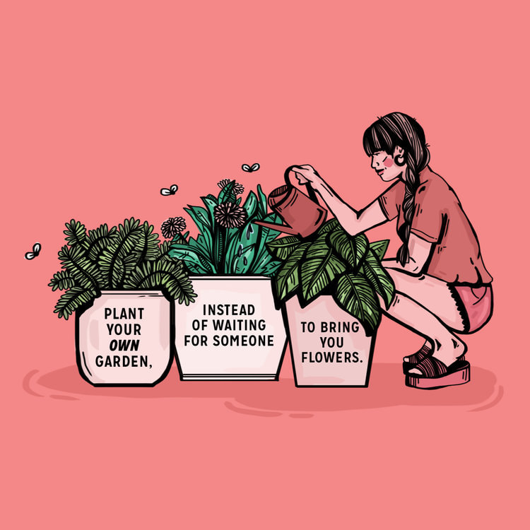 Grow ur garden. Digital illustration.
Here, the colors are reaching a saturation level closer to my preferred style. I like the asymmetrical arrangement of the boxy plants and more rectangular figure. The flies are sort of reminiscent of trash, but I appreciate how they are placed a little bit away from the plants to widen the perimeter of space actually used. The colors used for the woman's clothes and skin are altered just enough to distinguish her from the background without losing the sense of unity in similar colors. I couldn't help but notice the way the heels are lifted in the wedges, as if she is actively balancing in her crouch while watering the plants; it adds to the active energy, as if this is more than simply a still-life of living organisms, but a snapshot of a simple moment of mindfulness. The words are centered nicely within the frame of each pot, and I find the message of individualism and self-empowerment very heartfelt. There is an extra layer of meaning in having text referring to tending to your own garden while depicting a woman doing just that -- it begs the question: what is your garden? Also, the varied line weight contributes to capturing form, despite the simplified marksmanship. I especially appreciate how the shirt appears to billow out in a slightly-uneven tuck. Malka manipulates the line quality to effectively achieve this effect. I would like to pay closer attention to how one small line truly adds to (or detracts from) the whole piece. Malka's illustrations are boiled down to their rawest forms that even a tiny misplaced mark could misconstrue the entire image, and I appreciate her diligence. I hope to take these lessons in perceptiveness and clarity of message into the future. |
Archives
March 2021
Categories |
 RSS Feed
