|
Kelly Malka is not a conventional contemporary artist, but I enjoy the work she produces. Malka a Los Angeles - native freelance designer and illustrator. She attended Parsons School of Design from 2011 - 2012. In 2015, Malka then received her Bachelor's degree in Fine/Studio Arts with an emphasis in Design. During her time at USC, Malka acted as the Director of Graphic Design for USC's Concerts Committee and Program Board. Career
 Image for the Golden State Warriors Playoff's Campaign  Promotional image for the Adobe: Free the Love campaign 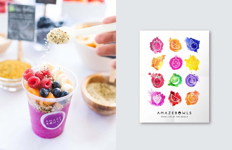 Social media publicity image and design for the Amazebowls promotional effort Endeavors in Illustration and Digital Art Her illustrations reflect an enduring fascination of the female form and nature, as well as messages of empowerment and motivation in regards to mental health and world issues. 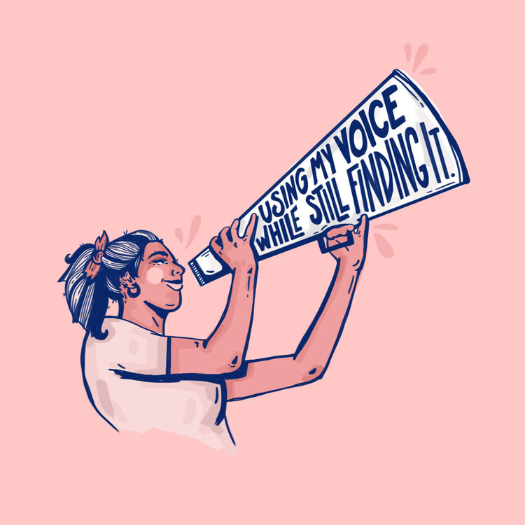 Voice. Digital illustration. I am immediately drawn to the simplicity of this image. I usually work in more vibrant colors, but the blues and pinks are similar to those I have worked with in my most recent artworks. I absolutely adore the clarity of the image and crispness of the lines; I highly value craftsmanship. The composition is simple yet strong, which makes me really focus in on the message: "using my voice while still finding it." I love the connection between the text and images. I think that words should be used to not only further define the work for the viewer, but also add to its meaning. The face of the woman is not quite cartoonish, so it maintains a professional finish -- even though there aren't many details. The use of both thin and thick diagonal lines makes the image dynamic and therefore more interesting, which I appreciate. It communicates active energy, as if the woman is in the process of raising up her megaphone/bullhorn thingy and speaking truth. The content is one of empowerment and growth, which is something I find myself drawn to in creating my own works. Looking at and analyzing this illustration and its effectiveness as a public - awareness piece has inspired me to embolden my text. I also the block shading technique used on the woman because it is relatively quick but still creates form and depth in the figure. This piece truly leaves me with a sense of encouragement and inspiration, and I want to carry that feeling forward and try to pour it into my own future work. 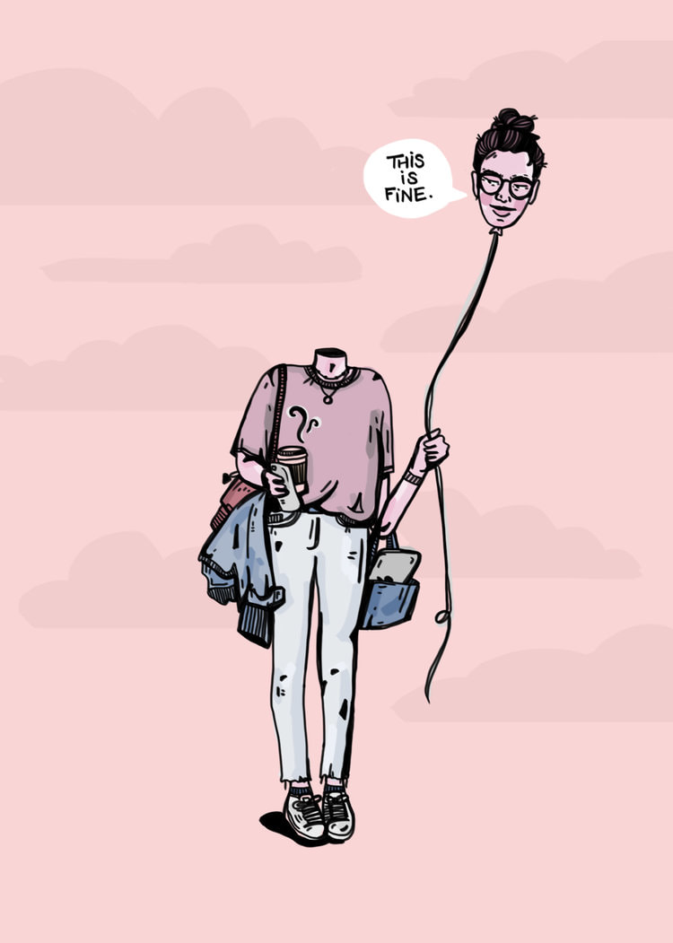 TLoosin' it. Digital illustration. This illustration does not have a traditionally formal composition, but I nonetheless think it is a particularly powerful piece. Again, the muted tones are different than the sorts of deeply saturated values I usually gravitate towards, but I like the humility of the whole work. The subtle clouds in the background create the illusion of space and depth. The sort of controlled messiness of the shirt, the open bag, and the jacket slung under an arm are important connecting points with the viewer. The way the toes of the figure point inward conveys a sense of shyness, of turning into one's self. But, the head on the balloon -- the head in the clouds -- has a sort of side-eyed smirk, as if to contradict the shyness of the body language. I find it especially interesting that the string attached to the balloon-head is sort of lax, rather than taut; the person's mind is comfortably detached from her body, but not actively pulling further away. The text suggests that purpose the woman is unsatisfied -- but with what? What better alternative does she have? And, what is she looking at -- or, what is she looking away from? This simple illustration begs answers to these questions, of which there are many more. It is sensational that such a minimalistic design can resonate with someone on such a personal level. Similar to Malka's work here, I hope to explore how an individual can encounter mental health challenges on a daily level, rather than those raw, intimate periods of loneliness in which we sometimes find ourselves trapped. This girl is dressed and ready to tackle the world, even if her mind is bobbing around in the vague space above her shoulders. I would like to experiment with the notion of detachment and severance between the mind and body. 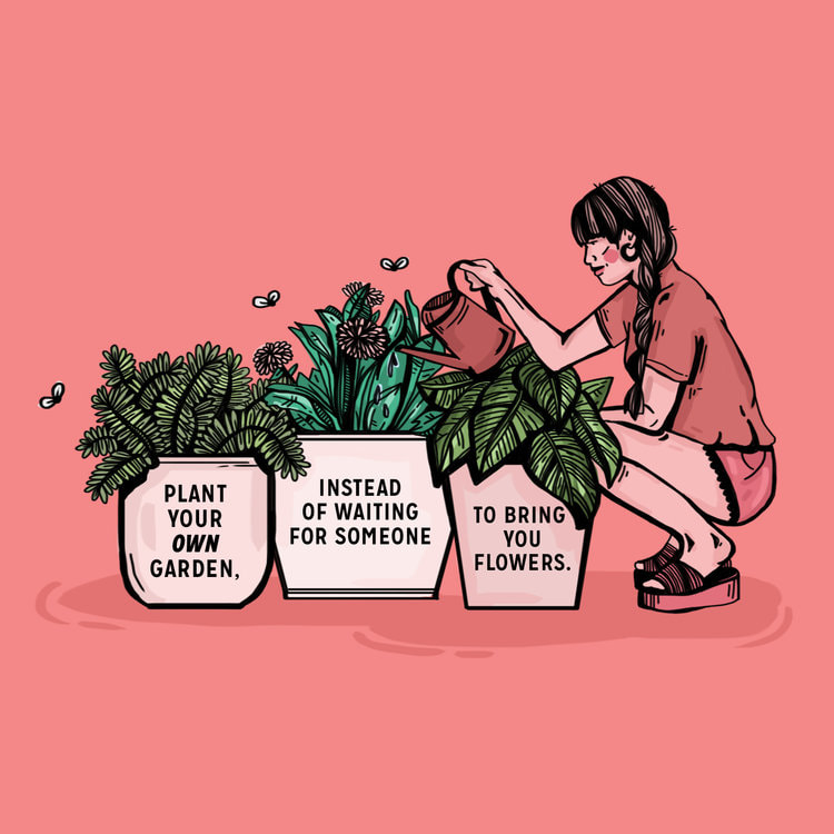 Grow ur garden. Digital illustration.
Here, the colors are reaching a saturation level closer to my preferred style. I like the asymmetrical arrangement of the boxy plants and more rectangular figure. The flies are sort of reminiscent of trash, but I appreciate how they are placed a little bit away from the plants to widen the perimeter of space actually used. The colors used for the woman's clothes and skin are altered just enough to distinguish her from the background without losing the sense of unity in similar colors. I couldn't help but notice the way the heels are lifted in the wedges, as if she is actively balancing in her crouch while watering the plants; it adds to the active energy, as if this is more than simply a still-life of living organisms, but a snapshot of a simple moment of mindfulness. The words are centered nicely within the frame of each pot, and I find the message of individualism and self-empowerment very heartfelt. There is an extra layer of meaning in having text referring to tending to your own garden while depicting a woman doing just that -- it begs the question: what is your garden? Also, the varied line weight contributes to capturing form, despite the simplified marksmanship. I especially appreciate how the shirt appears to billow out in a slightly-uneven tuck. Malka manipulates the line quality to effectively achieve this effect. I would like to pay closer attention to how one small line truly adds to (or detracts from) the whole piece. Malka's illustrations are boiled down to their rawest forms that even a tiny misplaced mark could misconstrue the entire image, and I appreciate her diligence. I hope to take these lessons in perceptiveness and clarity of message into the future.
0 Comments
Leave a Reply. |
Archives
March 2021
Categories |
 RSS Feed
