 Basic Facts:
CV: Museum Collections and Exhibitions
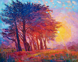 Cypress Fog, 2019, oil on canvas, Erin Hanson, 50 x 40 in. Cypress Fog, 2019, oil on canvas, Erin Hanson, 50 x 40 in. Immediately, my eyes are drawn to the sun and how the marks radiate around the center of it. I am enchanted by the rays which appear to be carved out of the paint. The trees are also wonderfully rendered in different values and tones to convey the illusion of distance and placement of the light source. 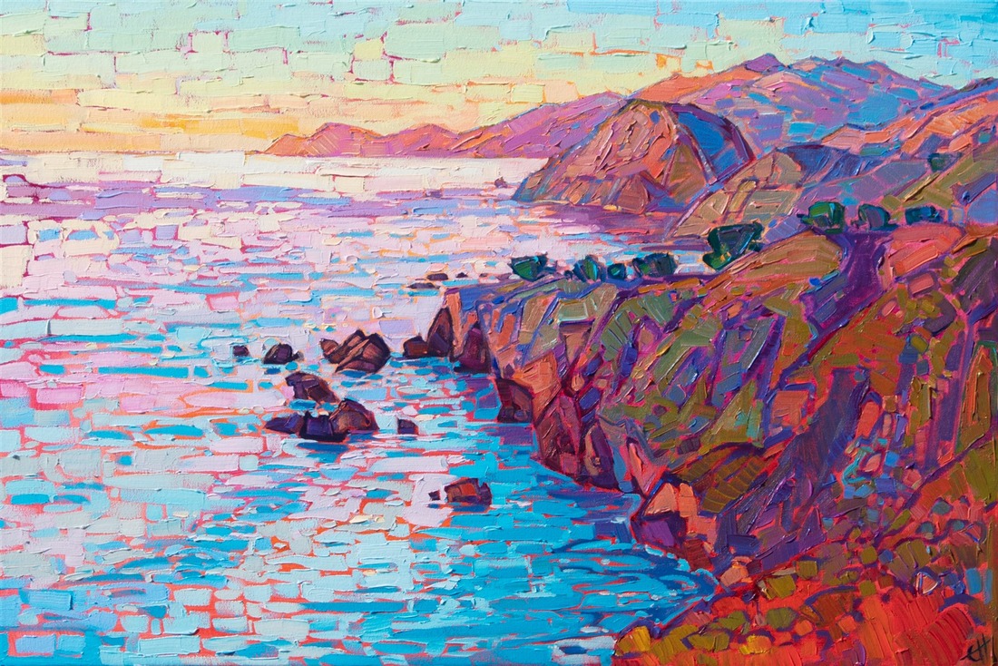 Coastal Lights, 2019, oil on canvas, Erin Hanson, 30 x 20 in. Coastal Lights, 2019, oil on canvas, Erin Hanson, 30 x 20 in. I am especially drawn to the brick - like horizontal strokes along the left side of the canvas, which effectively contrast with the horizontal marks on the coastline. The orange undertones of the ocean nicely compliment the top layer of blues. All of the above information comes from Erin Hanson's website For additional information, view the videos below: Reflection:
I am absolutely stunned by Hanson's work. Her art is powerful and beautifully rendered. I cannot imagine being so completely dedicated to Art from practically the very beginning of her life, in addition to exploring the field of biology in college. I admire her commitment to mastering technical color theory and application before comfortably developing her own style. Learning about her progression as an artist has encouraged me to more seriously consider the factual basis of aestheticism and how colors interact with one another in an effective manner. I usually kind of ignore or avoid the science of Art, but I now understand that, ultimately, this aversion will only hurt my artistic progress. Also, I am usually not of fan of simply natural landscapes because I find them mundane and over - done, but the vivacious Open - Impressionism of Hanson's truly inspire a deep emotional response within me. I feel like the colors are leaping from the canvas and encompassing me in an envelope of radiant natural beauty and peace. I love the positive energy and inherent dynamism. Also, it is obvious that Hanson is purposeful in her composition in her use of continuity and the rule - of - thirds, among other techniques. I appreciate her desire to create an interaction with the artwork and the viewer, rather than simply presenting it as is. I can relate to this sentiment because this is also one of my top priorities as an artist. In regards to medium, I am immensely intimidated by her use of impasto, limited colors, and only one layer of paint. I aspire to attain that level of confidence in my artistic vision. I am now curious about Open - Impression and would like to explore this emerging style in future projects. I think I would enjoy oil painting because I am fond of the ability to continuously mix and manipulate paints, not to mention the dimension that oil paint affords, which you simply cannot recreate with acrylic paint. I was also surprised that I was so drawn to Hanson's work because I am usually a fan of subtly blended, smooth forms. Obviously, Hanson prefers more mosaic - like strokes, but the purposefulness of each individual mark is captivating. I adore the fact that you can zoom in one of her pieces and observe the pure integrity of the colors she uses, since her palette usually consists of about four, and then back away to see how the nuances come together. Hanson is, in short, a breath - taking artist. After researching and reflecting on her work, I hope to continue exploring the many resources associated with oil painting and Open - Impressionism. Additionally, I am further encouraged to utilized color properties to mindfully choose and mix my paints.
0 Comments
Leave a Reply. |
Archives
March 2021
Categories |
 RSS Feed
