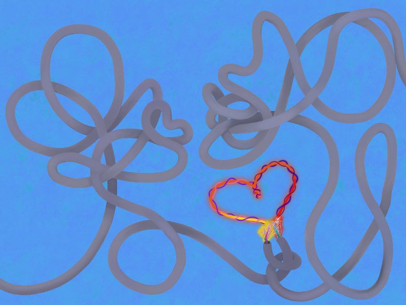
 This project was much more labor-intensive than I initially thought it would be. I spent a long time on the iPad trying to figure out how to manage the settings for line quality and blending the colors just right so that I could effectively create the optical illusion of 3D wires on a flat surface. Plus, I had to spend a lot of time erasing and refining the edges of the wire because I had to transfer the digital drawing onto another canvas in the app I was using so that I could create a textured background. The frayed wires also took an extremely long time because I had to erase all of the white background from the original image, and then I enhanced it to increase the saturation and vibrancy of the colors, as well as added my own colors. It took me a while to figure out what I wanted to do with the space where the wires met. My original design was for sparks to form a heart, but I counted figure out a way to make the sparks look realistic enough for my taste. Instead, I decided to explore the drawing tool that created a glowing effect on the line, so that it seemed almost electric. I made the energy from the two different wires different colors to convey the dichotomy of the interaction. I was content with how the colors produced a gradient effect, although it took a lot of blending and erasing to seamlessly go from yellow to orange to red. The sort of tendrils of light that wrap around the more central light/energy was not part of my original design; I added them after finishing the one main fusion of the energies between the wires and realizing that the space still seemed too plain and simple. It also took me a long time to settle on a background color and texture. I wasn't sure if I wanted for the background to be a point of contrast (the blue) or continuity (the yellow). Ultimately, I am a sucker for starkly contrasting colors because I feel like they add a bit more intrigue and catch the eye, so I settled on the blue. Plus, the blue made the gray wires really pop. I chose a light blue because this also made the gray wires appear darker, which for some reason makes sense to me. I decided to add a simple texture to the blue for the sake of depth, so that it doesn't appear like the wires are on a plain canvas. Overall, I am satisfied with how the piece turned out. It isn't especially profound, but I think the experience was nevertheless meaningful.
0 Comments
Leave a Reply. |
Archives
March 2021
Categories |
 RSS Feed
