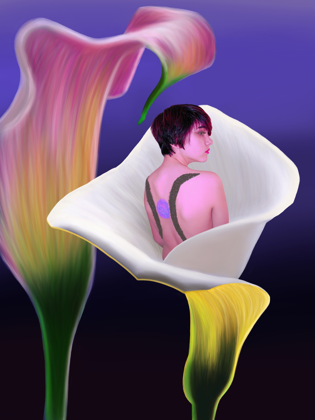
 I am finally satisfied. I reincorporated the photograph of Lily. I am keeping the glitter-part of the symbol. I also blurred the skin and heightened the hair, which makes the skin fit into the flowers more. I also added a gradient style to the background, which I think ties in all of the colors nicely while also contrasting with the bright whites and yellows.
5 Comments
Ada Rigsby
3/30/2020 11:44:20 am
This is so cool Liz! I am extremely impressed with the flowers and also think that the photograph of Lily alone is really powerful. Really well done! I have one small suggestion, but its really random. I was wondering how it might look to either make the whiter flower a little larger or the figure a little smaller so that it looks like the body and base of the flower line up a little more. I know that's kinda weird, but just an idea. Overall, I love this!
Helen Hall
3/30/2020 11:50:54 am
I love the flowers so much! I like how you made the flower behind slightly blurred so it looks like its farther behind. I think the photograph is well incorporated and I don't know if it was purposeful but having her hair match the pink of the flower looks cool. I'm wondering if maybe there is a way to add the brush like texture on top of the photograph without covering it so it looks more cohesive, but as it is the figure stands out. Overall, it looks really cool!
Rylan Karjane
3/30/2020 01:23:52 pm
Your creation is so cool. I love how you continually meld photography, which you are clearly very talented at, and digital art. The texture of the flowers is really good and the atmospheric perspective you utilize with the flower in the background being more blurred that the one in the foreground shows a phenomenal understanding of perspective techniques. The only comment I have is that the figure kinda feels a bit removed from the rest of the piece. I don't really know how to explain it and it is super minor.
shreya malani
3/30/2020 01:25:17 pm
I LOVE IT!!!! I’m so happy to see how the final final product turned out and I love the gradient that you added. Incorporating lily into the flower itself turned out very nice as well because it seems so effortless that she actually just happens to be in the flower :)). I also appreciate how much time you put in to get the petals of the flower, I know that can be so tough using an Apple pencil. The only actual comment that I have is perhaps considering flipping the gradient so that the purple is at the bottom to contrast the green and yellow. I love it liz :)
Julianne Zielinski
3/30/2020 05:02:17 pm
I love this piece, I remember you talking about the concept and I was kind of confused but I think it came together really well. I love the ombre colored background and the way you incorporated your sister into the flower, I think it looks super smooth and natural and has great composition. My only polish would be the color on the design on her back because it seems more muted than the other colors in the photo, however I'm not aware of the content connected to it so that may be purposeful. The flowers themselves are beautiful and I'm extremely impressed with them. Overall amazing piece ((: Leave a Reply. |
Archives
March 2021
Categories |
 RSS Feed
