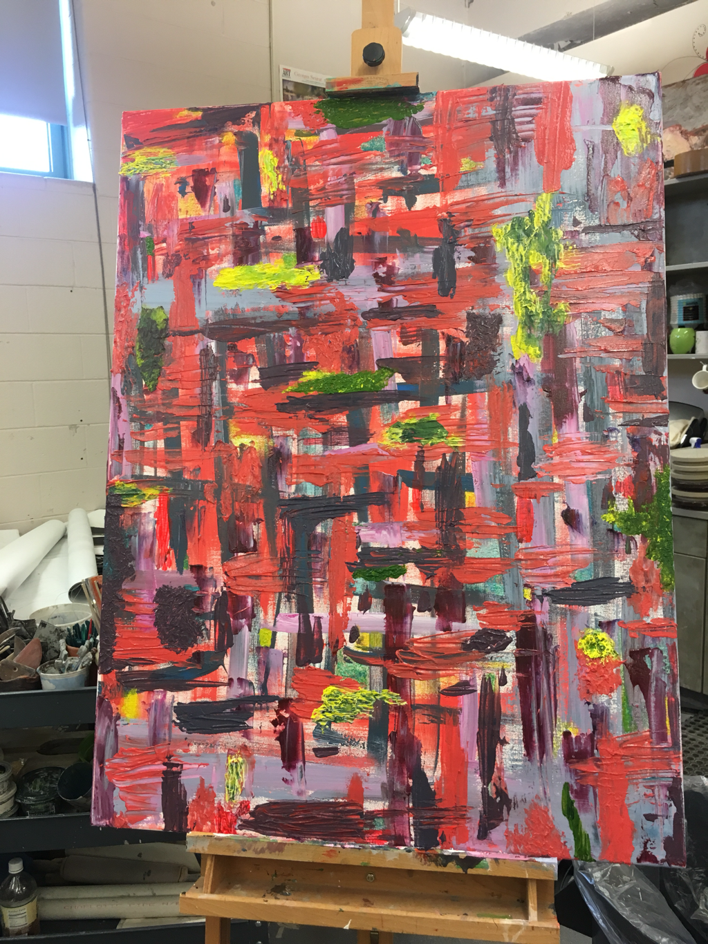
 I came in today and realized that the gel medium I had used was not, in fact, the clear - drying kind. Frustrated, I found the same can I had mixed the greens and yellows for my paints skins in and added some more yellow. Then, I filled in each part of the paint skin where I saw the shot gel. I really liked the contrast of the yellow with the purples and pinks, so I began to add them and slightly transparent shades of yellow in the negative spaces. It still done feel done to me, however. I talked to Mrs. Mosley for a hot second, and we decided that I should: 1. fix the large - ish blob of purple on the left - hand edge and 2. add some more of the neon pinkish color that I added in a few sporadic vertical strokes. I think that the use of neon colors and contrastingly dark hues emphasizes spatial relationship and establishes a foreground and background. I would really like to explore how this concept could be applied to abstraction. I will try to get into the studio before Wednesday, which is (unbelievably) our critique day!
1 Comment
MM
2/24/2019 07:47:38 am
Where's the final post? Great process/commentary, otherwise... but get that final reflection in there! Also, include your practice paintings in order to pull the whole project together and to reflect on all aspects of the techniques you tried and conclusions you made. Make your final photo a bit more formal (straight on - cropped - etc.) Leave a Reply. |
Archives
March 2021
Categories |
 RSS Feed
