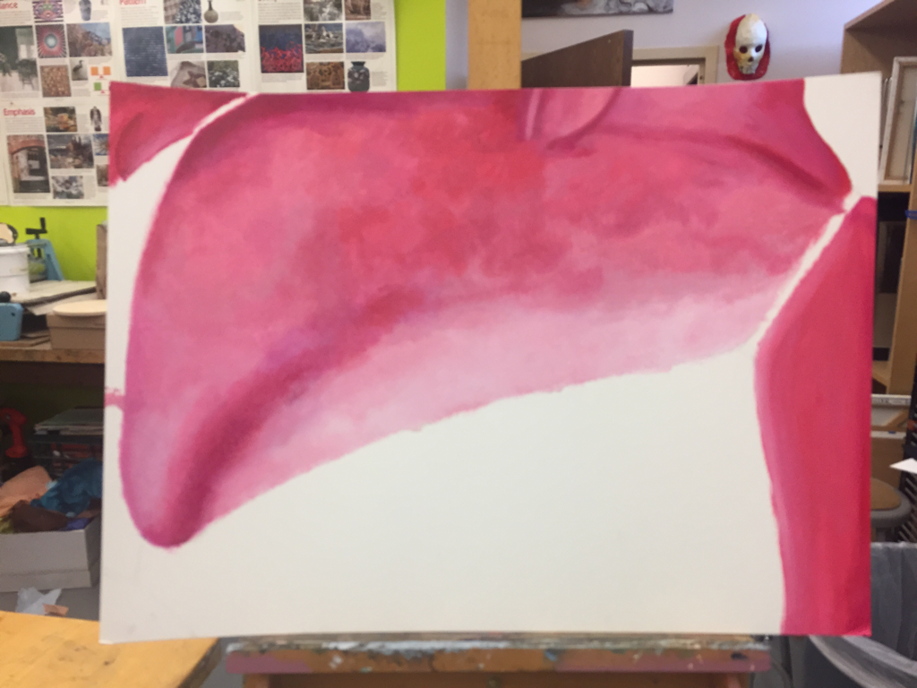
 Well, I made HUGE progress today! I am super excited that I got a nice base coat for the whole figure. I do not like how the chest varies so much in areas of deep amaranth to dull cerise. Also, I realized how long dab painting takes, so I took a short - cut and used extremely broad brushstrokes on the right arm. I plan on going back over that area with dabs to add speckles of color to continue with the same soft variations in value and tone which add an interesting aspect of abstraction to the rest of the painting. I am trying to go over all of the muted areas of light mauve with more punch - y and ruby - ish tones. I definitely also need to resolve the shadows because I do not believe they are dark enough to add an effective contrast to the highlights. I began to work on an easel this class, rather than hunching over the table, and I am extremely glad with this decision. I also took more time to look at my reference image because I regretted not doing so during the last class. Coach Hall and I had a brief discussion as to what i am going to do for the bra. He suggested keeping in mind a technique which would retain a quality of flatness, such as my plan to mount a paper with the painted bra onto this piece. He also suggested considering exploring the use of the same fabric of the actual bra. I did some quick googling, and I think it would be feasible to buy iridescent taffeta fabric. I think that I need to make a decision as to how central I want for the necklaces and whatever writing I end up using to be. I will brainstorm over the weekend, and we'll see how it goes from there.
0 Comments
Portrait of a Friend: part 1/3 raw images These are the images from my photo - session with Spike and Lily today. I am going to be selecting either two or three to refine and edit for my friendship series, the subject of which is Spike. The other two parts will include my mom and me. 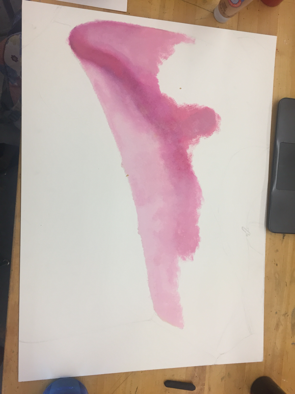 I made some slight progress today. I spent a lot of time mixing my paints and trying to figure out if I want more of a purplish pink or redish pink undertone. My indecision resulted in me applying a flat - looking layer of basically just dull pink. I don't like how disunified the colors are, but the general values are a good starting place for myself. Also, I am working from an image on my computer, so I need to remember to reference that image more often so that the image does not get lost in my head. I am still struggling with how I am going to portray the opalescent bralette: do I want to continue with my original plan of painting it on a separate piece of paper, cutting out the shape, and mounting it over top of this image? Or should I do it all on the same page. I am vacillating, and the indecision is really bothering me.
|
Archives
March 2021
Categories |
 RSS Feed
