ELIZABETH CELENTANO
  • Home
  • About
  • Art Gallery
  • Photo Gallery
  • Blog
    • Head and Heart 2019-2020

Reflection

6/4/2021

0 Comments

 
Well, the school year has officially ended. It hasn't actually sunk in yet that I will never have a class at Maggie Walker again. These four years have both dragged and flown by -- and same for this past year. It was certainly unexpected and unprecedented. I am sad we had to have virtual school, but I nevertheless feel I was able to make the best of it, and especially for art class. I am very happy with my art class experience this year; I feel like I really found my passion and niche, and it's gratifying to know I can make ambitious pieces if I set my mind to it and work hard, all the while balancing other responsibilities. I've always felt a bit lost when it comes to my theme, but this year, I was able to hone in on a specific idea and just work on exploring all the different ways I could express it, which I truly enjoyed. I would have loved to be in the art room making art, surrounded by friends, but alas, my bedroom has sufficed. I hope I am able to continue to make art, whether that may be just drawings in a sketchbook, or making gifts for people, or actually working on full-blown independent projects. Sometimes, it's difficult for me to take the time to just make art for the sake of making it, like when it isn't for an assignment, because of this gnawing fear that I should be doing something better or more productive with my time. However, if I've learned anything this year, it's that if you enjoy doing something that is engaging and challenges you, then you are getting something out of it, and it is therefore productive. This is the mindset I hope to carry with me into the next phase of my life. I'd like to think I will keep up with this website, but the reality is I will probably only remember I have it, like, once every few months and update it sporadically. Still, it's cool to scroll back through my posts all the way to September 2018 and see my progress. I am proud of the hard work and time I've dedicated to this class, and I am forever grateful to the lessons it has taught me about individuality, perseverance, and the nature of art-making. 
0 Comments

Experience: Inca Culture

4/30/2021

0 Comments

 
Information from Dr. Jeanette Nicewinter + Additional Resources

Notes: 
  • Inca civilization of Peru lasted c. 1425 to 1532 CE 
  • art consisted of metalwork and ceramics, but most notably, textiles 
  • designs: geometrical shapes, incredible level of detail 
  • most of art destroyed by European invaders due to monetary gain or religious reasons 
  • influenced by art of earlier Chimu civilization and improved upon it --> own distinctive style that was technically superior to any other Andean culture (even master metalworkers of Moche civilization)
  • art was standardized (same forms and designs, like the checkerboard), but this did not inhibit its quality 
    • motifs that signified Incan society 
    • localities still had some degree of freedom over their own specific variations of Incan art
    • craftsmen worked in ayllus to create work for the empire
      • ayllus specialized in a specific type of art 
      • acllas: Chosen Women, specialized artisans working on jewelry and clothing for nobility and Sapa Inca 
  • Incan art did not include representations of themselves -- almost always used colorful geometric designs and abstract symbols to represent animals and birds 
  • pottery: used natural clay with added materials like mica, sand, pulverized rock, shell 
    • no potter's wheel, so made by hand 
    • before firing: clay slip added, vessel painted, incised, reliefs added
    • fired in kilns, pits, or open fires: oxidizing method to create lighter pottery or reduction method to create black wares
    • ceramics mostly for practical use 
      • urpu shape: bulbous, long neck, flared lip, small handles, pointed base for storing maize 
        • standardized sizes based on content volume 
        • mostly decorated with zig-zags or dots 
      • paccha: hollow tube shaped like a foot plough, placed into ground so maize beer could be poured into it during ceremonies so they would have a good harvest 
    • metalworks: objects with precious metals like tumi (ceremonial knives), lime dippers, jewelry, figurines for Incan nobles 
      • gold: sweat of the sun; silver: tears of the moon 
      • gold and silver used for religious pieces, like natural phenomena and places Incans thought were sacred (sun, moon, stars, rainbows, lightning, waterfalls)
      • masks representing Inti (god of the sun) and Mama Kilya (goddess of the moon)
        • most famous lost Incan art: gold statue of Inti represented as a small seated boy known as Punchao; kept in the Temple of the Sun in Qorikancha at Cuzco, but statue hidden after Spanish conquest and never found again 
    • Qorikancha garden dedicated to Inti
      • everything made of gold and silver
      • large field of corn, life-size models of shepherds, llamas, jaguars, guinea pigs, monkeys, birds, insects made out of precious metal
      • only thing to survive: some golden corn stalks 
    • more examples of textiles than other crafts - Spanish chroniclers made drawings, dry environment preserved 
      • use cotton, alpaca + llama wool, superior + rare wool of vicunas and guanacos (exclusively for Inca nobility)
      • fine cloth = symbol of wealth and status, could be used as tax and currency 
      • best textiles even more valued than gold or silver 
      • incan weavers most accomplished than any others in the Americas, up to 120 wefts per cm 
      • mostly women were weavers, but in Cuzco finest cloth made by male specialists called quipucamayocs 
      • main colors: black, white, green, yellow, orange, purple, red -- came from natural dyes 
        • specific associations: red = conquest, rulership, blood; green = rainforests and its inhabitants, ancestors, rain, plants; black = creation and death; yellow = maize or gold; purple =Mama Oclla, founding mother of Inca race
      • checkboard motifs, repeated patterns (tocapus)
      • abstract symbols: felines, llamas, snakes, birds, sea creatures, plants 
      • clothes usually had square designs and a triangle at the neck
        • ex: standard military tunic
  • 1500s European invades melted down, destroyed, stole many Incan artworks + actively repressed their culture, discouraged textile designs associated with royal power (many indigenous people were continued anyways --> perseverance = how many Incan designs and motifs survive today, why modern Peru is able to maintain that cultural integrity) 
    • art in a tradition that has endured: Inti Raymi, celebration of the Sun -- Inca descendants create elaborate costumes with rich cotton textiles, offer gifts like food and jewelry to Sun
​Images:
Picture
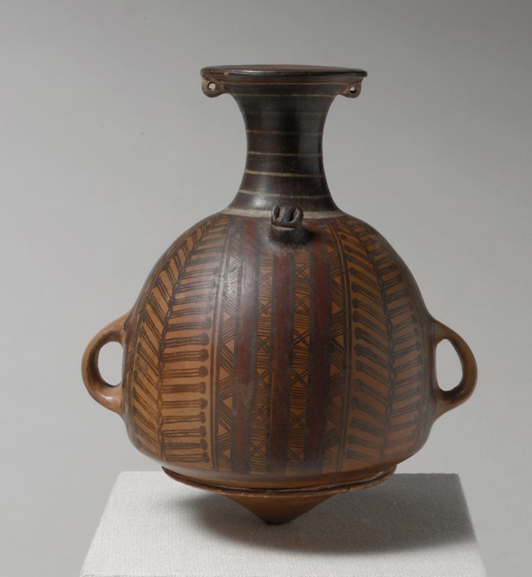
Storage jar or urpu, 15th–early 16th century, Inka, ceramic, 21.9 x 18.8 x 14.6 cm (The Metropolitan Museum of Art)
Picture
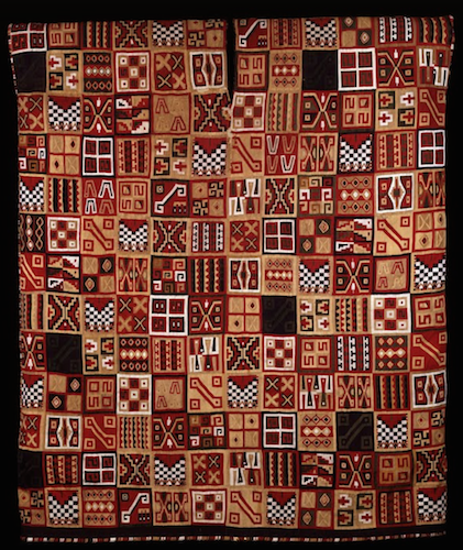
All-T’oqapu Tunic, Inka, 1450–1540, camelid fiber and cotton, 90.2 x 77.15 cm (Dumbarton Oaks, Washington D.C.)
Picture
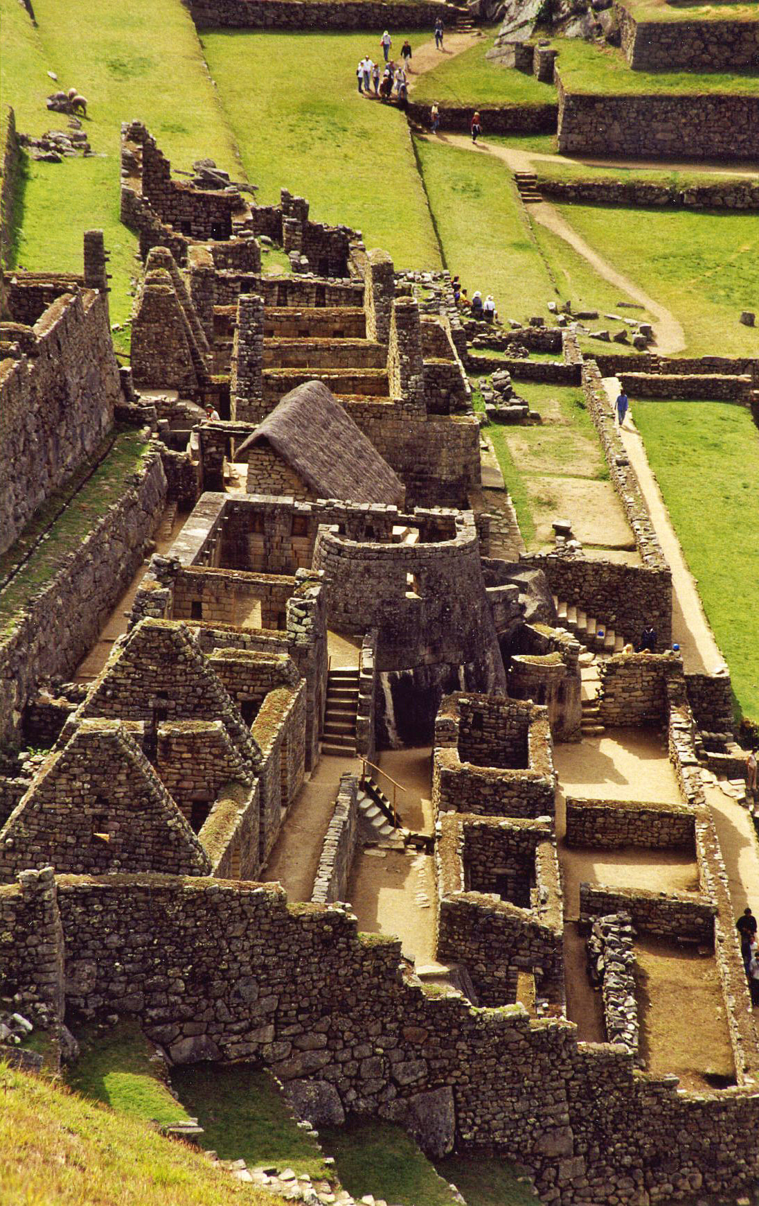
Temple of the Sun at Macchu Picchu
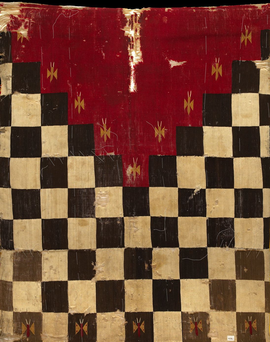
Picture
Inca military uniform
Picture
Inti Raymi Celebration 2020
Reflection / Connection to my own art:
It was super cool to learn about Incan culture, especially since South America was only a brief part of my 10th grade history class. It's so sad that the majority of Europeans just blatantly disregarded their works and actively tried to suppress their culture. I am so grateful that some artifacts remained because this culture was truly revolutionary in their understanding of artistic principles and appreciation for skilled craftsmanship. I didn't realize how carefully they balances practicality and freedom of expression in their artworks. It was absolutely mind-blowing to learn that some pieces of textile were more valuable to them than gold and silver, especially considering these metals are literally called "precious". The level of detail the weavers were able to attain in their textiles is so impressive. I appreciate the geometric patterns and abstract shapes, too. I wouldn't be opposed to exploring a similar style in my future works, as I tend to gravitate towards realism; I think focusing on the abstract could allow me to express the same theme I am currently working on (where home is, the connection between the mind and body) in a very different way. I also have never worked with textiles before, and I think it could be really interesting to try and actually do a weaving and just get some real hands-on experience to be able to fully appreciate the amount of time and attention textile artworks require. I think I could be good at this because I naturally have an eye for detail, but I could also see myself becoming impatient with the process and frustrated if it didn't turn out exactly like I had imagined. Nevertheless, I am glad to have had the experience of this lecture and looking at some additional resources to gain a greater appreciation for Incan culture. 


Resource Links: 
Inca Art - World History Encyclopedia
Inca Art Forms | Discover Peru (discover-peru.org)
​
Introduction to the Inka (article) | Inka | Khan Academy
0 Comments

Process: 1st Q3 In-Class Project (cont.)

3/26/2021

0 Comments

 
I had to meet with Coach Hall so he could help me figure out the perspective for the windows and door because I was struggling a lot. But, he helped immensely, and I was finally able to start actually adding the colors. Now, I'm working the details of the windows and door, and then I'll have color in the areas around them to make sure the integration isn't choppy. I'm happy with progress so far, and I'm excited to be almost done. 
0 Comments

Process: 1st Q3 In-Class Project (cont.)

3/19/2021

0 Comments

 
I'm still working on blending the colors on the heart to make them smooth and vibrant before I move on to the windows and door. I still have details on the middle to left part of the heart, but I'm making steady progress.
0 Comments

Awareness: Jim Warren

3/17/2021

0 Comments

 
Picture
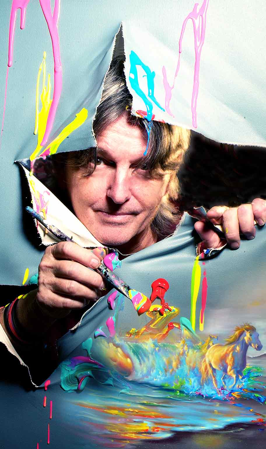
Jim Warren began painting and selling his art in high school over 50 years ago. Now considered a “Living Legend of the Art World” much of Warren’s oeuvre is steeped in surrealism, portraying dreamlike, illogical and fantastical scenes with realistic details. 
  • types of art (according to his website): fine arts, portraits, Disney fine arts, illustrations 
  • first steps into the art world = taking up drawing at the age of 2.
  • While in high school, Warren considered careers ranging from artist to magician to rock star. He did not decide to be an artist until 1967. He began working in surrealistic fantasy in 1969.
  • early 1970s: traditional oil paint on stretched canvas -- won first place awards at large outdoor art shows in California.
    • won first place at his first art show in 1975.
    • 1976 painting “Sexual Explosion” banned from many exhibitions during the 1970s --> new life in 2011
  • inspired by master painters like Dali, Rockwell and Rembrandt, but mostly self-taught
    • one of his favorite mantras comes from Dali’s attitude: “to Hell with the rules, paint what you like”
    • captivated by Rockwell’s realism and ability to tell stories with his expressive characters
  • the ‘80s: pursued high school dream of painting album cover art --> painted hundreds of magazine illustrations, movie posters, book covers
    • album covers for stars like Alice Cooper, Prince and Bob Seger
      • won a Grammy Award for best album package for the cover of Seger's “Against the Wind,” which topped the Billboard 200.
      • album covers + other illustrative work --> pushed him to paint ideas or subjects he would not have thought of attempting (ex: had never painted horses until art director of Capital Records in Hollywood commissioned him to paint cover of "Against the Wind" --> now regularly creates works with horses)
  • the ‘90s = new focus on the environment and saving the earth
    • “Earth – Love It or Lose It” received critical acclaim, featured on numerous magazines, billboards and shirts, popular visual representation for the global environmental movement.
  • mid-90s: began painting famous actors and incorporating celebrities and friends into his work (refers to them as “personalized paintings”) --> painted Juliette Lewis, Wyland, and Michael Parnell
  • 2004: collaborations with Disney released as fine art prints --> continues to paint own unique interpretations of Disney characters
  • 2009: began painting celebrities for the Fame-Wall project in New York and Hollywood
    • paintings of: The Beach Boys, John Stamos, Kelsey Grammar, Kristin Chenowith, Brooke Shields and others.
  • also collaborated with fellow Park West artist Michael Godard in 2009: combined Warren’s fantasy and "alluring style" with Godard’s "lighthearted art."
  • most recently = experimenting with abstract painting; wasn’t until 2013 that he switched over to acrylic paint -- could still paint realism while also exploring more abstract styles.
**Notes from:
www.parkwestgallery.com/the-wonderfully-surreal-art-of-jim-warren/
www.parkwestgallery.com/artist/jim-warren/
**Artworks from:
Jim Warren - Grammy Award Winning and Disney Fine Artist


Some of My Favorite Artworks from his Website: 

**Note: These artworks are made to be reproduced, so they are not labeled with sizes because they can be reprinted as "high quality, limited edition Giclée on canvas prints. They are available in three sizes: 18×24″ (small), 24×30″ (medium) and 30×40″ (large)."
I stumbled upon Jim Morrison's work by doing a Google search of "surrealist painters." One of his vibrant, eye-catching pieces popped up, and I proceeded to spend the next hour looking at all 16 pages of Fine Arts work he had posted on his website. 16 pages of pieces under only 1 of 4 categories of types of art in his portfolio (the other categories being portraits, Disney fine arts, and and illustrations). Many of his works are reiterations of the same ideas: the beach, animals (especially horses, dogs, and cats), vibrant colors which create high contrast. 
Why I like each of the above images: 
1. Heavenly Skies
  • ​​the dynamism of the waves
  • the bright contrast of the water with the sunset 
  • how the hands seem to be gently reaching towards the sun  (especially how the top hand fades into a cloud) and the allegorical reference to the hands of God --> a unique take on a scene (sunset on the beach) that is often trite
2. Dance to the Music
  • interaction with space: how the hand at the top right corner is breaking through the imposed barrier of the painted canvas and revealing another "layer" (and how those layers interact: the "wave of music" spilling through the tear)
  • how the woman's dress blends into the dynamic, swirling strokes of color
  • the high contrast of the paint strokes -- reds, blues, purples, greens -- layered over a muted background 
3. Jim Morrison's Door 
  • implied form of a door is very realistic (also the scale: elongated - makes for a unique composition because usually canvas are elongated horizontally, rather than vertically)
  • how the different images flow into each other (the microphone cord --> lightning --> horse)
  • the way the light shines on the horses, almost as if they are made from sunbeams
  • again, the high contrast of the forms with the more muted background 
4. Hitchcock's Birds
  • high contrast between highlights and shadows on the figure
  • the way the head is shattered so that pieces of the head blend in with the birds
  • composition: how the largest bird is slightly off-centered, the hand to the mouth 
  • concept: reminds me of my recent works with "headspace" imagery 
  • Inspirations
5. Inspirations
  • concept: interesting idea of visually depicting the artworks / artists that initially inspired him, but in his own style
  • contrast between the vividly green trees and soft, muted tones of the sky 
  • love the soup can pouring out the clock over the waterfall -- very jarring, but also a creative combination of images 
6. Earth - Love it or Lose it
  • the scale: i am really drawn to pieces which distort figures to increase or decrease their relative importance in relation to / control over each other. 
  • incorporation of the title into the actual piece: i am always thinking about how text can be included in an artwork, and I think it was very clever of him to include the text here in a childlike manner, which goes along with the child in the painting itself
  • the diagonals (both subtle and obvious) = lovely dynamism and energy 
  • kind of weird, but the combination of the sun and moon into one weird glowing celestial body with the uniquely human surprised expression  (and especially because it is in the top left-hand corner, which is just a traditional child-like way of drawing a sun or moon on the landscape --> further supports the overall style)
7. Grow Together
  • absolutely stunned by the realism 
  • conceptually, I am very intrigued and impressed with the idea of combining the roots and the treetop through joined hands 
  • the stark contrast of the bright purple/lavender background with the greens of the leaves and warmish skin tones 
8. Pool Shark 
  • always a fan of a play on words - clever representation
  • composition: the shark is well-placed by being slightly off-center in the foreground and then the edges of the pool table also being skewed. 
  • impressed by the highlights and shadows on the pool balls themselves 
9. Artists At Work​
  • again, that interaction with space: how the stick figures are painting the "actual painting"
  • subtlety of the arrow to his name in the bottom right-hand corner 
  • again, the incorporation of text -- but also different this time because he uses it as a dialogue between the stick figures, which is engaging in a very unique way 
  • childishness of the stick figures effectively contrasts with the impressive portrayal of the dog 
10. Fly Like an Eagle
  • i am drawn to works which feel like they portray evolution within themselves -- like i can actually see the process, rather than just looking at the final work and then not being able to fully appreciate what went into it. I think I am just fascinated by growth and change and adaptation over time. 
  • the flight path of the plane to eagle: i like how the path is slightly curved, rather than linear; makes the composition more interesting 

0 Comments

Experience: Japanese Aesthetics Lecture

3/12/2021

0 Comments

 
Picture
Picture
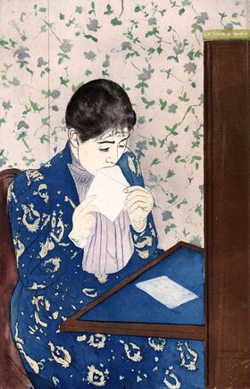
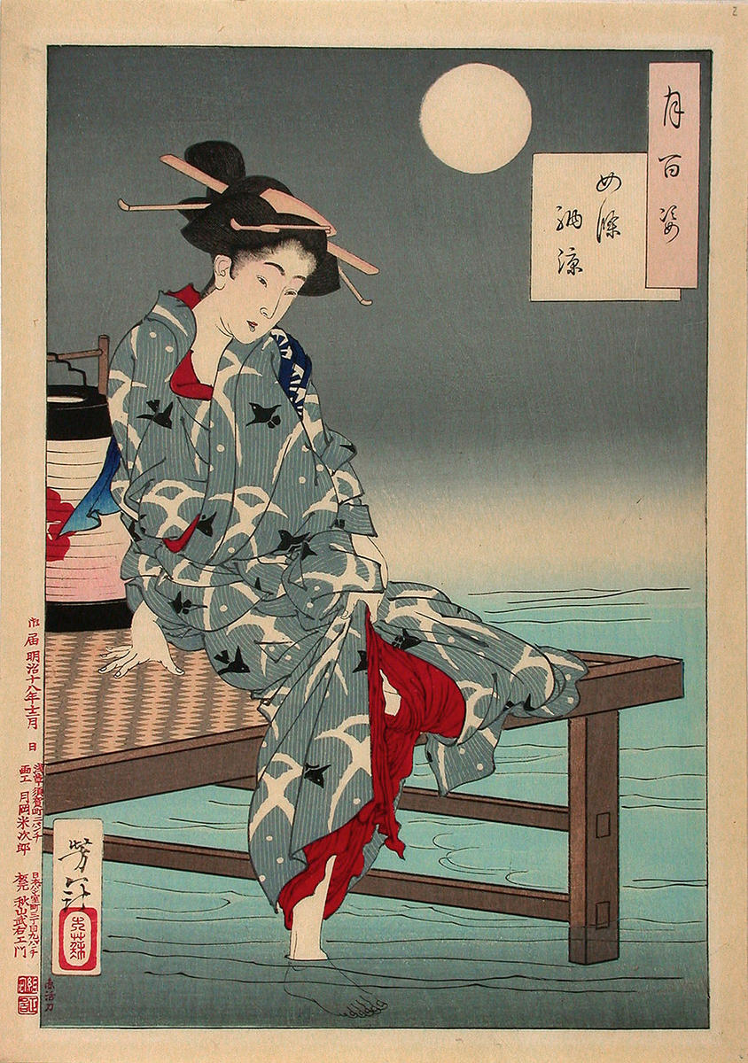
The West has been influenced by Eastern aesthetics since 1853 opening of Japan

Right: Mary Cassatt's The Letter (1891)

Left: Yoshitoshi's Cooling off at Shijō, from the series One hundred aspects of the moon (1885)
Picture
Wabi: connected to Shinto religion, original religion of Japan, 3rd century 
  • Pantheistic and polytheistic Gods are called kamis
  • An everyday type of beauty: austere, imperfect, and regular beauty -- leaves room for imagination 
    • simple/unpretentious: embarrassed disappointment, frustration
    • Imperfect: Uncomplete considered more beautiful than something complete and unblemished 
    • austere/stark 
  • Also linked to Japanese tea ceremony 
    • When Buddhist monks came into Japan in 1500s, they adapted wabi to their own traditions = link wabi to the way the tea ceremony is conducted; very formulaic; utensils used  
Picture
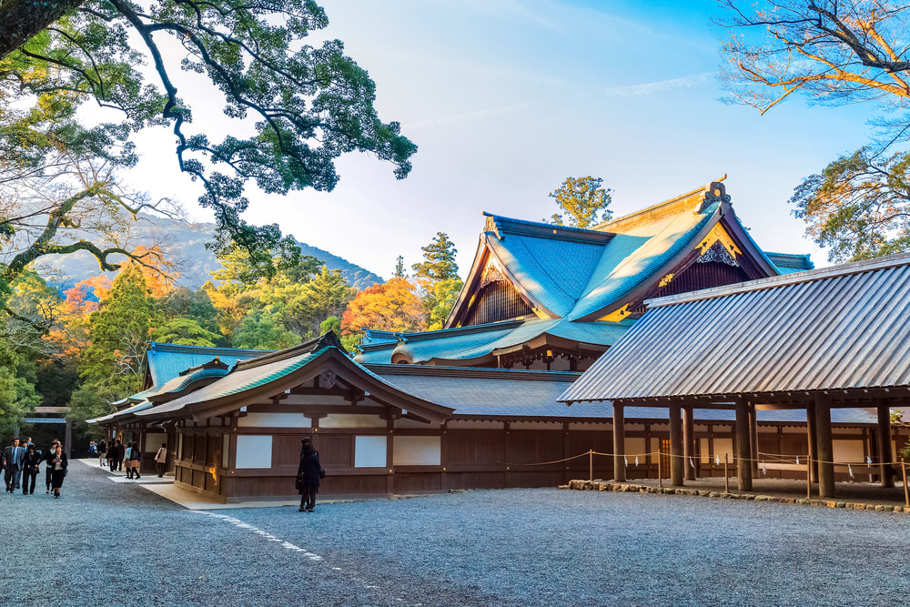
​The Grand shrine of Ise is considered the most important Shinto shrine. It is surrounded by 127 smaller shrines and continues to be built every 20 years using same materials and traditional methods as a way to continue that legacy.
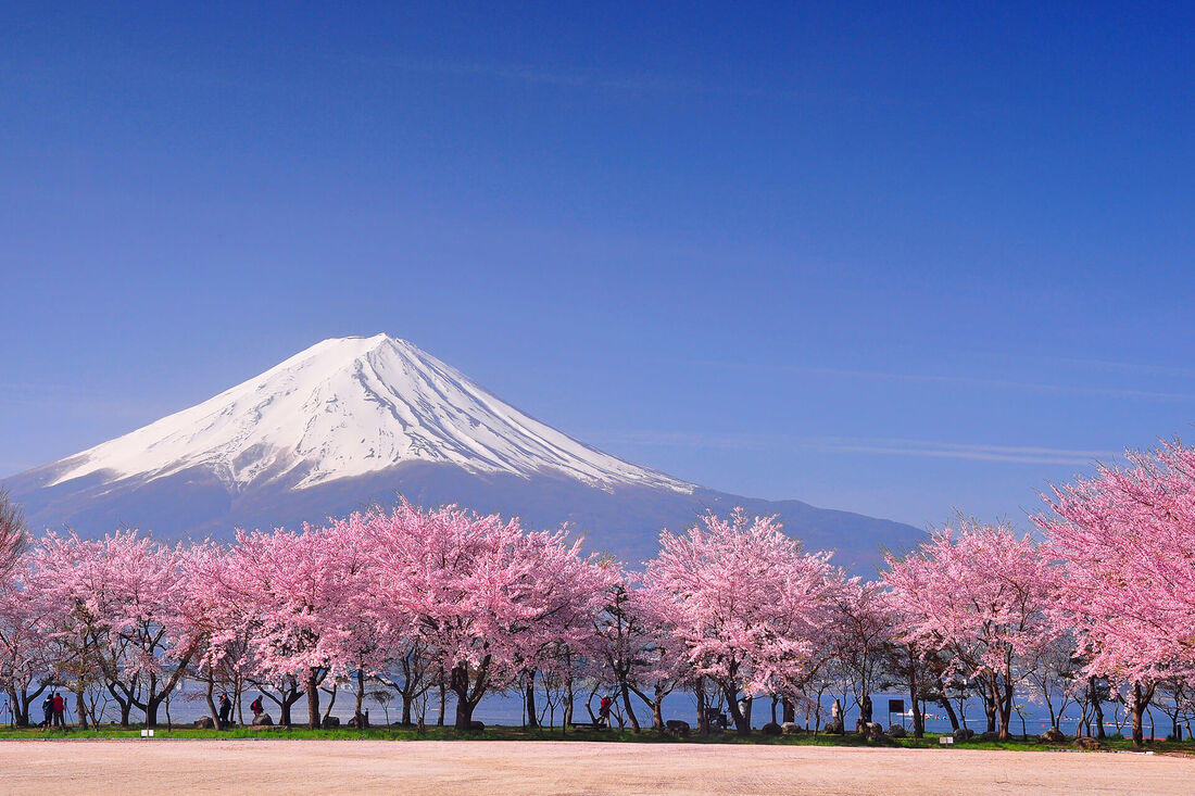
Picture
Sabi: mono no aware
  • Not really linked to any religion (Shinto, Confucianism, Buddhism)
  • The capacity to be moved by things. It tends to both sadness and melancholy 
  • Cherry blossoms: blossom and bloom within three days, passing of time 
Picture
Yugen: linked to Buddhist teachings
  • experience something and you don't quite have the words to express it 
  • A graceful beauty, addresses a higher realm 
  • an example of work inspired by Yugen: Hiroshi Sugomoto's Byrd Richmond 1993 
Junichiro Tanizaki
1933 In Praise of Shadows - wildly read in Japan, a pop culture figure 
  • In mid-50s while writing, thinking about younger days
  • Nostalgic tinge, longing for the past 
  • While writing in 1930s: all about rejecting everything western, figuring out what is important and unique about Japanese culture
  • Loves lacquerware; abhors ceramics as an aesthetic principle
  • believes modern man doesn't understand true beauty of gold because electric light does not cause the same shadows as candlelight
  • Wants spaces that have grey light 
  • “The beauty of a Japanese room depends on a variation of shadows”​
  • Shadows come, and linger, and go -- they are more beautiful for having been there
  • Temple architecture: loves the even shadows under the eaves 
  • Values Noh theatre over Kabuki 
    • Kabuki uses applied makeup and stark expressions, done under artificial electric light, done in 20th century stages 
    • Noh uses traditional Japanese clothing and only masks with blank expressions; preformed either outdoors or in candlelight; done in the round

Reflection

I remembered a lot of the details of this lecture from a similar one from 2018 on Japanese aesthetics. I specifically recalled the information about the principles of wabi and sabi because I think these ideas really resonated with me. As someone who identifies closely with perfectionism and the desire for a polished, finished artwork, I highly respect people who can look at a piece of art that is frustratingly crooked or incomplete and appreciate it as it stands. I found this notion -- that artworks which are not complete could be even more valuable than artwork which has been crafted with painstaking attention to detail -- especially frustrating; it feels like an insult to people who put time and effort into making their craft flawless. I guess that's the whole point, though; as yugen means, life is better spent appreciating the moment as it comes, rather than always thinking about the moment that has yet to come. When you really care about being present for the process of creating an artwork, I guess the finished product doesn't seem like the end-all be-all anymore. I think that's a valuable lesson; but, honestly, I don't know if I'd ever be able to fully ascribe to this way of thinking. I am goal-oriented, motivated by a vision I have of myself -- whether that be in art, school, or any other aspect of my life. While I understand there are drawbacks to this mentality, I also feel it has helped me succeed and maintain a good work ethic because of my internal drive. I would fear that if I were to try to incorporate wabi, sabi, and yugen into my work, I would lose that drive that keeps me on top of things. I guess, though, the whole point is balance: balance in being present in the moment and having a clear vision to work towards; balance in appreciating imperfections but also having a sense of pride in my work; balance in appreciating life as it comes and goes. I understand why individuals within Western art culture were inspired by Japanese aesthetics; their values are simple and humble, but the end result is a sense of contentment and satisfaction you are unlikely to achieve elsewhere. Plus, just the style itself with the flat shapes and the cherry blossoms is peaceful. 
Overall, I enjoyed the lecture. I think I will apply it to my current works, using the principles of wabi, sabi, and yugen to center my mind when I feel I am too hyper-focused on perfectionism or not appreciating the process of art-making itself. 
0 Comments

Process: 1st Q3 In-Class Project (cont.)

3/12/2021

0 Comments

 
Picture
Picture
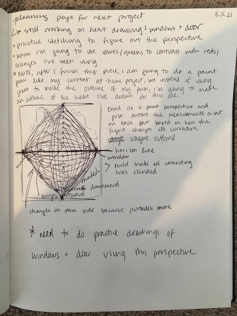
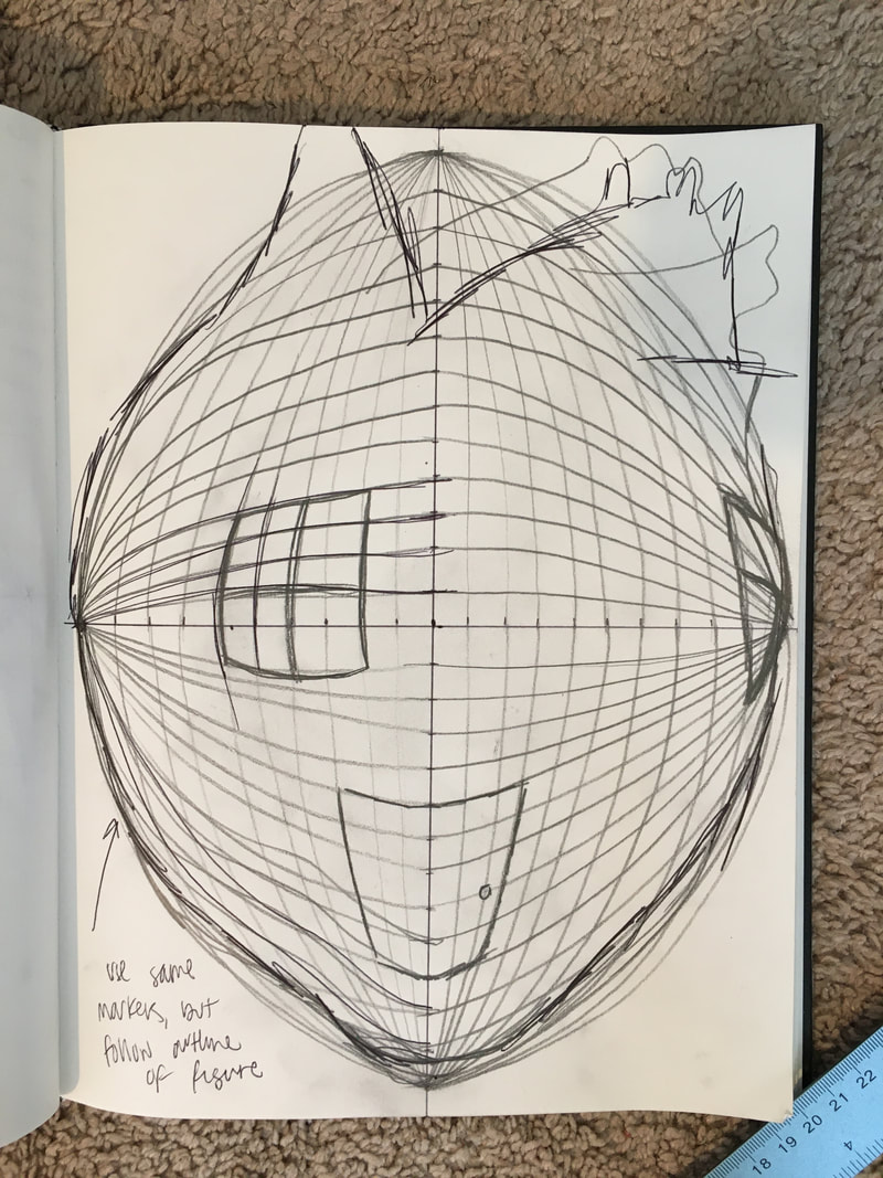
The images of the planning pages I've included from my sketchbook (above) pretty much sum up my next steps for this project. I still need to finish shading the heart itself and making sure the colors are as bold as I want them to be. I struggled with the textures of the upper left quadrant a lot, especially since there is a pretty large area of highlight in the photo that I wasn't sure how to capture. I explained my concerns about the areas with highlight to Coach, and he suggested I take a bit of artistic license. So, I am just sort of pretending like those highlights don't really exist because they are incredibly difficult to render using colored pencil. Once I finish coloring the heart, I'll begin on the windows and door. As depicted in my planning pages, I've been thinking about how to best portray the angles of the windows and door because I want it to be clear the heart has dimension and depth. It is tricky because it is not an even globe shape, so the angles are a bit different for each part. I think what I will probably do is begin with a horizon line and adjust the lines I use as markers according to the irregular curves. I think I'm going to follow Coach's suggestion of making the door inset so that there's an entryway and the door itself is set back into the heart. I think this would give a really awesome sense of depth to the piece and be more visually interesting than a regular door. Plus, as he pointed out, it would be very difficult to draw the door distorted on the surface of the heart. 
I'm both nervous and excited for these next steps in my progress... but mostly excited!
0 Comments

Process: 2nd Independent Project

2/19/2021

0 Comments

 
Picture
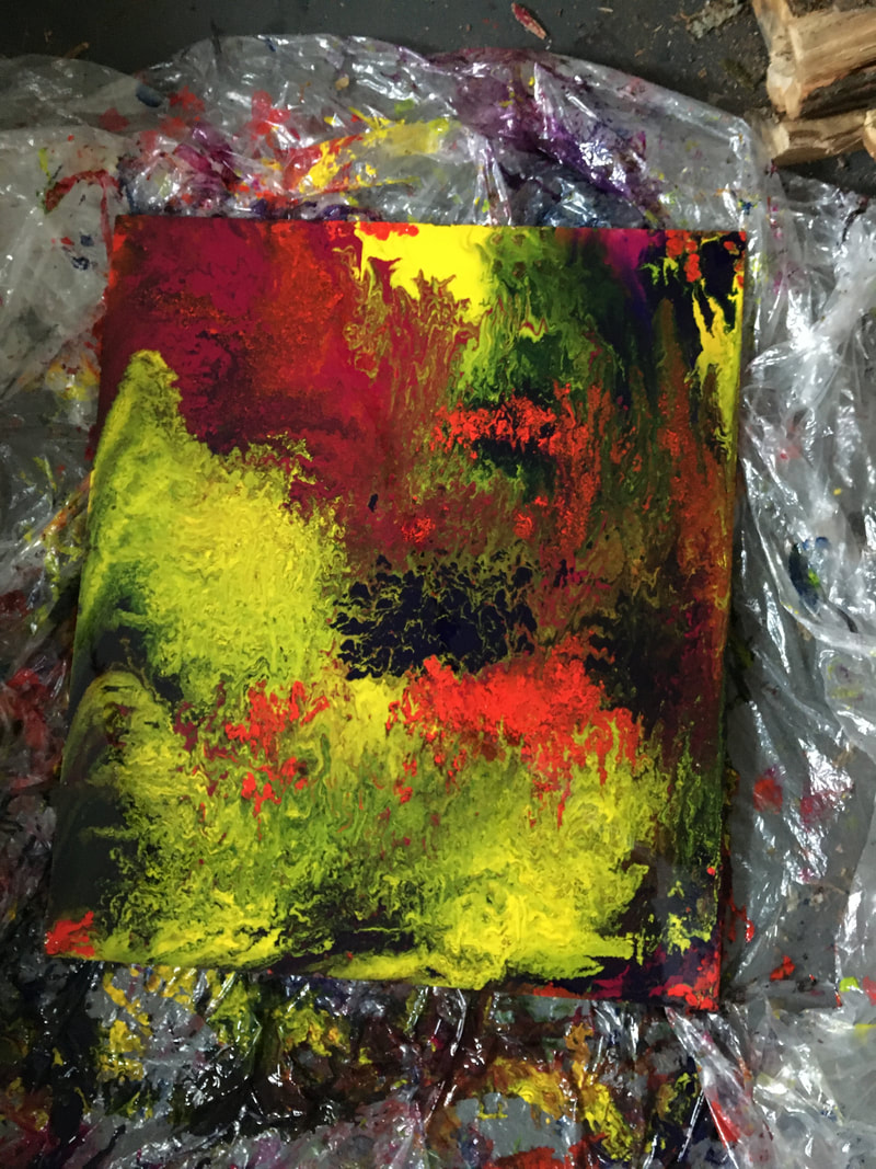
It's really difficult to take process pictures of the paint pour because it gets so messy and I can't stop in the middle of the process to take pictures with my hands all covered in paint. But, anyways, I finally went to Lowe's and got a super large piece of this very thick material that is similar to fiber board, but not quite the same (I don't remember what it's called). We got them to cut so that it would be the right size. Then, I could finally do the actual paint pour (after my first failed attempt). I ran into the same problem as I did with my first attempt, where there were these little pockets of empty space that the paint just sort of went around, rather than filling them in. So, I had to put paint on my finger and basically break whatever seal/barrier the paint had formed that kept it from not spreading to that space. It was kind of satisfying, but also time-consuming. Overall, this piece is alright. I am concerned there is not enough purple to balance the yellow that somehow managed to dominate the bottom left part of the board. But, the textures and patterns are really cool. I'm excited for the next phase: making the outline of the silhouette, using the same picture of myself that I used for my last piece. Originally, I was going to actually cut the outline out, but I need to see if that is actually feasible. As an alternative, I was thinking of maybe just using gesso to make a subtle outline, or something like that. I was also thinking that I could just fill in the outline with gesso, like a color block, rather than just outlining the figure.  
0 Comments

Process: 1st Q3 In-Class Project

2/19/2021

0 Comments

 
Picture
Picture
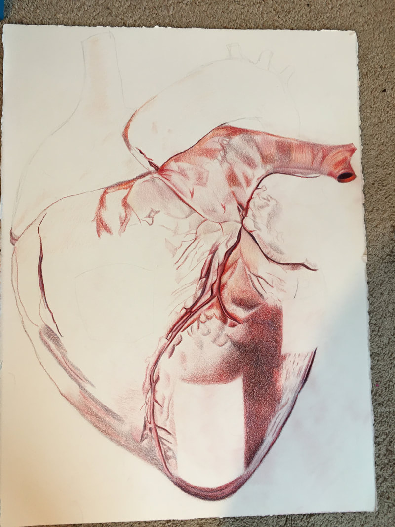
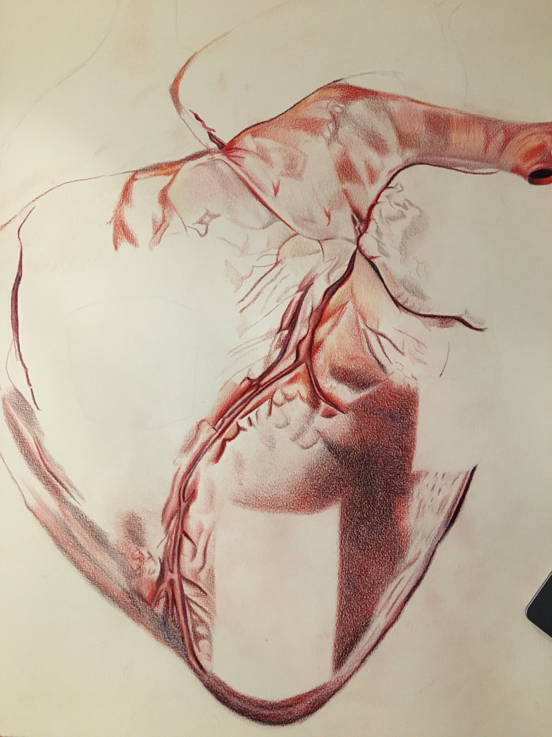
I've made some good progress on this piece. It's difficult to blend the colors correctly to get the right hues and shades, but I've enjoyed the process. I'm sort of dancing around the parts that are the most detail-oriented, especially where there are highlights. My fear is that I won't be able to execute the details, and the highlights will just look like blank spots, as if it's unfinished. I'm gonna have to get over it at some point, though, if I intend to finish.
0 Comments

Process: 1st Q3 In-Class Project

2/12/2021

0 Comments

 
I've made some decent progress thus far. All I'm really doing right now is using my reference photo to color and shade. It's a fun but slow process. I'm not following the reference picture exactly, but close enough for it to still be realistic. I am having a tricky time with the highlights on the right side -- I'm not sure how to depict them accurately. I might have to leave that part for the end so I have time to figure it out. Overall, I am content with where this piece is headed. 
0 Comments
<<Previous

    Archives

    March 2021
    February 2021
    January 2021
    December 2020
    November 2020
    October 2020
    September 2020
    August 2020
    July 2020
    June 2020
    May 2020
    April 2020
    March 2020
    February 2020
    January 2020
    December 2019
    November 2019
    October 2019
    September 2019
    August 2019
    July 2019
    June 2019
    May 2019
    April 2019
    March 2019
    February 2019
    January 2019
    December 2018
    November 2018
    October 2018
    September 2018

    Categories

    All
    Awareness
    Experience
    Process
    Update

    RSS Feed

Powered by Create your own unique website with customizable templates.
  • Home
  • About
  • Art Gallery
  • Photo Gallery
  • Blog
    • Head and Heart 2019-2020